iOS 12 Wallpaper Red Pink 13
Topics
Details
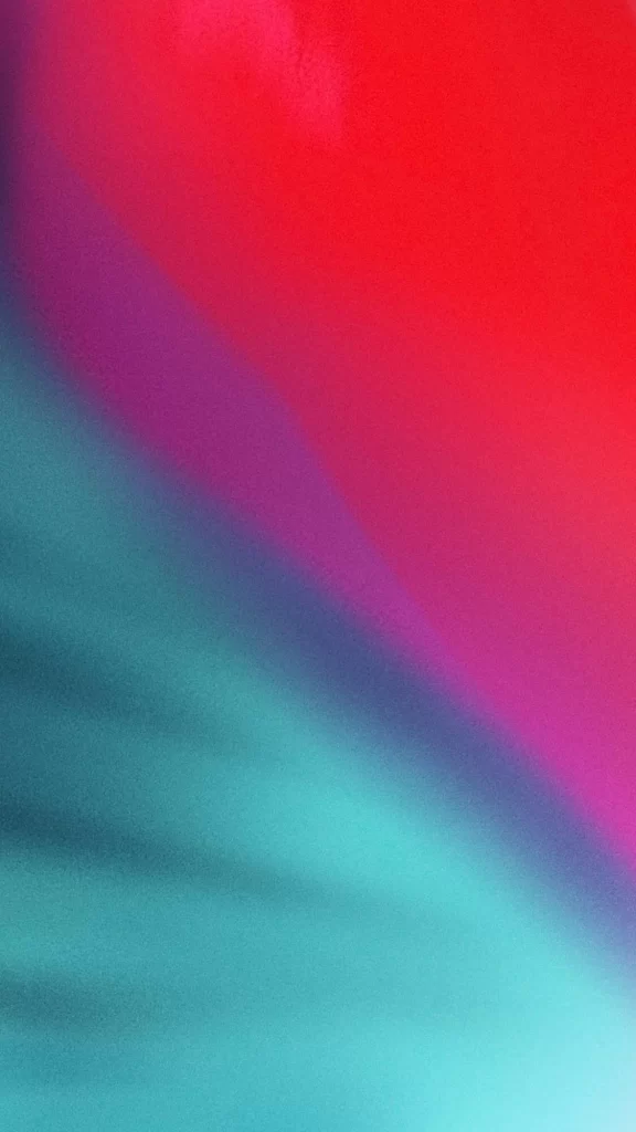
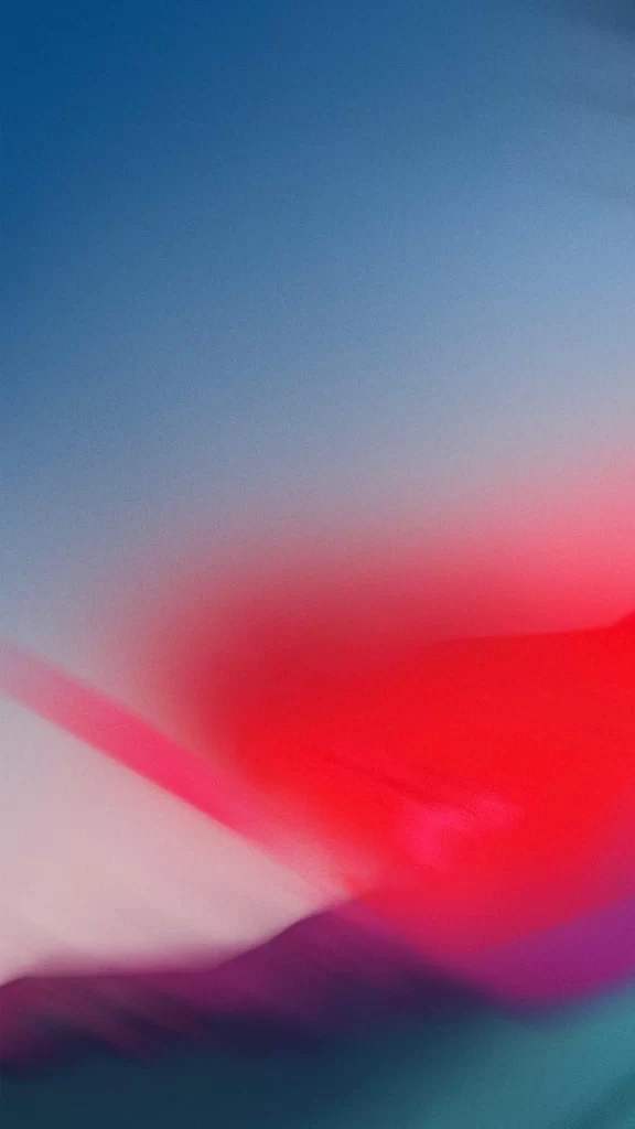
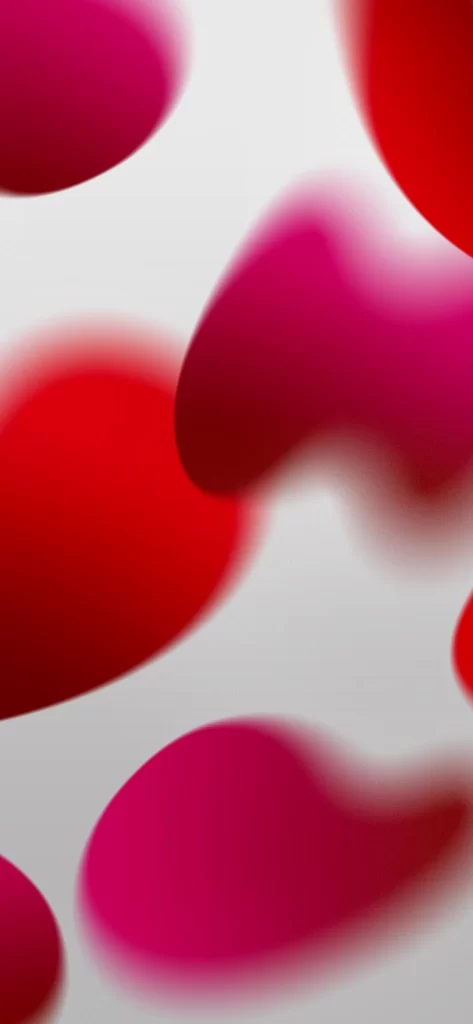
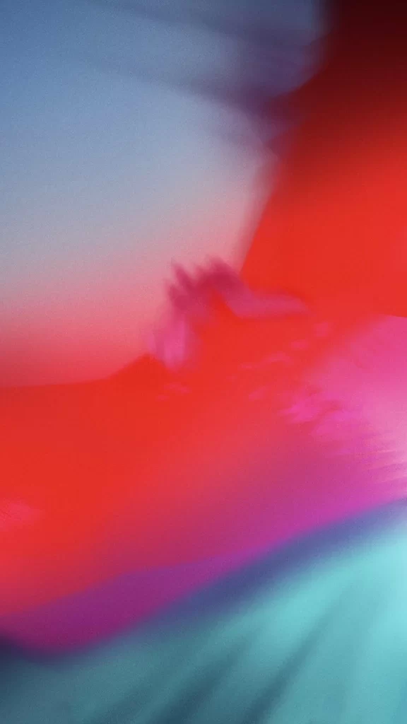
Sweeping across the frame, a bold crimson field dominates the lower two-thirds of the composition, its edges bleeding into softer magenta and violet tones where it meets a pale periwinkle expanse above. The boundary between these color zones appears deliberately blurred, creating an ethereal gradient that suggests motion or a shallow depth of field. At the very bottom, a sliver of cool cyan provides a subtle chromatic anchor to the otherwise warm palette.
Visual interest emerges from the interplay between saturated warmth and muted coolness, with the red area exhibiting a subtle grain texture that lends tactile depth to the digital surface. The composition avoids sharp geometric lines in favor of organic, fluid transitions that evoke a sense of atmospheric perspective. Such deliberate softness distinguishes this particular iteration from more rigid abstract designs, offering instead a meditative quality through its diffused color boundaries.
Mobile interface designers might employ this as a backdrop for minimalist app layouts where content legibility requires low-contrast backgrounds. Color theorists could reference the specific hue relationships when developing brand palettes that balance energy with calmness. Digital artists working on ambient installations would find the smooth gradients particularly useful for creating seamless looping animations that require gentle visual transitions.