iOS 16 Wallpaper Rainbow Gradient Abstract
Topics
Details
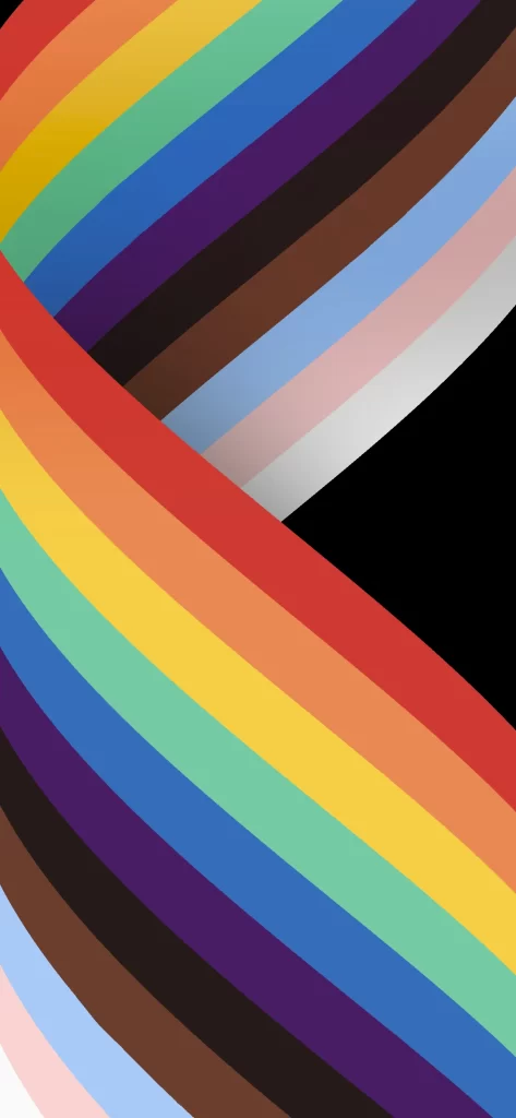
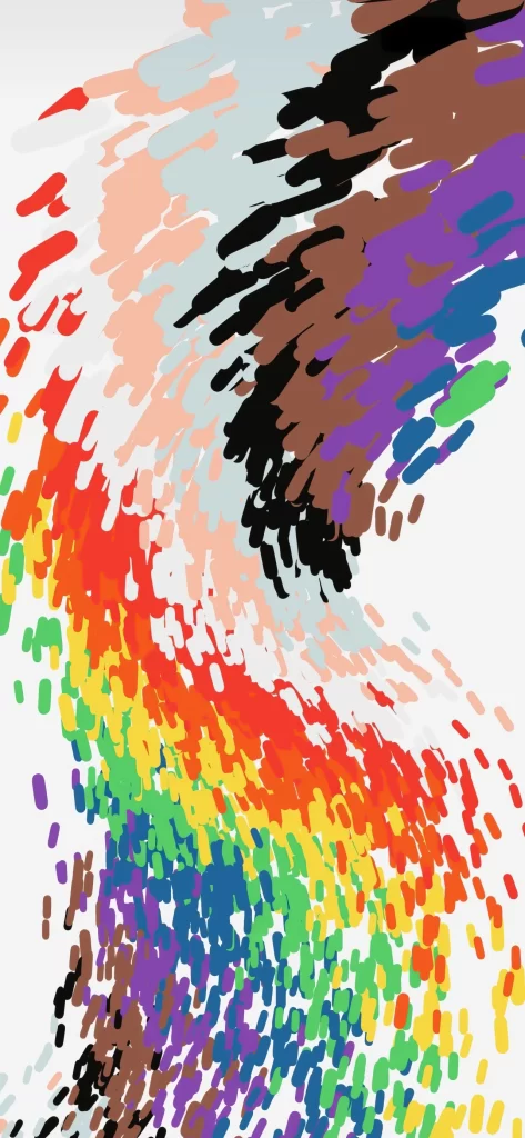
Streaks of crimson, amber, and emerald cascade diagonally across a stark white void, intermingling with cooler tones of lavender and cerulean. The composition features two distinct chromatic currents: one flowing from the upper left in soft pastels and primary hues, while the other descends from the top right in deep browns, blacks, and saturated purples. Each color manifests as an irregular, brush-like dab of pigment, creating a textured tapestry that suggests digital finger-painting rather than smooth vector gradients.
Visual tension arises from the collision of these opposing color streams, where warm spectral bands meet earthy, shadowed tones in the center of the frame. The irregular, almost gestural quality of each individual mark prevents the rainbow effect from feeling mechanical or overly polished, lending the piece an organic, handcrafted sensibility. Such deliberate imperfection in the stroke work distinguishes this abstract pattern from typical linear gradients, offering depth through layered opacity and varying mark density.
Mobile interface designers seeking vibrant yet non-distracting backgrounds for dark-mode applications would find the darker upper-right quadrant particularly useful for overlaying text elements. Artists exploring generative art techniques might study the distribution patterns to understand how randomized brush placement can create cohesive directional flow without rigid structure. Color theorists could also reference the specific juxtaposition of complementary and analogous pairings when developing palettes for contemporary branding projects.