Bottle Mineral Water Izkin Brand Blue
Topics
Details
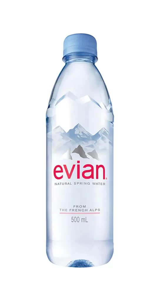
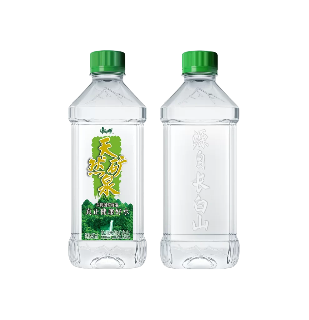
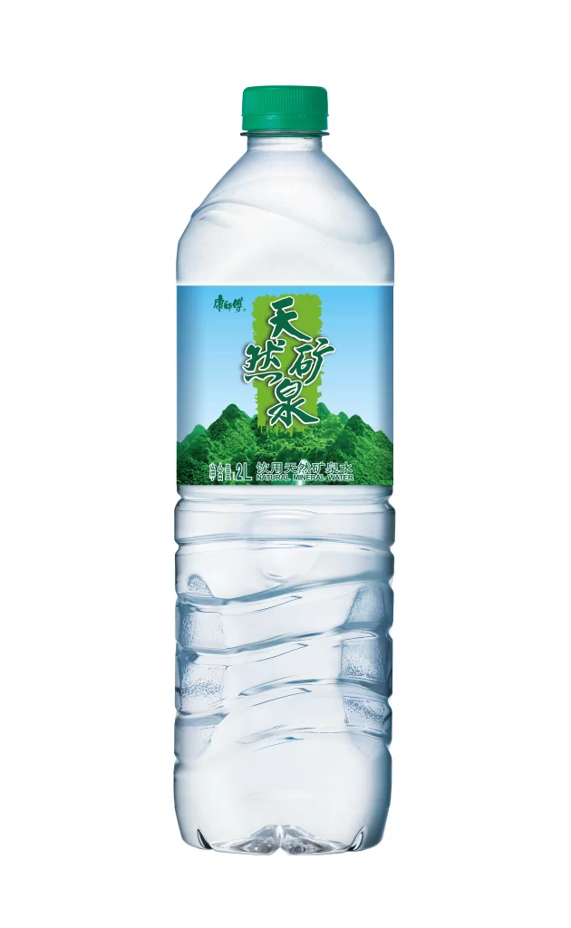
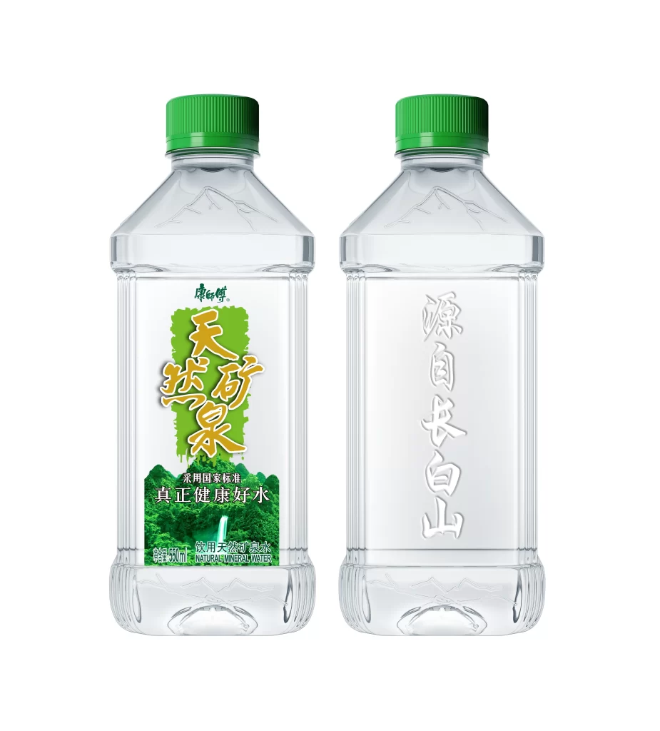
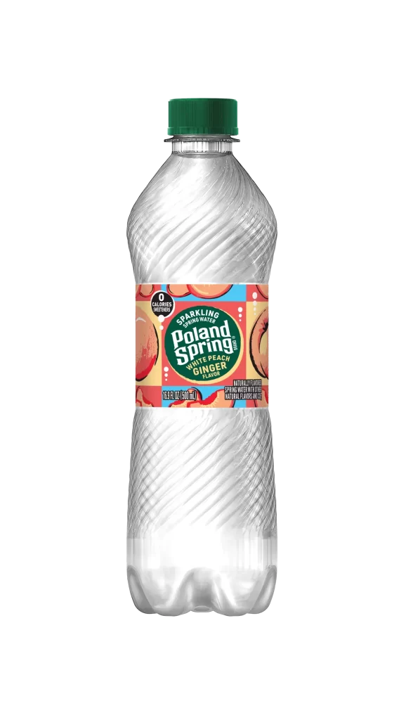
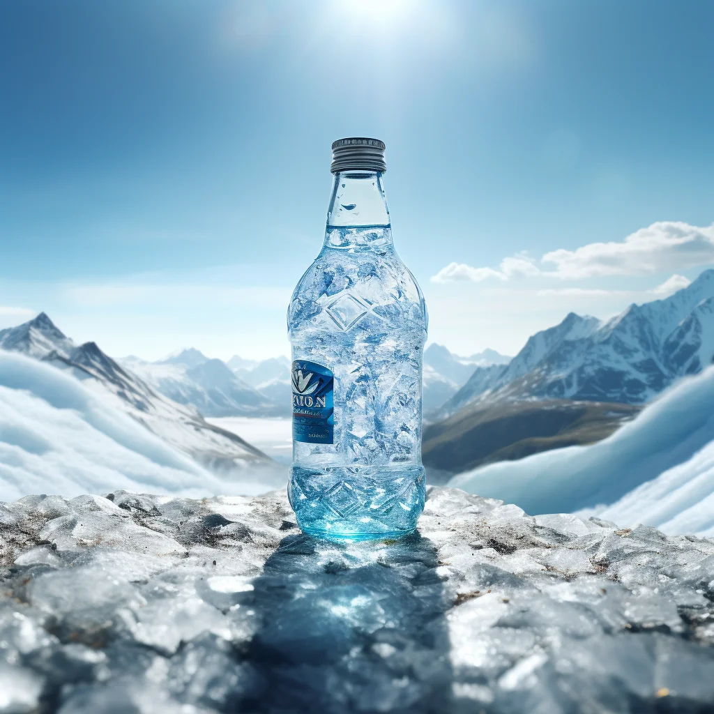
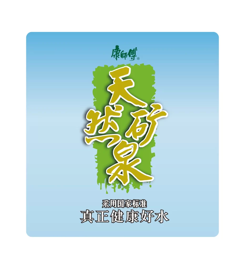
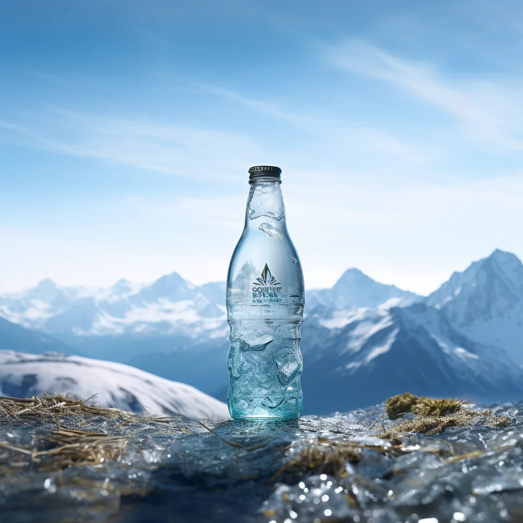
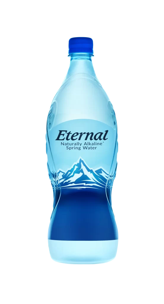
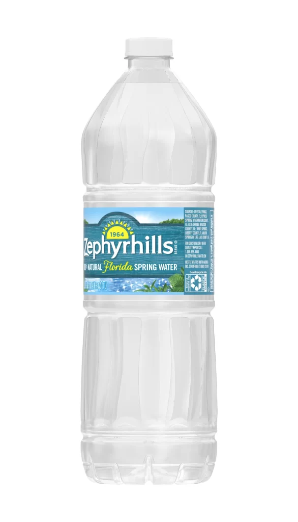
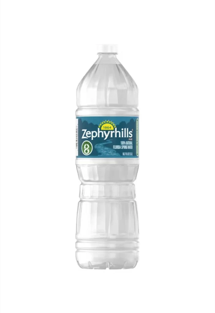
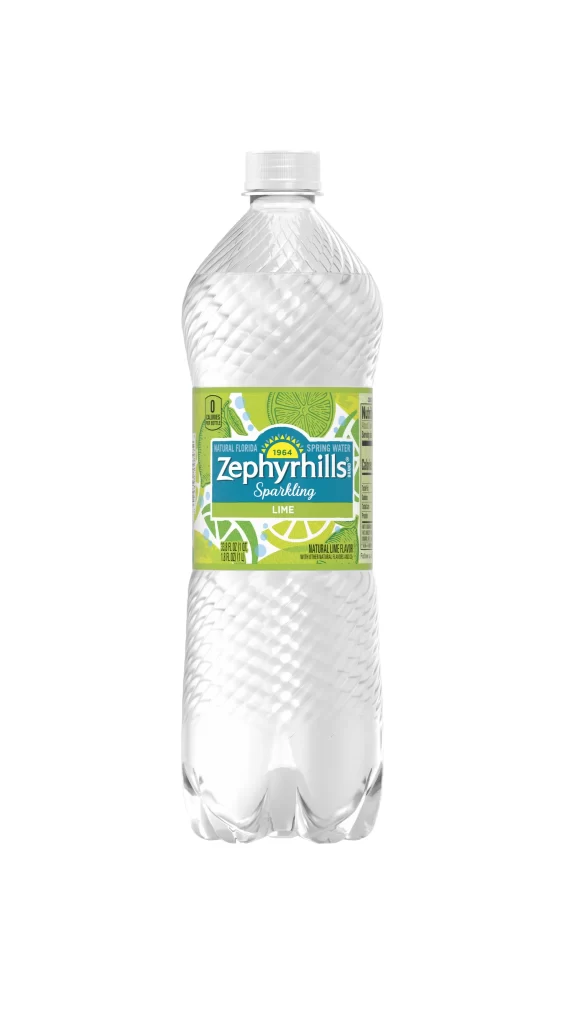
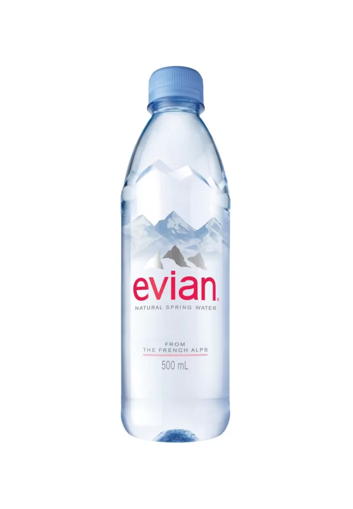
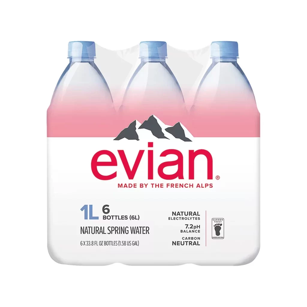
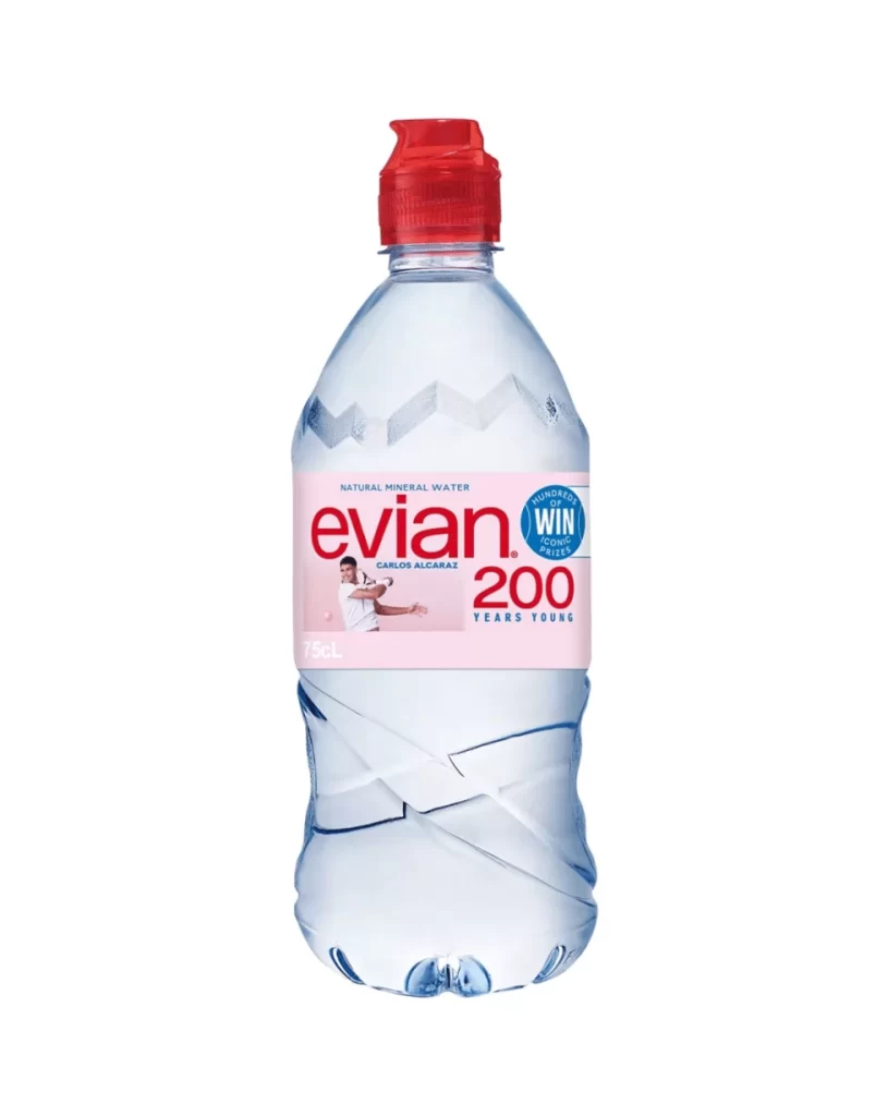
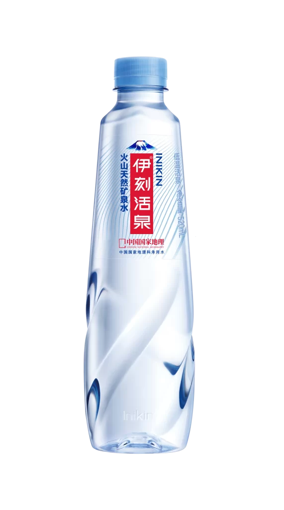
A clear plastic bottle of Izkin brand mineral water stands upright, featuring a light blue screw cap and a contoured body with subtle wave-like indentations. The label displays bold red Chinese characters for the brand name alongside a stylized mountain peak logo in blue and white, with additional text indicating volcanic natural mineral water. Vertical orientation captures the full 520ml container against a neutral backdrop with even studio lighting that highlights the transparency of the liquid and material.
Visual distinction comes from the interplay between the crystalline PET structure and the vibrant red-and-blue labeling system that creates strong contrast against the clear contents. The twisted geometric patterns molded into the plastic surface add tactile interest while the bilingual typography arrangement balances traditional Chinese characters with Romanized branding elements. Cool color palette dominated by azure tones reinforces the refreshing product positioning through consistent application across cap, graphics, and liquid presentation.
Packaging designers studying beverage category conventions would examine this specimen to understand how mineral water brands communicate purity through material choices and color psychology. Marketing teams developing Asian market entry strategies could reference the typographic hierarchy and cultural symbolism embedded in the mountain iconography. Industrial designers researching ergonomic bottle forms might analyze the grip-enhancing contours and structural ribbing for similar functional applications in consumer goods.