Mineral Water Bottle 2
Topics
Details
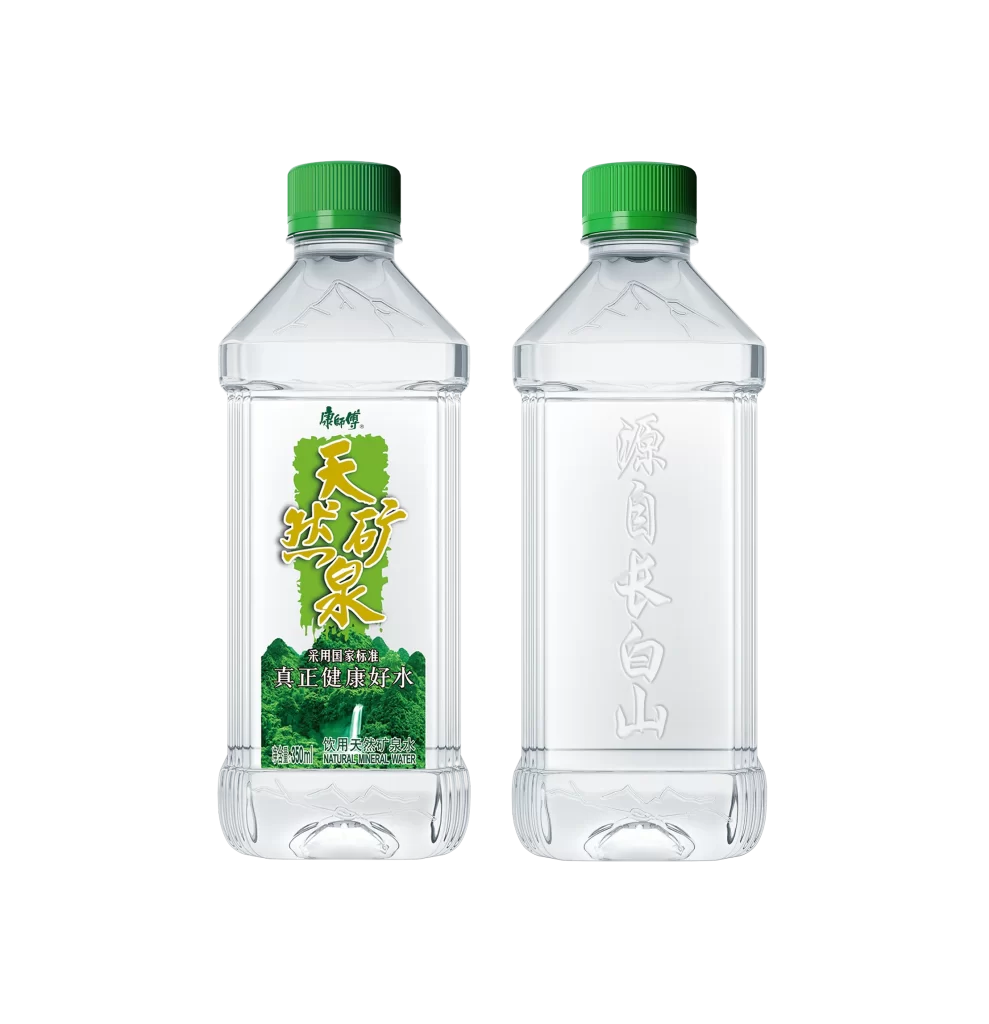
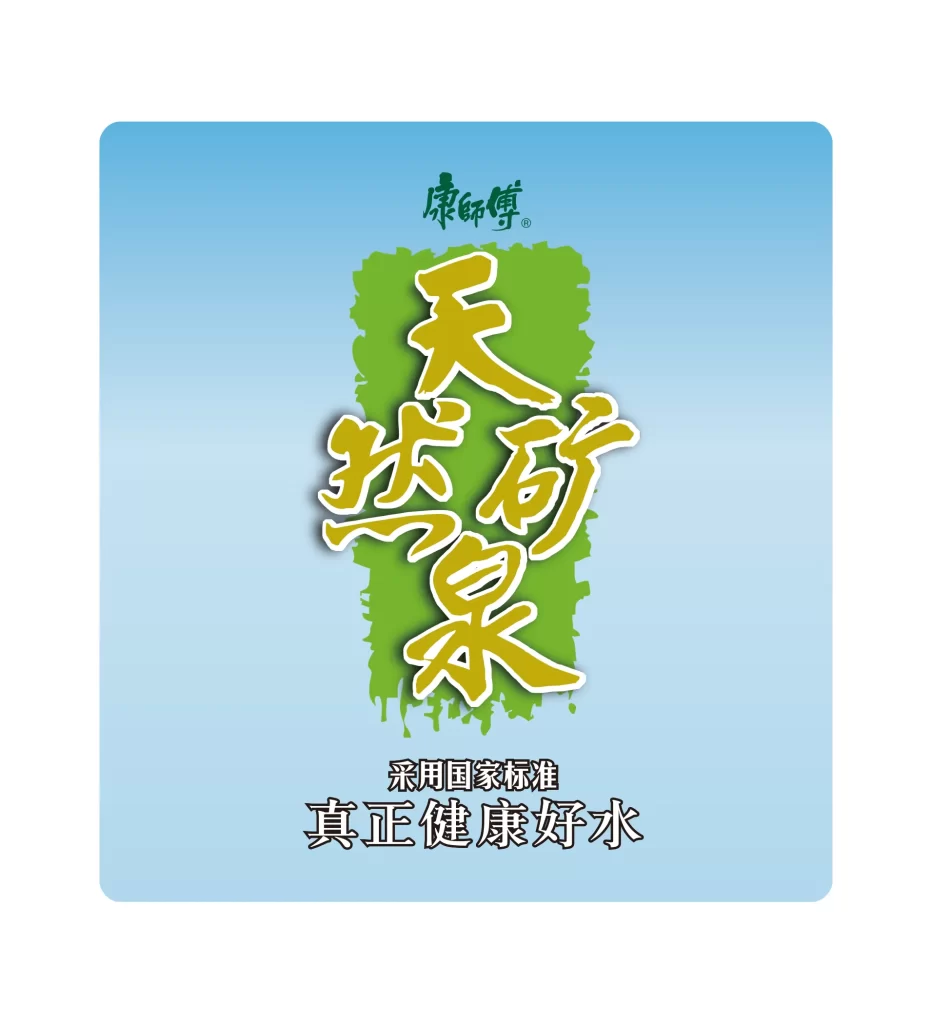
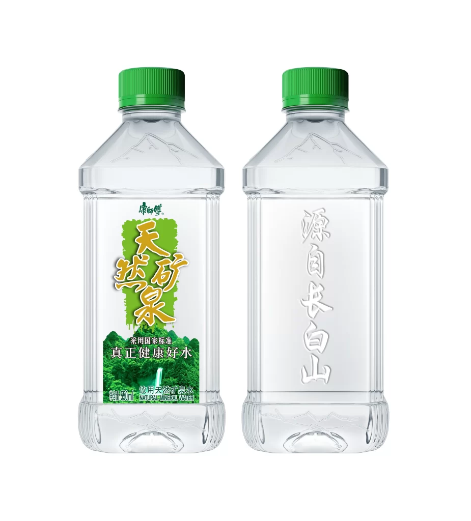
Two clear plastic bottles of Kangshifu Natural Mineral Water stand side by side, each sealed with a bright green screw cap and featuring a subtle mountain-peak embossment on the upper shoulder. The left bottle displays a vibrant green label with golden Chinese characters reading "天然矿泉" (Natural Mineral Water) above the slogan "真正健康好水" (Truly Healthy Good Water), while the reverse side shows vertically embossed white text stating "源自长白山" (Sourced from Changbai Mountain). Soft, even studio lighting eliminates harsh shadows across the transparent PET surfaces, revealing the 550ml volume marking and English translation at the label's base.
What distinguishes this packaging is its dual-sided storytelling approach, combining a colorful illustrated front panel depicting lush forests and waterfalls with tactile, raised typography on the back that emphasizes geographic provenance. The bottle's architectural silhouette—featuring vertical ribbing along the sides and a faceted base—creates interesting light refraction patterns that change depending on viewing angle. Green serves as the unifying accent color, appearing on both the closure and the primary label background to reinforce freshness associations without overwhelming the product's clarity.
Product photographers studying beverage packaging will find this composition useful for understanding how to balance front-label graphics with back-panel embossing details in a single shot. Brand designers working on Asian market mineral water projects can analyze the hierarchy between the brand logo, product name, and origin claim to inform their own typographic layouts. 3D artists modeling consumer goods might reference the specific proportions of the shoulder embossment and cap threading to achieve realistic plastic material renders.