Buggy Bix Dog Treats Pumpkin Black Soldier Fly Biscuits Orange Illustration
Topics
Details
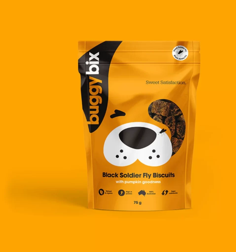
A matte orange stand-up pouch features a stylized dog face illustration with a white muzzle, black nose, and a single ear filled with textured biscuit photography. The brand name 'buggy bix' runs vertically in bold yellow and white sans-serif type along the left black panel. Below the central graphic, 'Black Soldier Fly Biscuits with pumpkin goodness' appears in dark text above four circular icons and a 75g weight marking, all set against a solid orange backdrop with soft frontal lighting.
The packaging merges playful character design with functional product visualization by using the dog's ear as a window to display the actual treats inside. This clever compositional choice creates immediate visual connection between the friendly mascot and the physical goods while maintaining brand consistency through limited color palette of orange, black, and white. The typographic hierarchy balances vertical branding with horizontal product information effectively across the curved surface.
Pet food marketers studying contemporary snack packaging trends would examine this example for its integration of mascot imagery with transparent product windows. Brand identity designers could reference the color blocking technique and icon placement for similar animal-product categories. Packaging engineers might analyze the structural layout for stand-up pouch applications requiring both emotional appeal and clear ingredient communication.