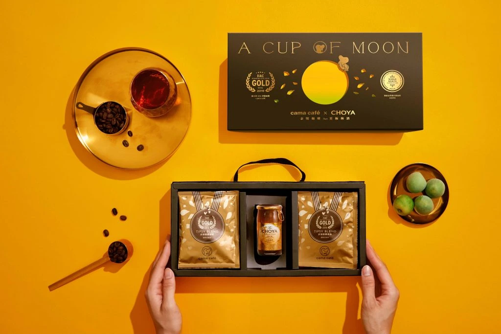
cama cafe Coffee Bean Box
DownloadTopics
Details
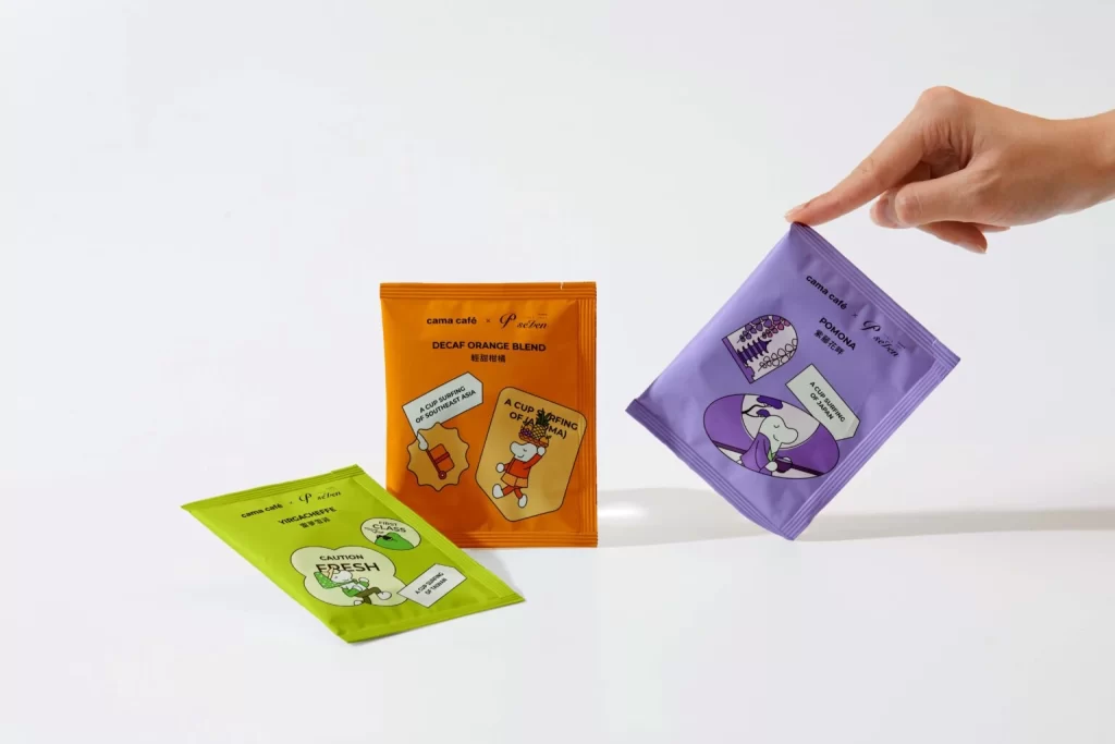
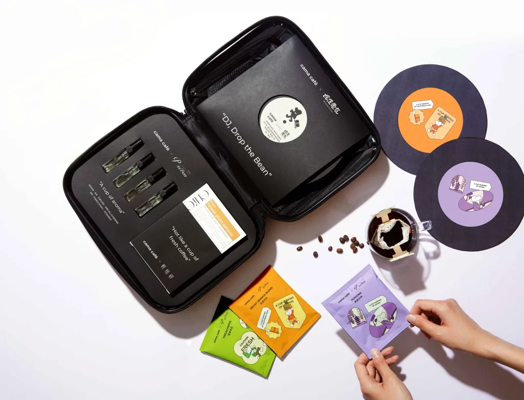
Over a clean white surface, an open black zippered case displays its contents at a slight angle, revealing four glass vials nestled in foam cutouts on the left side. The interior lid features bold white text reading "DJ Drop the Bean" alongside circular branding elements, while the base holds cards with phrases like "A cup of aroma." Scattered nearby are vibrant coffee sachets in lime green, tangerine, and lavender hues, two vinyl-style discs with cartoon illustrations, a glass mug of dark brew, and loose roasted beans catching soft overhead light.
What sets this packaging apart is its clever fusion of DJ culture with specialty coffee, using the record-inspired case and disc-shaped labels to create a playful, music-themed unboxing experience. The contrast between the sleek matte black exterior and the pop-art color palette of the individual packets gives it a modern, youthful energy that feels both premium and approachable. Designers looking to study innovative retail packaging or color-blocking techniques can grab the full-resolution file for free to examine every typographic and textural detail up close.
Product photographers might study this flat-lay arrangement to understand how props like scattered beans and human hands add life to commercial shots without cluttering the composition. Brand strategists could analyze how the consistent illustration style across the discs and sachets builds a cohesive visual identity that customers will recognize instantly. Anyone developing physical packaging for subscription boxes would benefit from seeing how rigid materials like the outer shell interact with flexible paper goods inside.