cama cafe Coffee Blend Pouch
Topics
Details
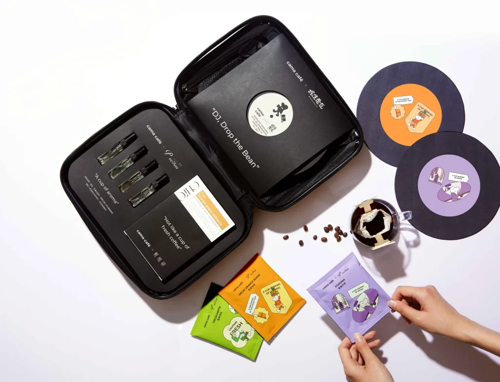
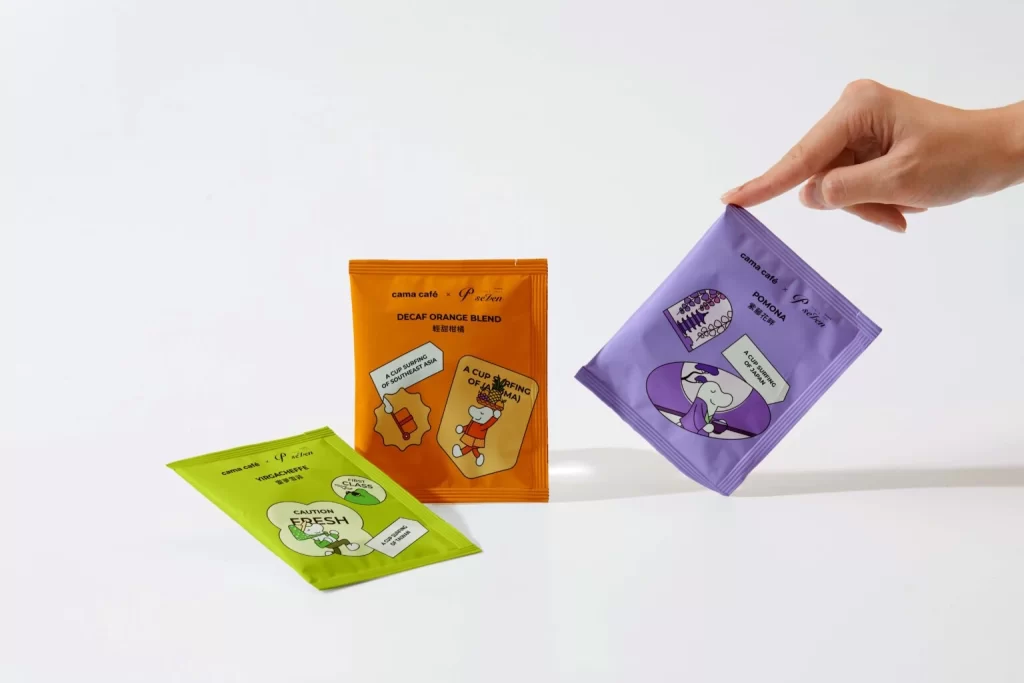
Three rectangular coffee sachets rest on a seamless white surface, each rendered in a distinct, saturated hue: lime green, burnt orange, and soft lavender. A human hand enters from the upper right to pinch the corner of the purple packet, introducing a dynamic sense of scale and interaction. The packaging features playful, hand-drawn illustrations of cartoon characters alongside bilingual text identifying the blends as Tiramisu, Decaf Orange, and Pomona.
Visual interest stems from the bold, monochromatic color blocking that differentiates the flavors at a glance while maintaining a cohesive brand identity through consistent typography. Whimsical graphic elements, such as speech bubbles containing phrases like 'Caution Fresh' and 'A Cup Sipping Off to China,' inject personality into the utilitarian format. This approach transforms standard single-serve packaging into a collectible, tactile experience that appeals to modern consumers seeking both convenience and aesthetic delight.
Brand strategists might analyze this composition to understand how color psychology influences consumer perception of flavor profiles in retail environments. Packaging designers could study the balance between illustrative charm and functional information density when developing their own product lines. Furthermore, art directors planning e-commerce photography sessions would benefit from examining how the inclusion of a human hand adds relatable context to sterile product shots.