Capriccio Vanilla Crocante Ice Cream Bar Tube
Topics
Details
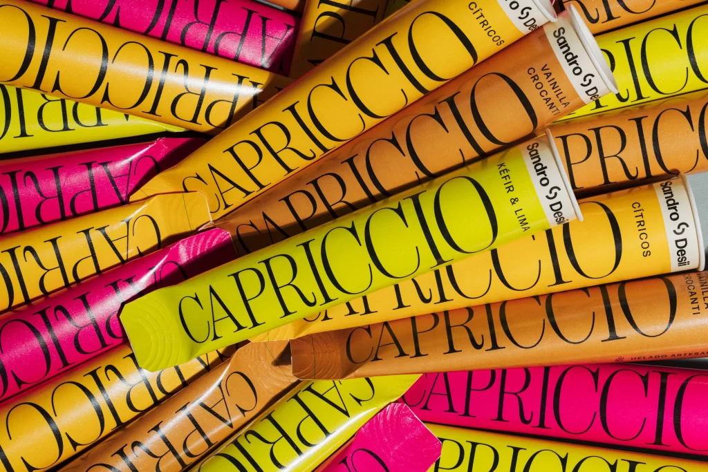
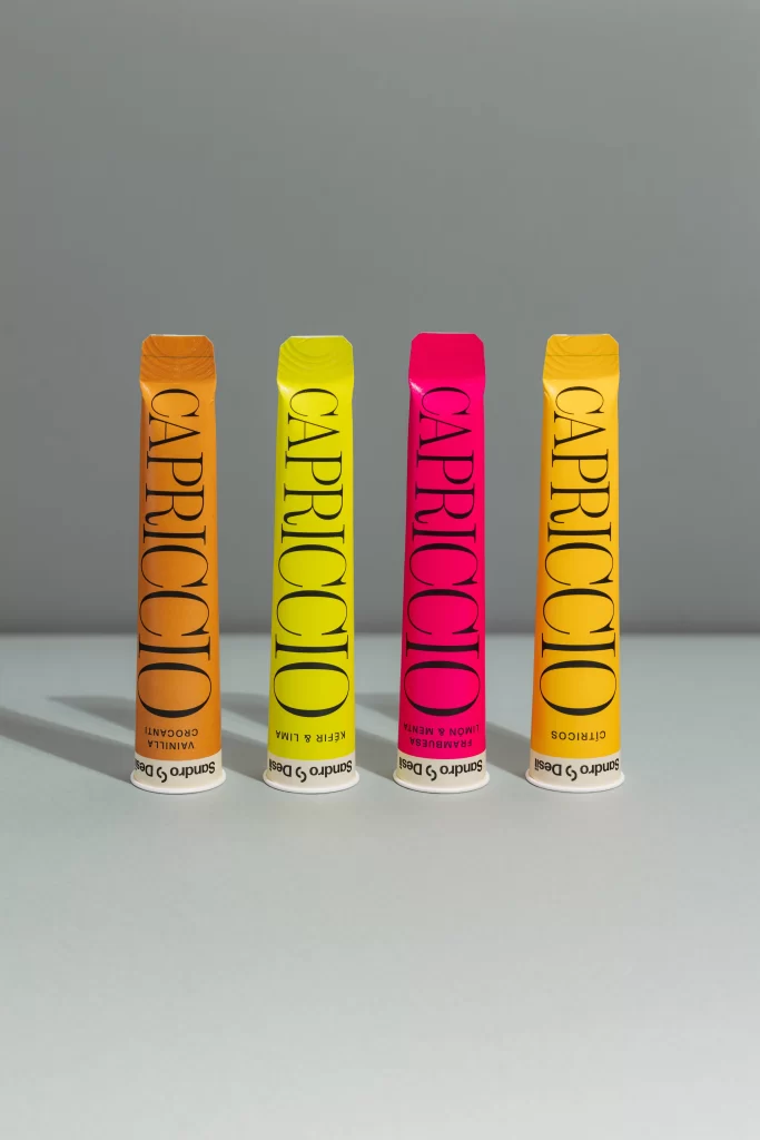
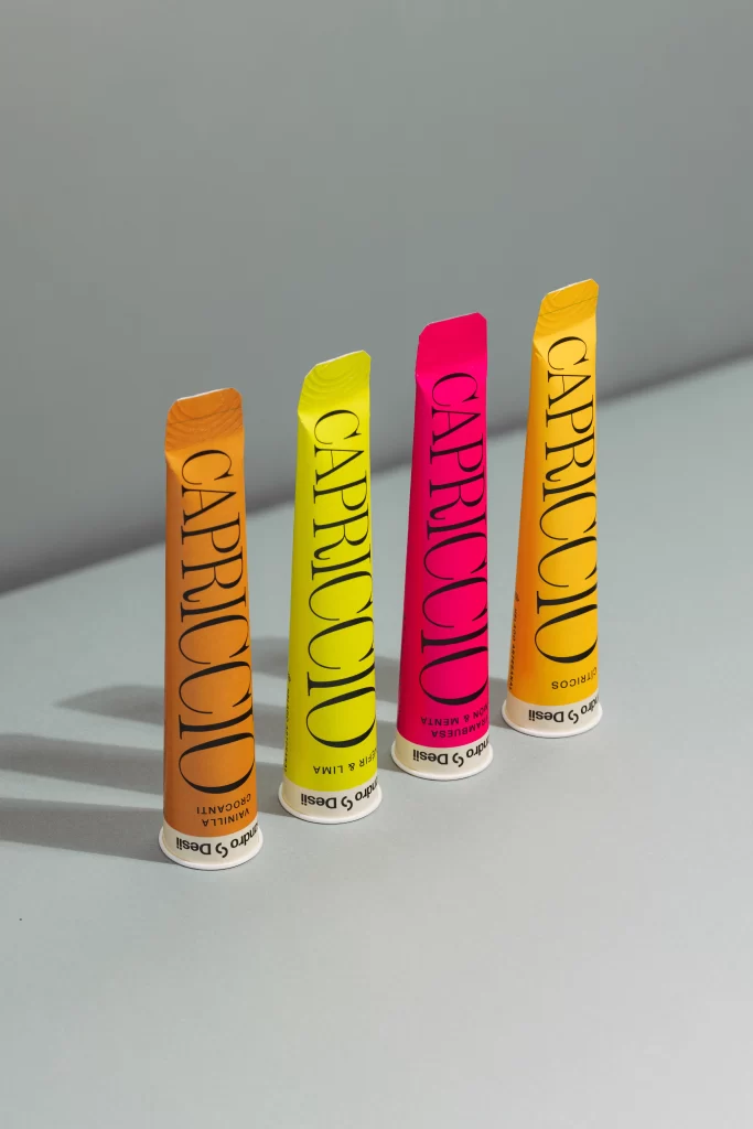
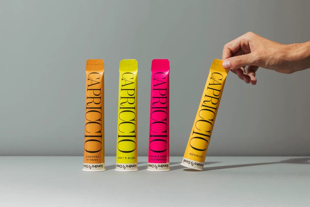
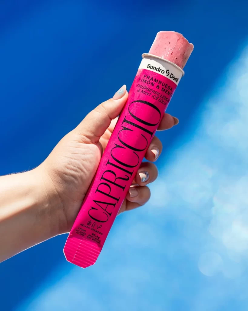
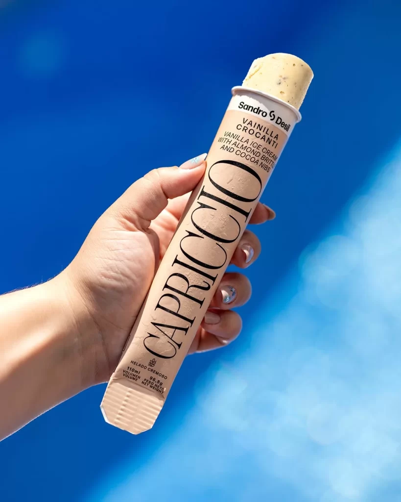
A pale beige cylindrical tube of Capriccio vanilla ice cream stands vertically, gripped by a manicured hand with shimmering silver polish. Bold black serif lettering spells out the brand name along the tube's length, while smaller text identifies the flavor as Vaniglia Crocante with almond brittle and cocoa nibs. The creamy yellow ice cream peeks from the top opening, all illuminated by bright natural light that makes the vivid blue background glow with soft bokeh highlights.
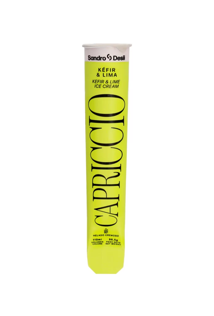
What sets this particular package apart is its elegant, fashion-forward aesthetic that mimics luxury cosmetic branding rather than typical frozen dessert packaging. The elongated proportions and the sophisticated font choice create an upscale visual identity, while the contrast between the matte tube finish and the textured ice cream surface adds tactile interest. This minimalist approach relies heavily on typography and negative space to convey premium quality without cluttered graphics or loud colors.
Food photographers and packaging designers might study this composition to understand how lighting affects product presentation on reflective surfaces. Brand strategists could analyze how the vertical text layout and color palette work together to communicate artisanal values to consumers. Anyone developing visual assets for summer lifestyle campaigns would find useful lessons here regarding hand-modeling angles and background color theory.