Capriccio Ice Pop Tube
Topics
Details
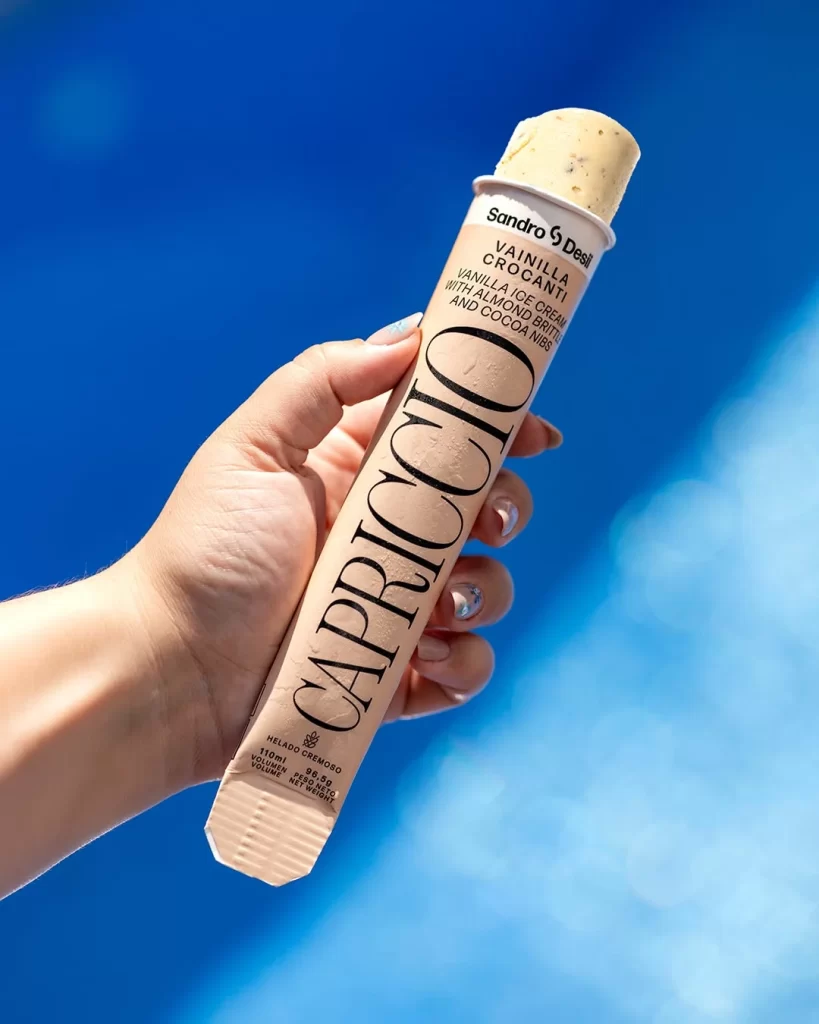
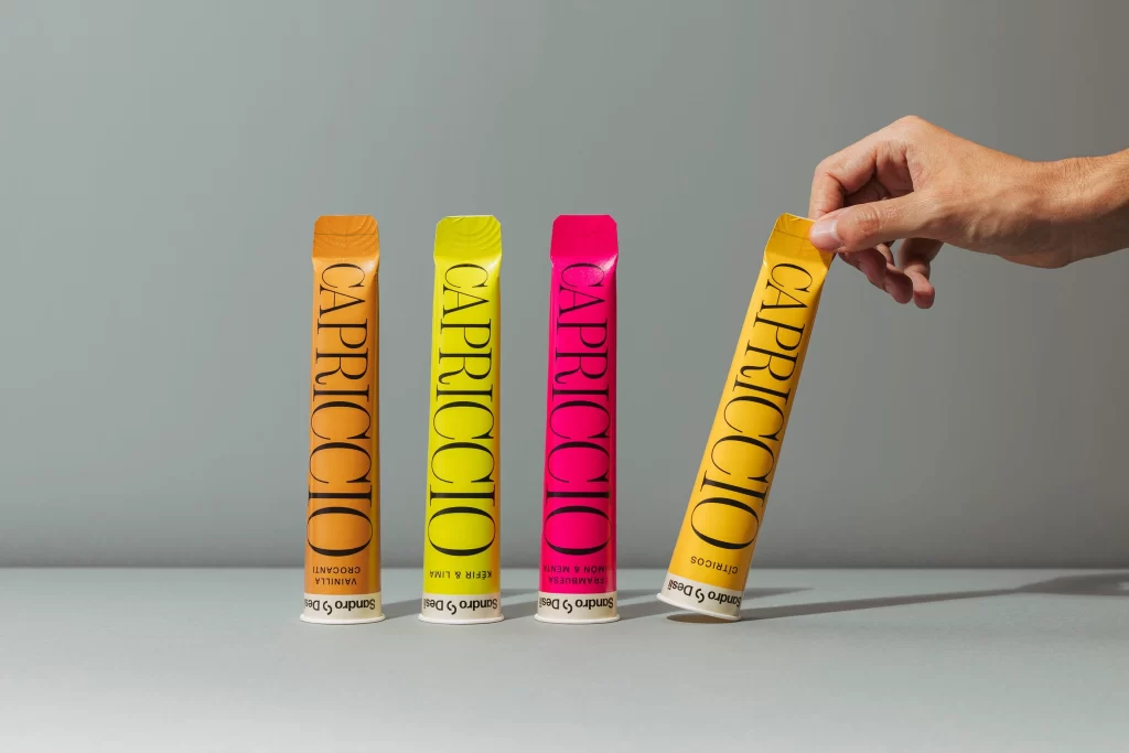
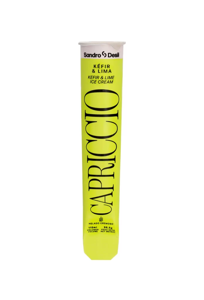
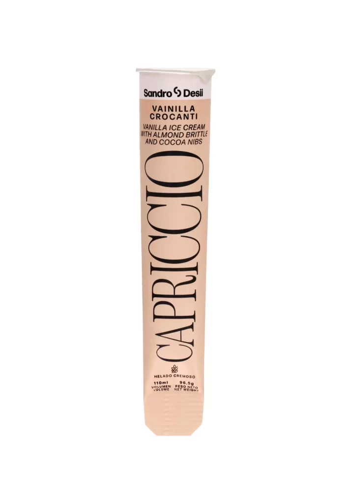
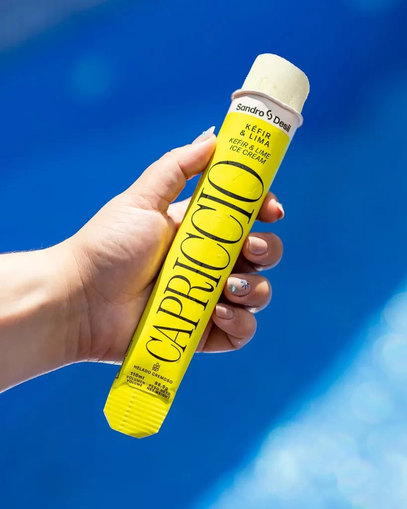
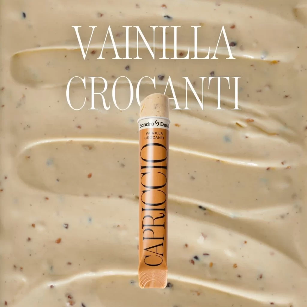
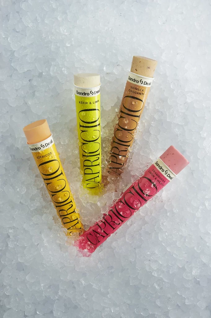
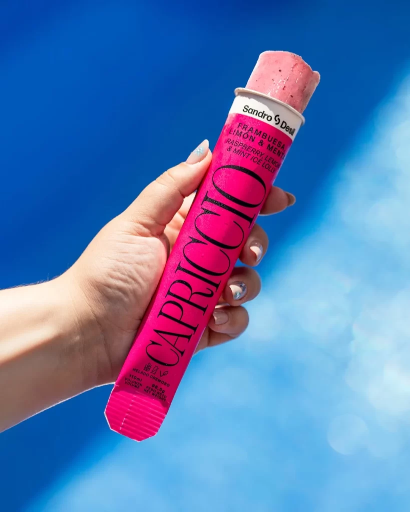
Against a saturated cerulean backdrop that suggests a sun-drenched poolside, a hand with manicured nails grips a vibrant magenta tube of Capriccio ice lolly. The packaging features bold, black serif typography spelling out the brand name vertically, while the top white collar displays the 'Sandro & Desi' collaboration mark. A pale pink frozen treat peeks out from the open end, its textured surface catching the bright, natural light that creates soft shadows across the fingers.
What distinguishes this particular product shot is the deliberate contrast between the aggressive neon pink substrate and the elegant, almost editorial quality of the typography. The composition balances commercial clarity with lifestyle aesthetics, using the human hand to provide scale while the shallow depth of field keeps focus tightly on the textural details of both the paper tube and the frozen dessert. Such a color palette and typographic hierarchy create immediate visual impact that feels both playful and sophisticated.
Photographers studying food styling might analyze how the lighting accentuates the icy texture without creating harsh glare. Brand designers could examine the effectiveness of vertical text orientation on cylindrical packaging for retail visibility. Additionally, color theorists would find value in documenting how this specific shade of pink performs under direct sunlight when paired with cool blue environmental tones.