Cheche Mandingo Wine Bottle
Topics
Details
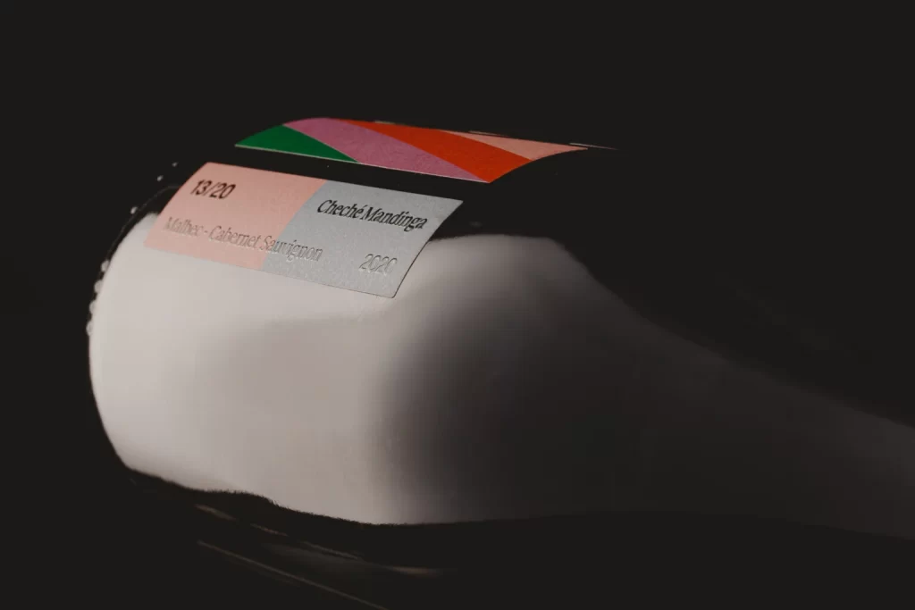
Against a void of absolute black, a dark glass vessel lies on its side, its curved shoulder catching a sharp, focused highlight that defines the bottle's cylindrical volume. A rectangular label wraps the upper surface, split between a pale salmon-pink left field and a cool gray right panel bearing the text 'Cheche Mandingo' in clean sans-serif type. Above this primary label, diagonal stripes of emerald green, lavender, coral, and crimson cut across the glass at an oblique angle, while smaller typography indicates '13:20', 'Malbec-Cabernet Sauvignon', and the vintage year '2020'.
Visual interest derives from the tension between the minimalist typographic layout and the bold chromatic interruption of the striped band, which breaks the conventional symmetry of standard wine labeling. The dual-tone label creates a clear information hierarchy, separating branding from varietal details through color blocking rather than traditional borders or rules. Dramatic side-lighting emphasizes the material contrast between matte paper, glossy glass, and the deep negative space surrounding the object.
Packaging designers studying contemporary wine label trends would examine this composition to understand how geometric color blocks can modernize traditional product categories. Photographers practicing product lighting setups could reference the specific highlight placement on the shoulder to replicate similar dimensional effects on dark reflective surfaces. Brand identity teams developing artisanal beverage packaging might analyze the font choices and spatial relationships between the vintage designation and the primary brand name.