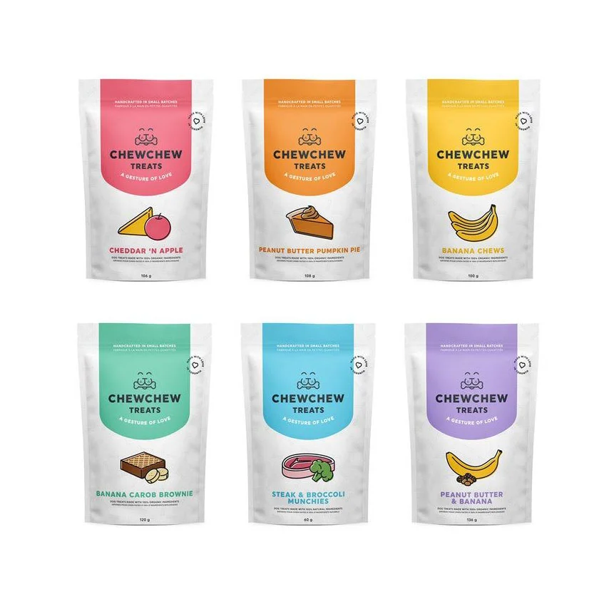
Chewchew Pet Treats Cheese Apple Illustration Pink Orange Yellow Green Blue Purple
Topics
Details
Six stand-up pouches for Chewchew Treats appear in a two-by-three grid, each featuring a distinct color banner at the top—pink, orange, yellow, teal, cyan, and purple—that bleeds into the white body of the bag. The brand name sits above a simple dog-bone icon with a smiling face, while hand-drawn illustrations of cheese wedges, apple slices, pie pieces, bananas, brownies, and steak occupy the center of each package. Small circular badges and weight notations ranging from 40g to 150g flank the central graphics, all photographed from a straight-on perspective under even lighting that eliminates harsh shadows.
Visual distinction comes from the systematic color-coding that assigns a unique hue to every flavor variant, creating an immediate organizational system across the product line. The flat, vector-style food illustrations maintain a consistent line weight and minimal shading that complements the clean sans-serif typography without competing for attention. Rounded package corners and the curved bottom edge of each color block soften the overall geometry, giving the utilitarian treat bags a friendly, approachable character suited to pet-care branding.
Packaging designers studying pet-food retail aesthetics could analyze how the six-color palette functions as a navigational tool while maintaining brand cohesion across different product weights. Illustrators developing icon sets for organic or artisanal food brands might reference the balance between recognizable food forms and simplified graphic execution. Marketing teams planning e-commerce photography layouts could examine how the grid arrangement presents multiple SKUs simultaneously without visual clutter.