ChewChew Pet Treats Peanut Butter Banana Purple White Illustration
Topics
Details
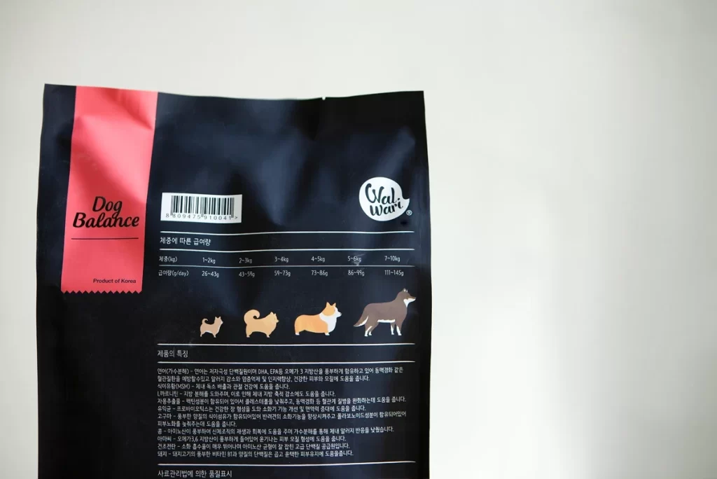
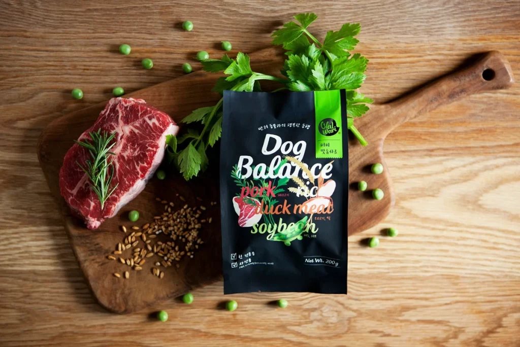
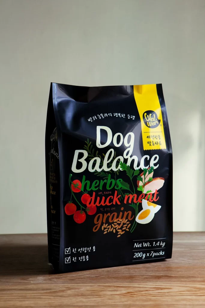
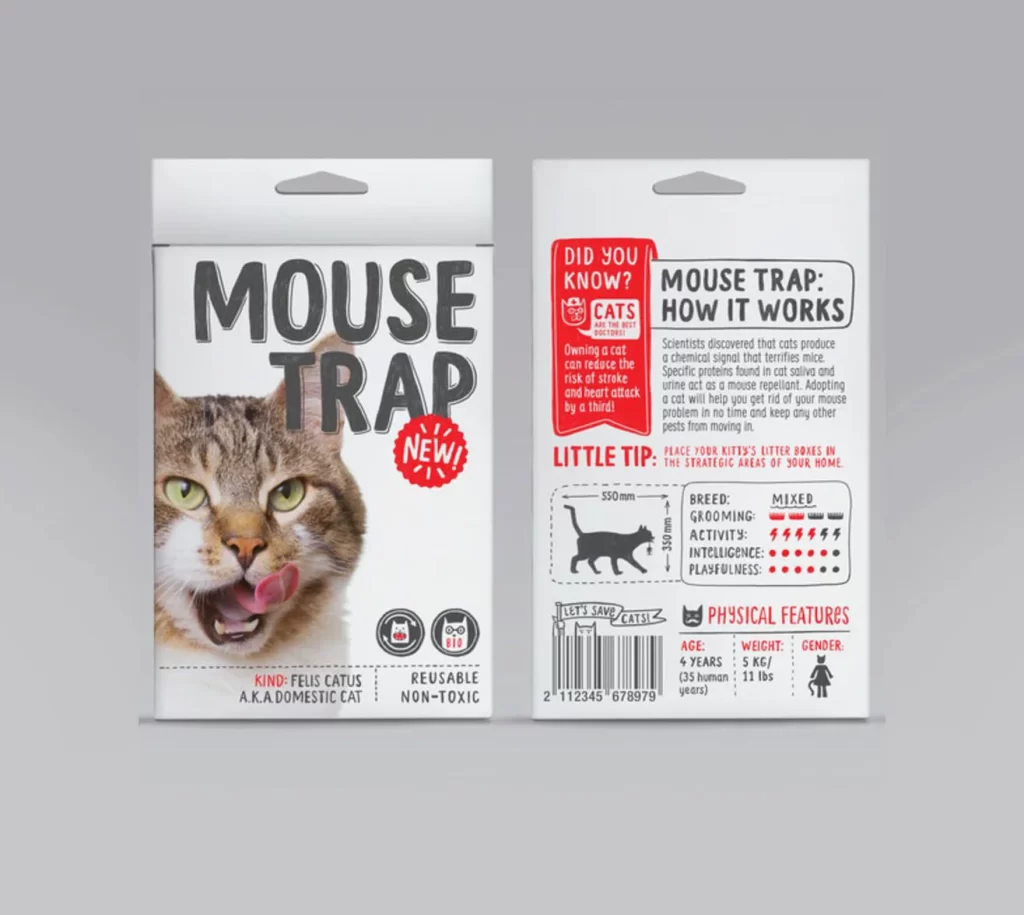
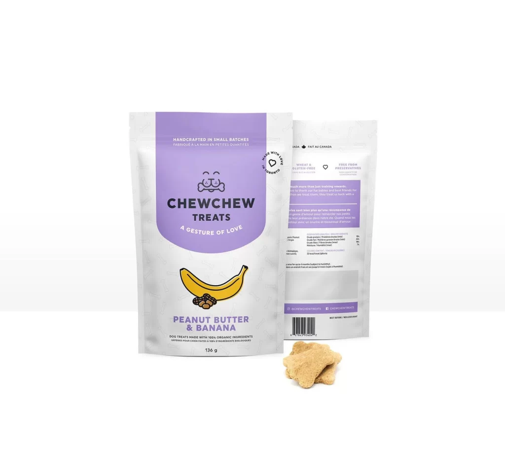
A 136-gram stand-up pouch of ChewChew Treats dominates the frame, featuring a lavender-purple upper panel that transitions into a white lower section decorated with faint line-art icons. The front displays a bold sans-serif brand name above a cartoon dog face icon, with the flavor "PEANUT BUTTER & BANANA" printed in purple beneath a yellow banana and brown peanut illustration. To the right, the reverse side reveals bilingual nutritional information, ingredient lists, and certification badges indicating wheat-free, gluten-free, and preservative-free composition. Two bone-shaped, tan-colored biscuits rest in the foreground, while soft studio lighting eliminates harsh shadows across the entire composition.
The packaging distinguishes itself through its two-tone color blocking strategy, where the saturated violet header creates immediate visual hierarchy against the subtly patterned white body. Hand-drawn food illustrations lend an artisanal, approachable quality that contrasts with the clean typographic system used for product claims like "Handcrafted in Small Batches" and "Made with Love in Toronto." This particular variant balances playful graphic elements with structured information architecture, making the organic positioning feel both trustworthy and whimsical rather than overly clinical or chaotic.
Brand strategists developing pet-food identities could analyze how the illustration style communicates handcrafted quality without sacrificing readability. Packaging engineers might study the stand-up pouch proportions and label placement to optimize their own retail-ready designs. Marketing teams launching organic snack lines could reference this color palette and typography to target health-conscious pet owners who value transparency in ingredient sourcing and manufacturing origins.