Chobani Coffee Creamer S’Mores
Topics
Details
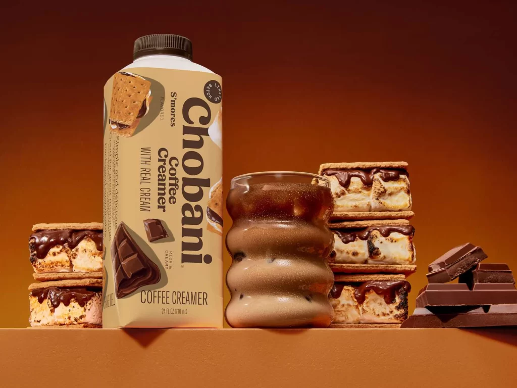
This resource features the Chobani Coffee Creamer S'mores Packaging. The visual showcases a single bottle of the S'mores flavor in a sealed retail format. The product is presented against a smooth background gradient of orange-brown tones. This clean presentation highlights the physical bottle, allowing designers to examine the label layout, typography, and structural form of the creamer container.
The design strategy relies on a warm orange-brown background gradient that evokes a cozy campfire aesthetic. This color choice perfectly complements the S'mores flavor, suggesting rich chocolate and toasted marshmallow notes. The bottle label likely uses clean typography to maintain brand identity while letting the warm gradient drive the emotional appeal. The overall visual feels inviting and appetizing.
Graphic designers and packaging specialists need this reference for consumer beverage projects. It serves as an excellent study for using background gradients to convey flavor profiles without relying on complex imagery. Brand strategists can also use it to understand how Chobani balances modern minimalism with indulgent S'mores cues in a sealed retail environment.