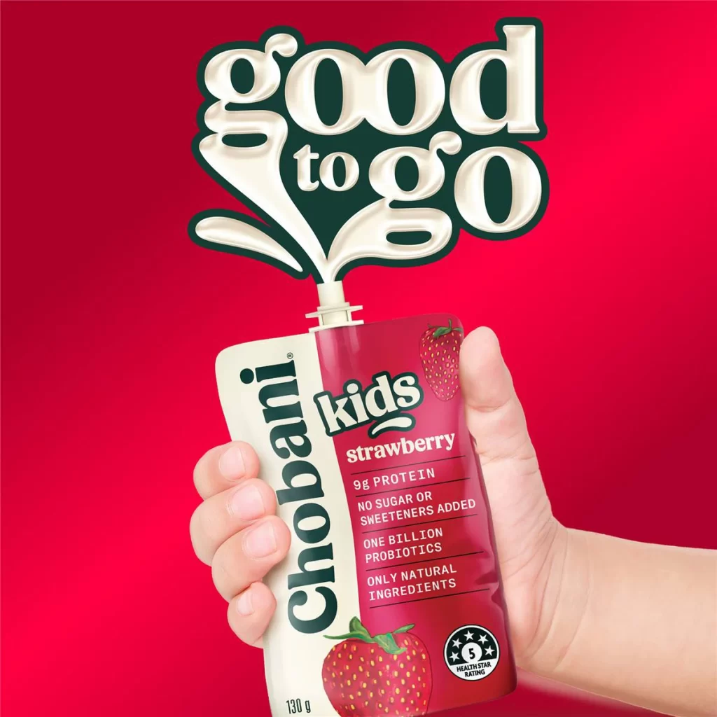
Chobani Kids Good To Go Campaign
Topics
Details
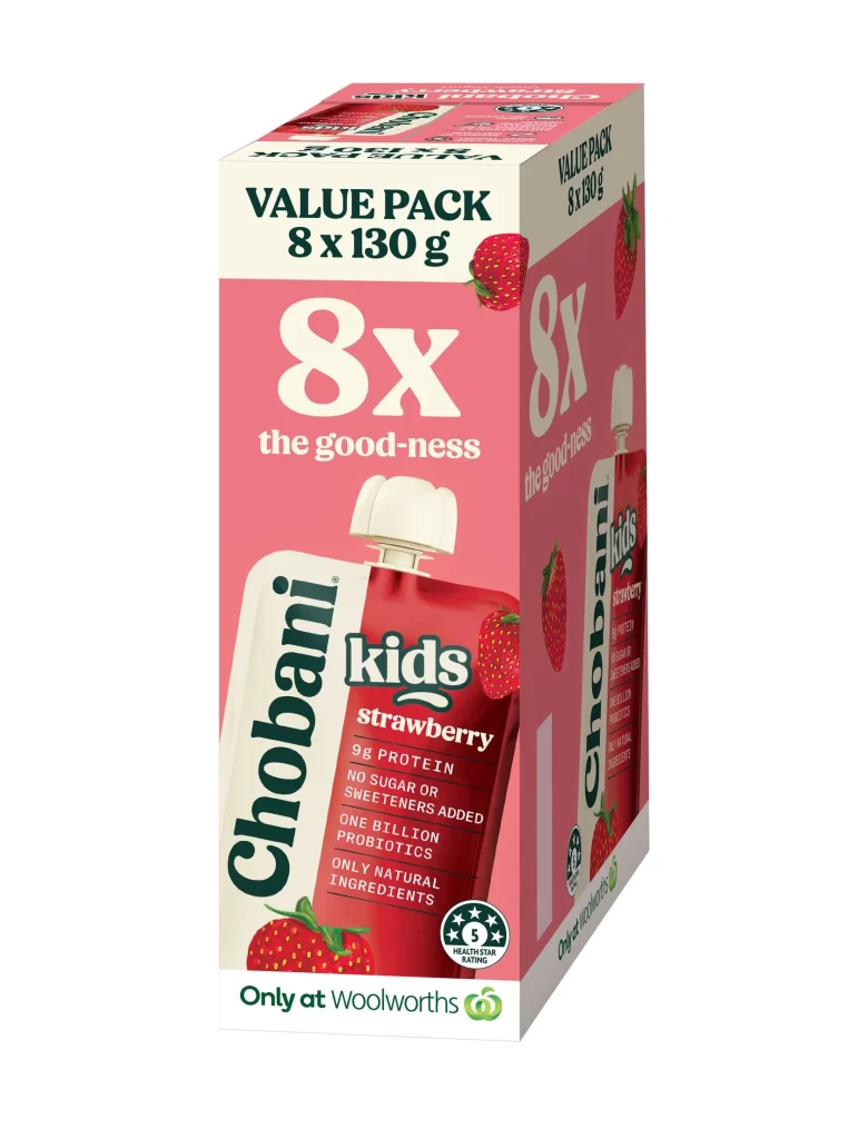
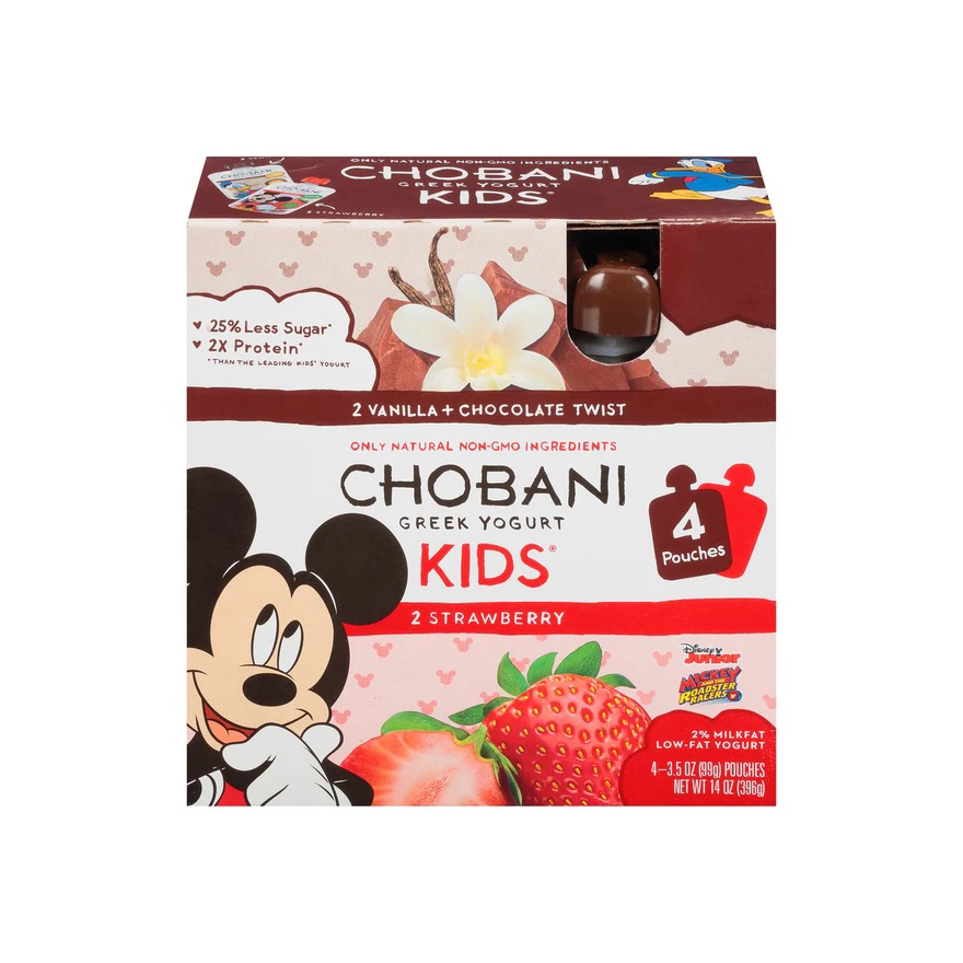
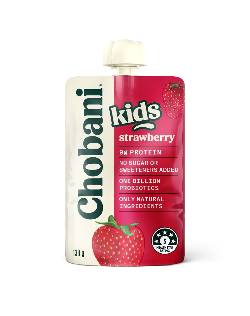
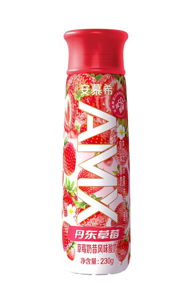
The Chobani Kids Good To Go Campaign features a single Strawberry pouch. The sealed retail packaging is visually striking and practical for small hands. Its design prominently showcases the delicious flavor, ensuring immediate recognition. The entire composition is set against a vibrant background gradient, transitioning smoothly through various shades of red to create a bold, energetic aesthetic that easily captures consumer attention.
The design relies heavily on a dynamic red gradient, symbolizing the sweet strawberry flavor while evoking feelings of youthful energy and excitement. This monochromatic background allows the foreground typography and product imagery to stand out sharply. The sealed pouch format emphasizes convenience and freshness. Overall, the color palette is intentionally bright, leveraging warm tones to stimulate appetite and communicate a sense of fun.
This resource is essential for packaging designers, brand strategists, and marketing students focusing on the children food and beverage sector. It serves as an excellent reference for creating engaging, single serve retail packaging. Professionals looking to understand how to effectively use gradient backgrounds, communicate flavor visually, and balance vibrant aesthetics with practical retail functionality will find this campaign breakdown highly valuable.