Chobani Creations Orange Cream Pop Packaging
Topics
Details
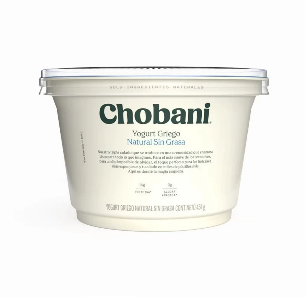
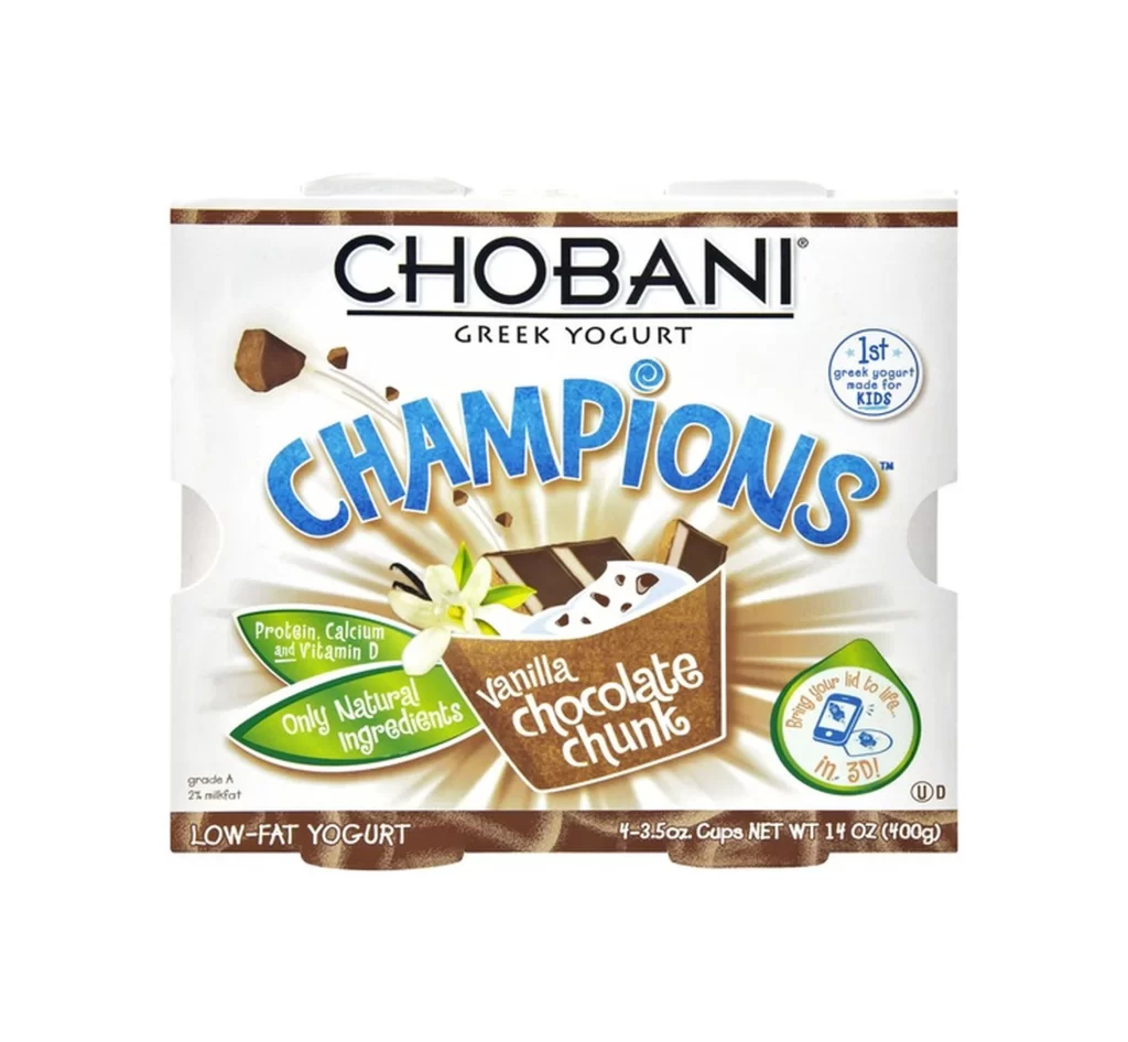
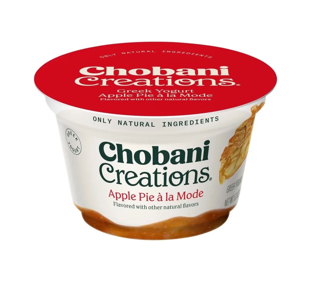
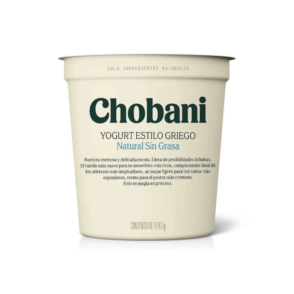
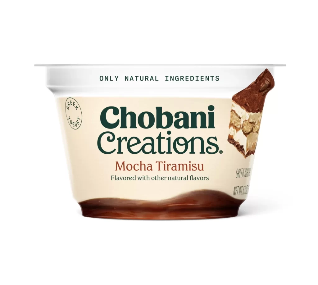
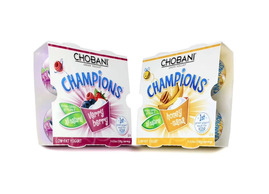
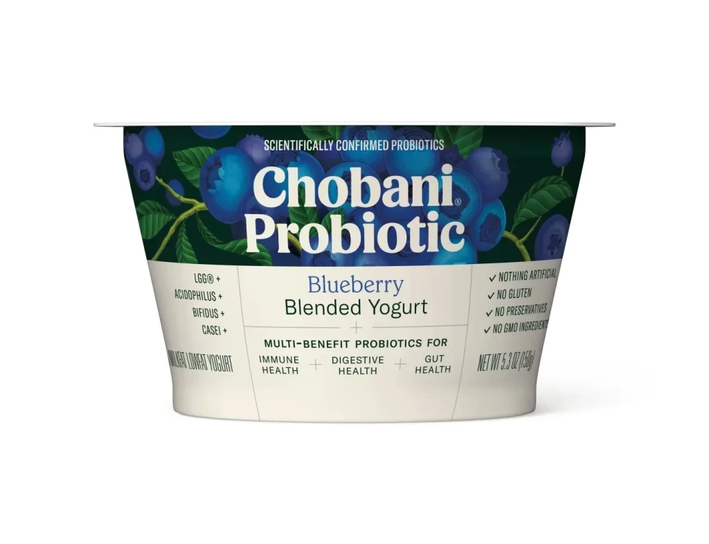
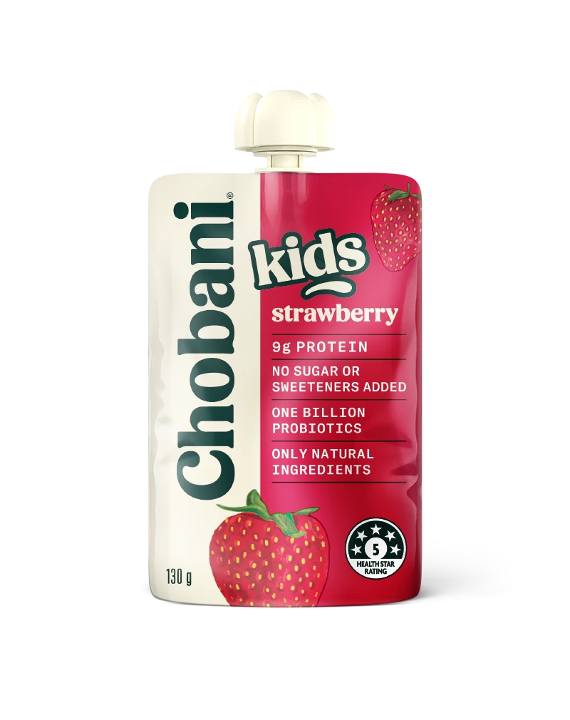
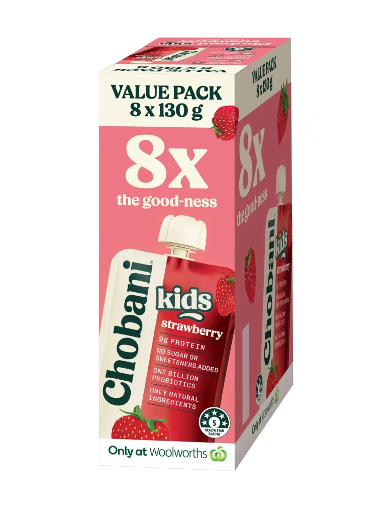
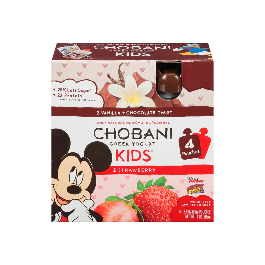
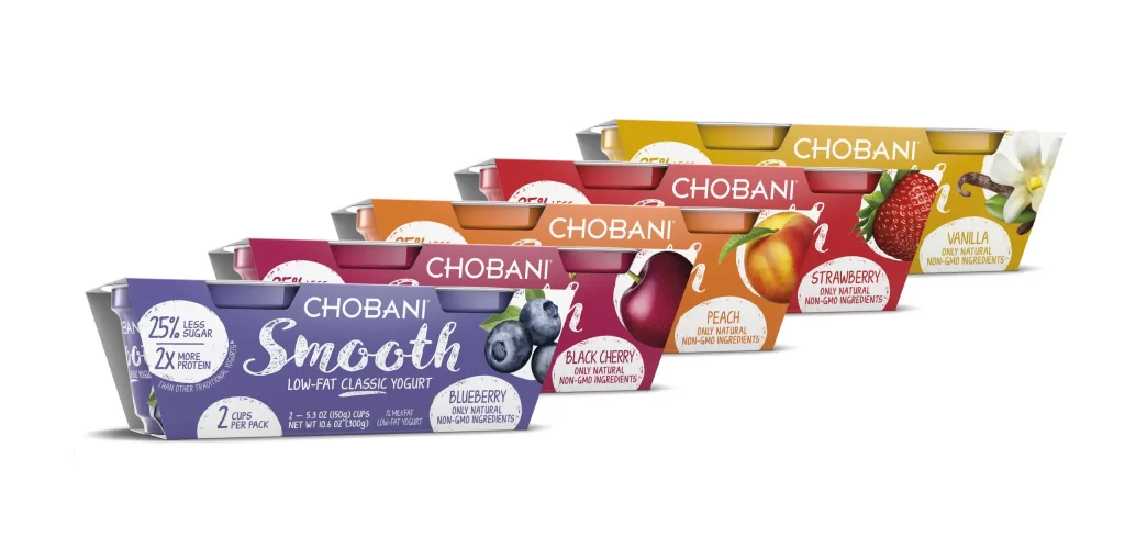
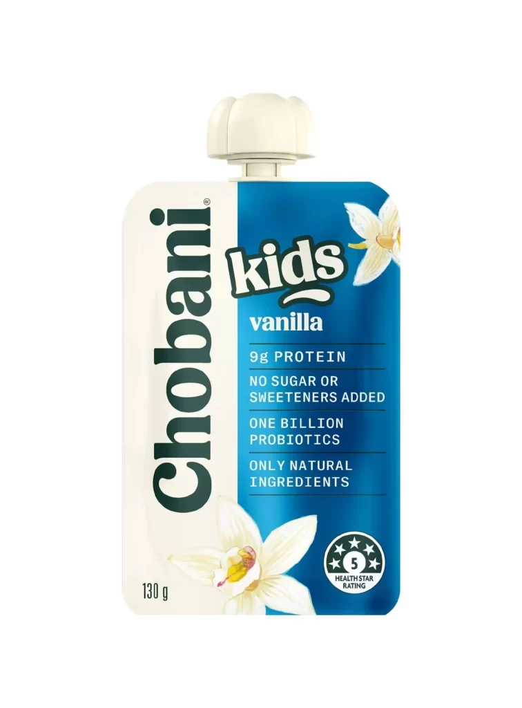
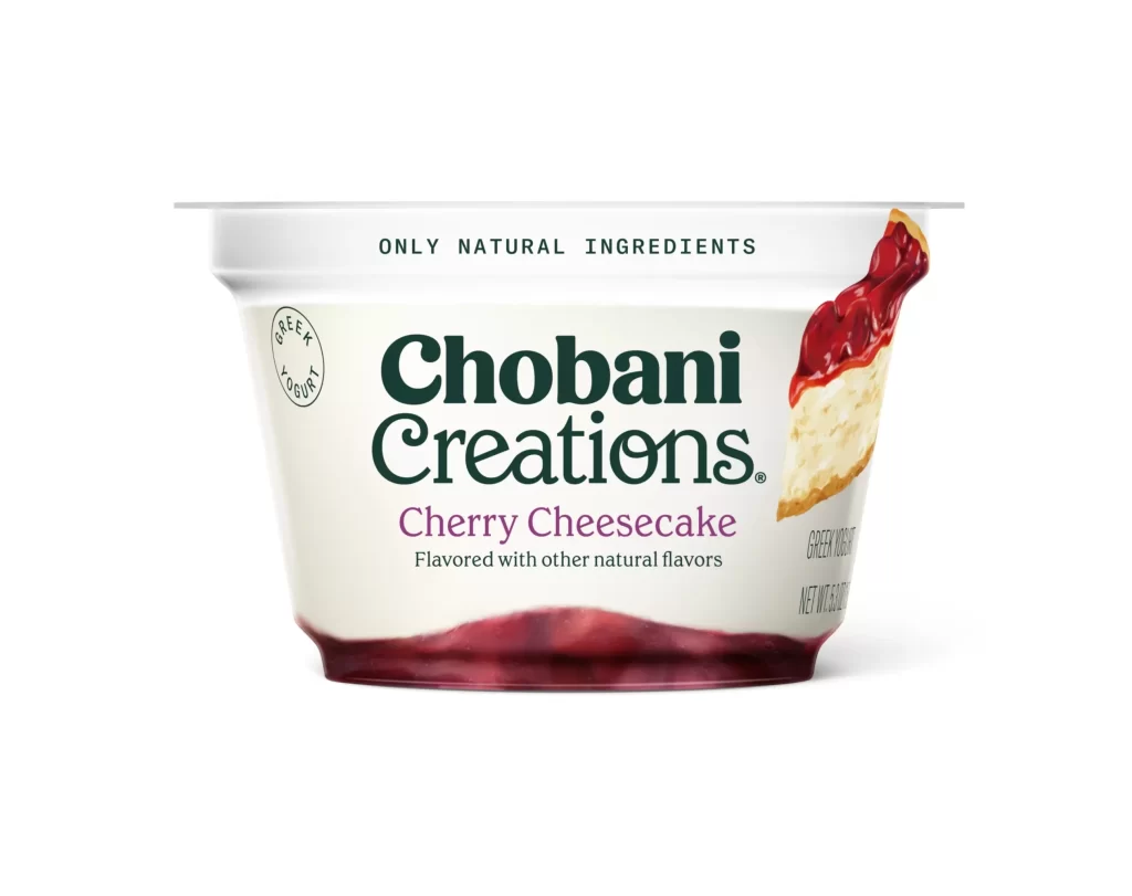
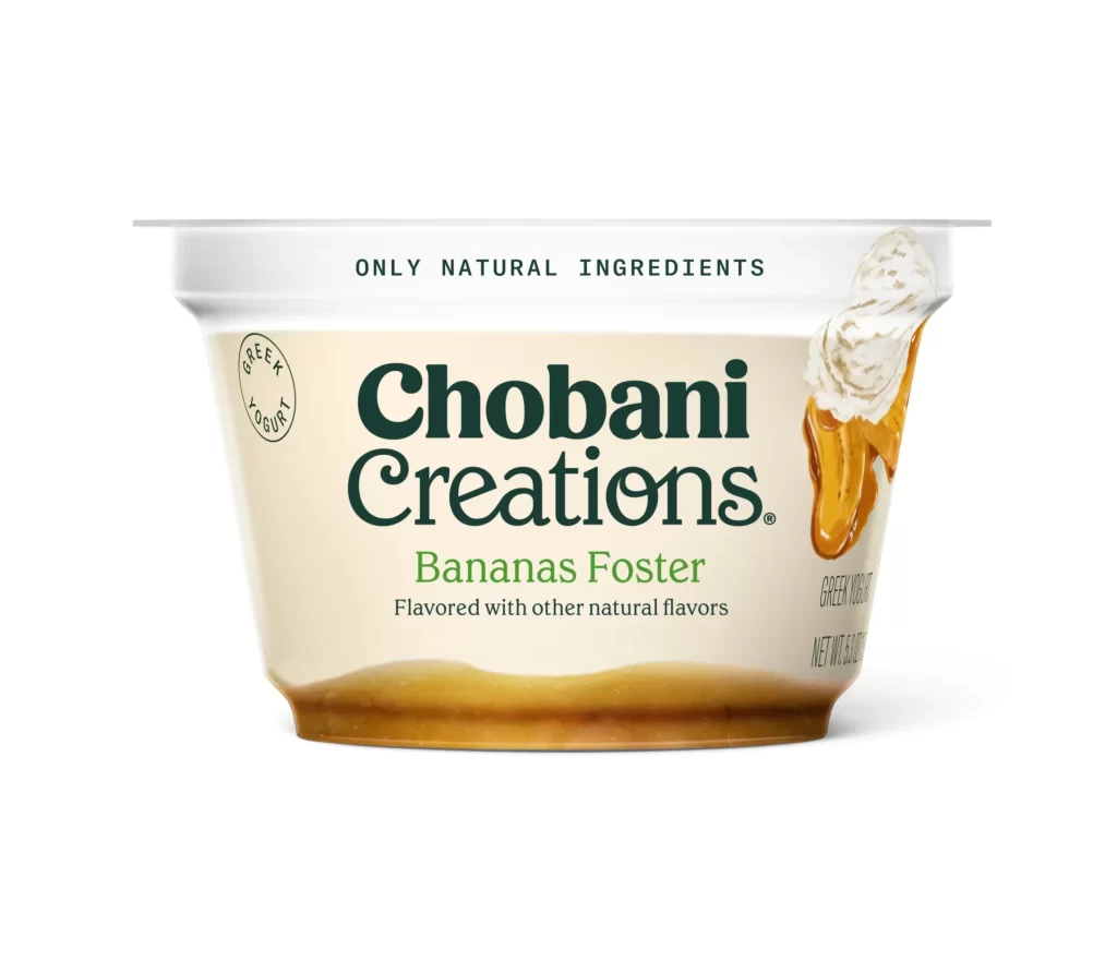
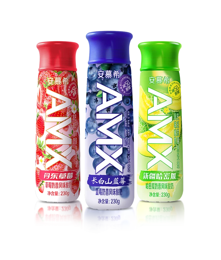
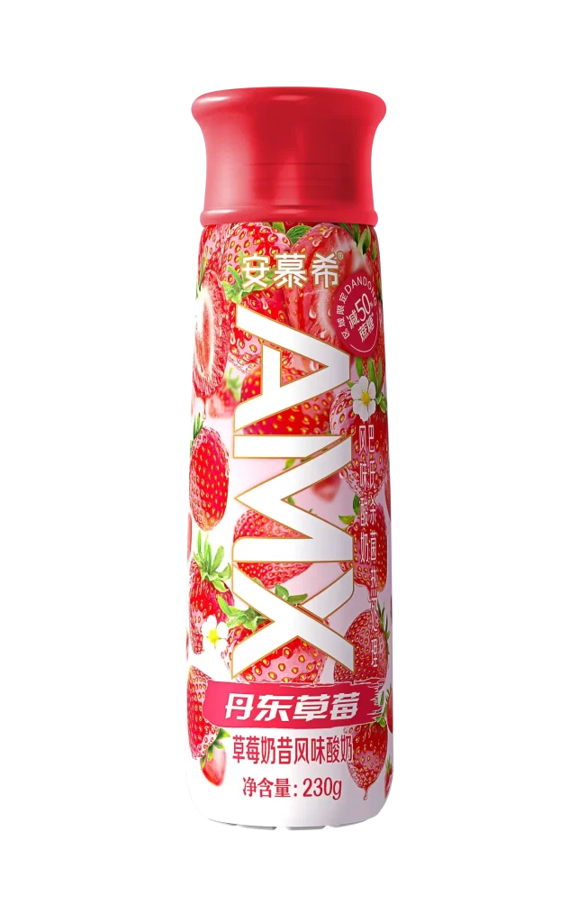
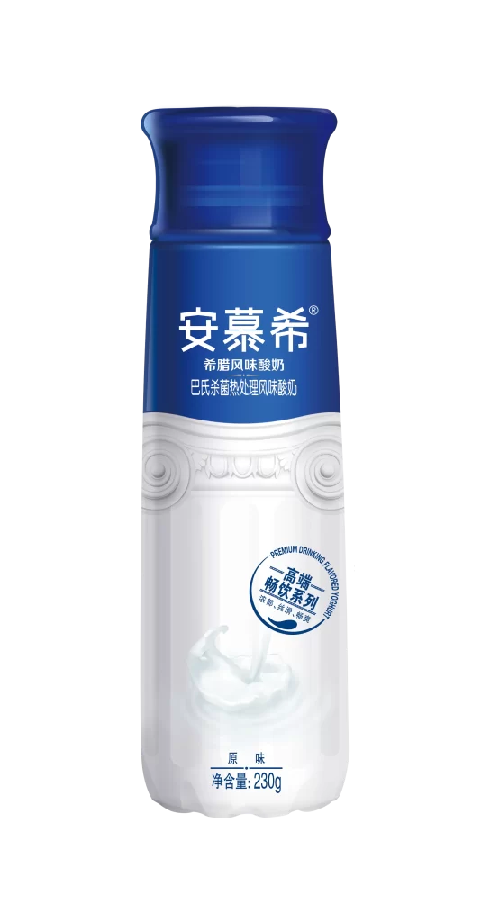
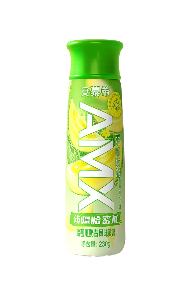
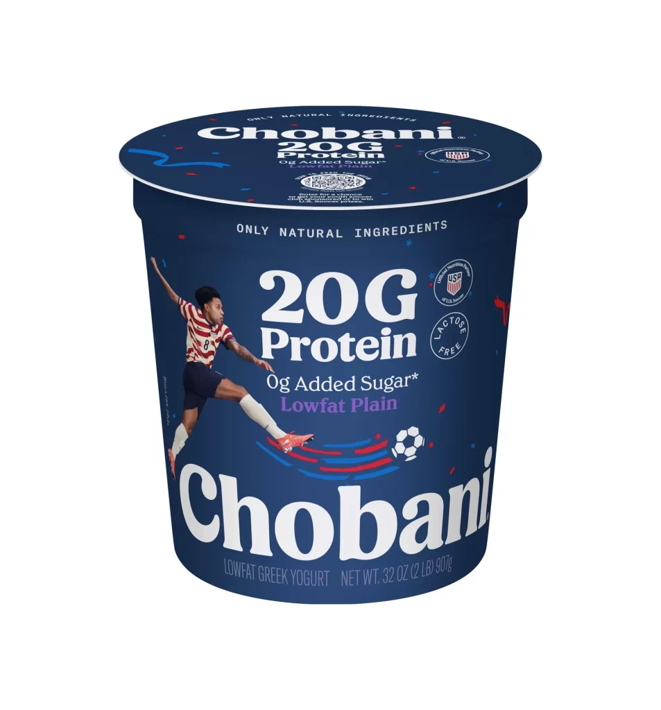
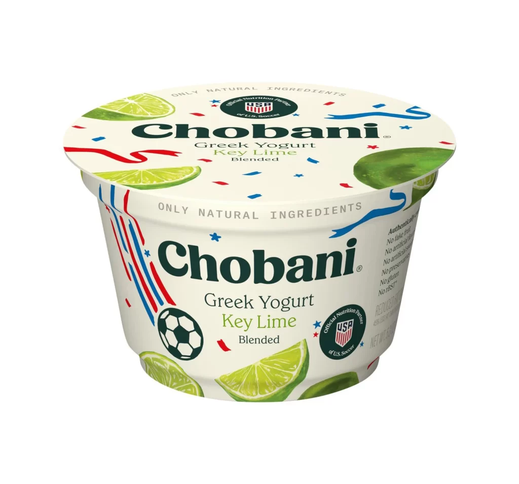
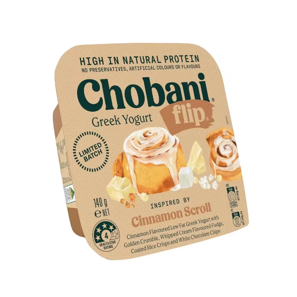
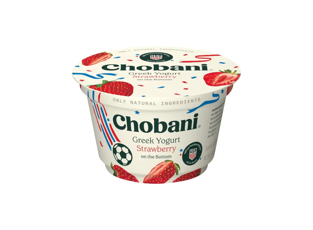
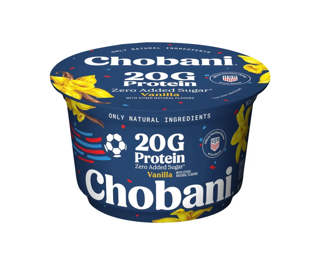
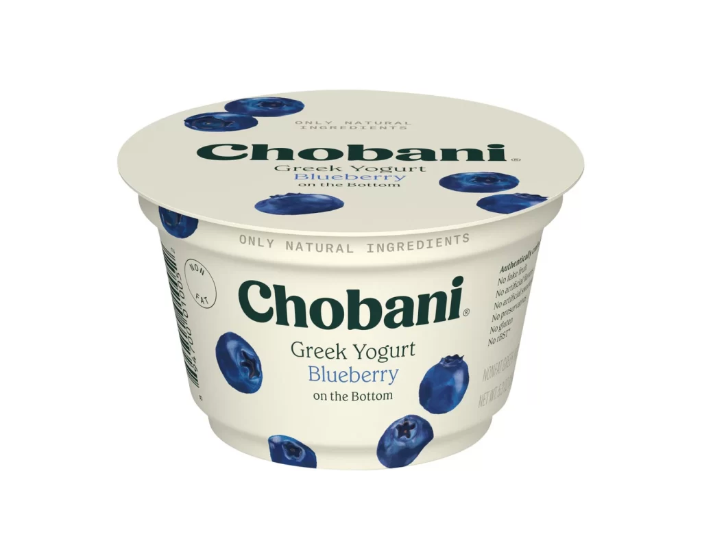
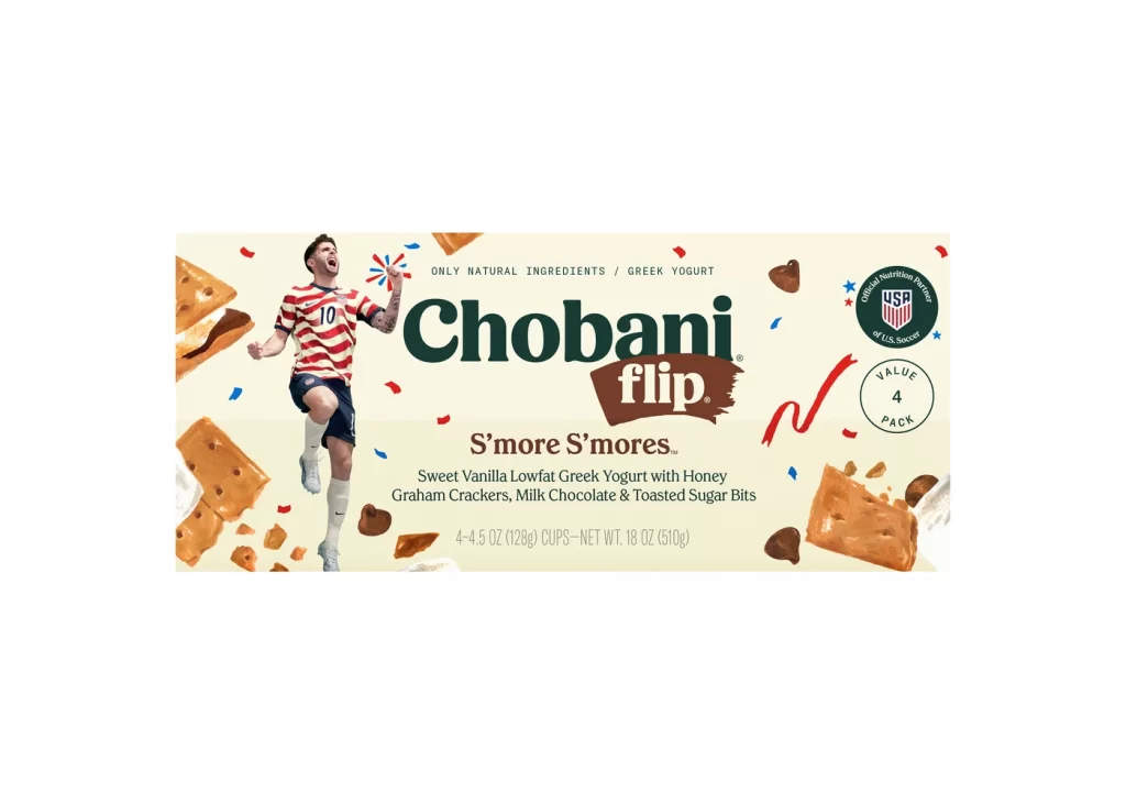
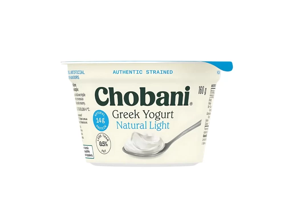
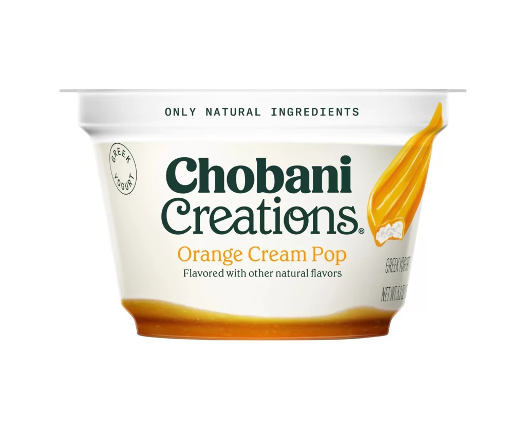
The Chobani Creations Orange Cream Pop packaging features a clean white background that highlights the 1 cup sealed retail format. The design showcases the vibrant Orange Cream Pop flavor through bright, citrus-toned typography and imagery. This visual approach emphasizes freshness and quality, making the product instantly recognizable on store shelves while maintaining a minimalist and modern aesthetic.
Color analysis reveals a strategic use of warm orange hues contrasted against the stark white background. This palette evokes the nostalgic, creamy sweetness of a classic orange cream dessert. The typography is bold yet approachable, creating a visual hierarchy that guides the consumer eye directly to the flavor name. The overall layout feels balanced, appetizing, and premium.
Graphic designers and packaging specialists need this reference for inspiration in dairy and dessert branding. It is ideal for professionals developing minimalist retail packaging that relies on bold color blocking. Marketing teams studying effective visual communication for single-serve cups will also find this example valuable for creating strong shelf presence and conveying flavor profiles.