Title

Citi Credit Card B


Topics

CitiCredit Card

Details

Uploaded user: Leo

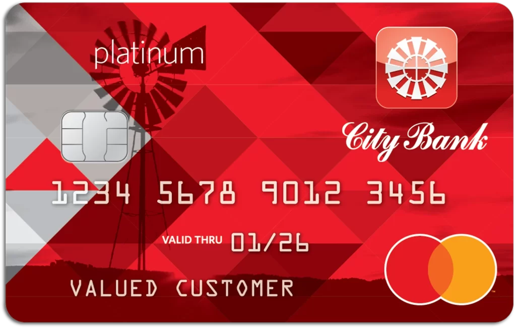
Dominating the visual field is a vibrant crimson red background, overlaid with a geometric pattern of darker ruby triangles that create a sense of depth and movement. A semi-transparent silhouette of a traditional windmill anchors the left side, partially obscured by the bold white text 'platinum' positioned near the top. The composition features standard credit card elements including a silver EMV chip on the left, a stylized windmill logo within a rounded square at the top right, and the elegant cursive script of 'City Bank' sitting above the Mastercard branding in the bottom corner.
What sets this particular card design apart is its clever use of transparency and layering to blend rustic imagery with modern financial aesthetics. The interplay between the sharp, angular geometric shapes and the organic, curved lines of the windmill creates a dynamic tension that feels both established and fresh. Furthermore, the choice of a monochromatic red palette with white typography ensures high readability while maintaining a premium, cohesive look that stands out from typical solid-color bank cards.

Financial illustrators and branding specialists might utilize this visual to explore how regional motifs can be integrated into corporate identity without appearing dated. UI designers working on banking applications could study the typographic hierarchy here, noting how the serif font for the bank name contrasts effectively with the sans-serif numerals. Additionally, marketing teams planning agricultural or community-focused campaigns could draw inspiration from the way the windmill imagery is subtly woven into the overall layout rather than serving as a standalone graphic.