Ollo Credit Card A
Topics
Details
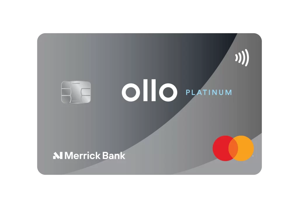
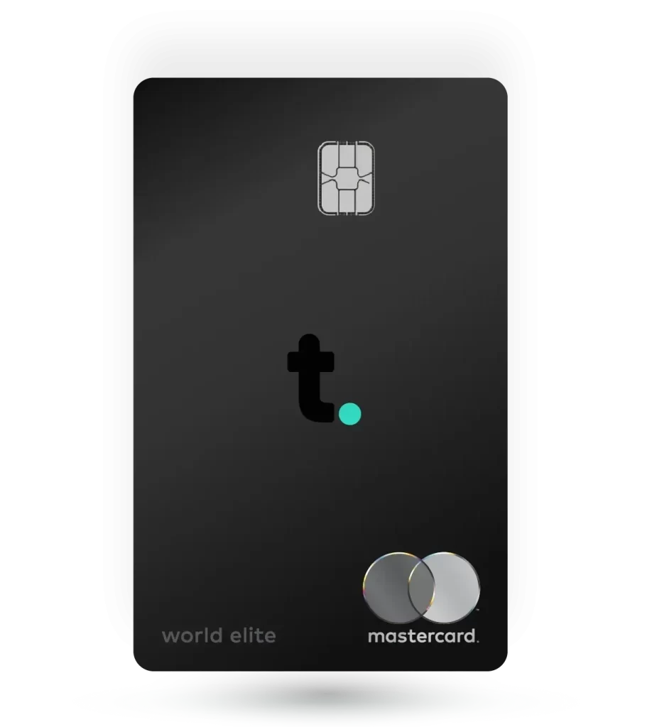
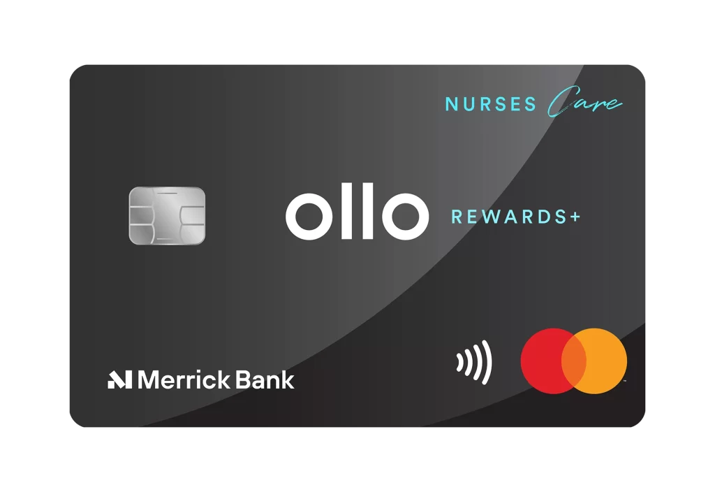
A sleek black credit card with a glossy surface and subtle diagonal sheen sits at a slight angle on a white background. The left side features a silver EMV chip with metallic detailing, while the center displays the word 'ollo' in bold white lowercase letters. Teal accents highlight 'NURSES Care' in the upper right corner and 'REWARDS+' just below the central branding.
What makes this card visually compelling is its sophisticated color palette that balances professional blacks and silvers with vibrant teal highlights. The diagonal light reflection across the surface adds depth and premium quality to the otherwise flat design. Typography plays a key role here, mixing bold sans-serif for the main brand with elegant script for ‘Care’, creating visual hierarchy that guides the eye naturally from brand to purpose.
Financial product designers might study this layout when developing healthcare-focused payment solutions that need to feel both trustworthy and modern. Marketing teams creating nurse appreciation campaigns could reference how the teal accent color ties into medical branding while maintaining corporate elegance. UX researchers analyzing credit card interfaces would find value in examining how the rewards messaging is positioned relative to the primary logo without cluttering the design space.