Ollo Credit Card B
Topics
Details
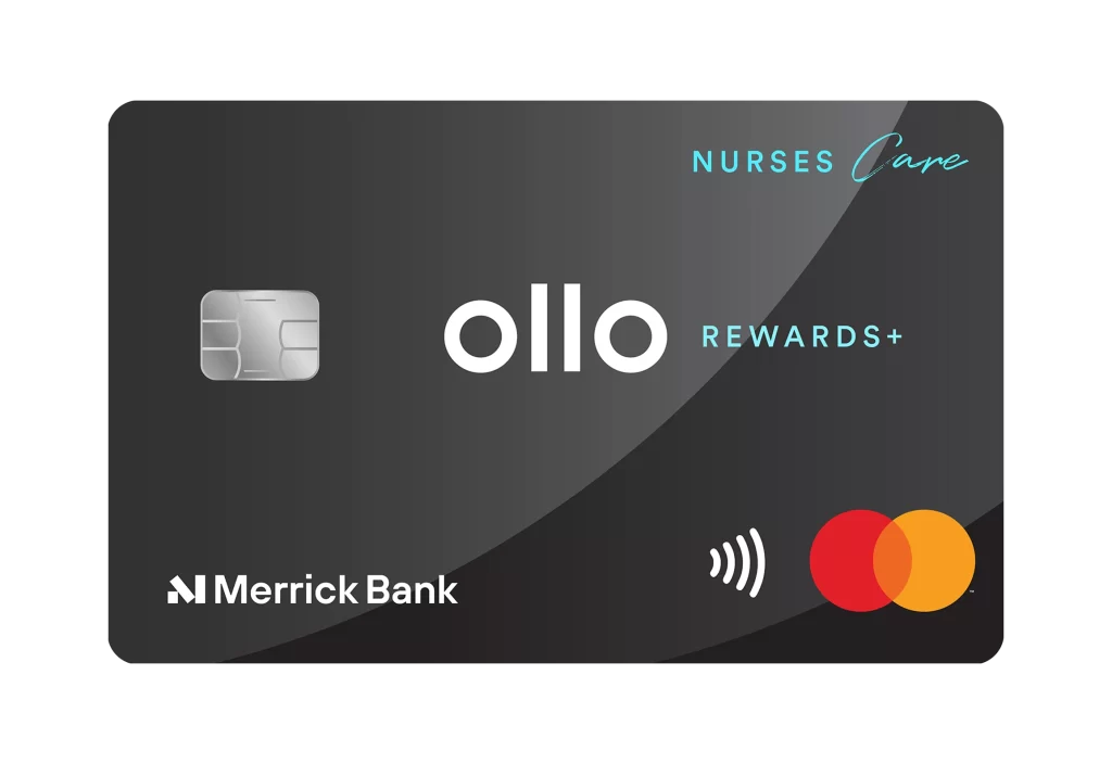
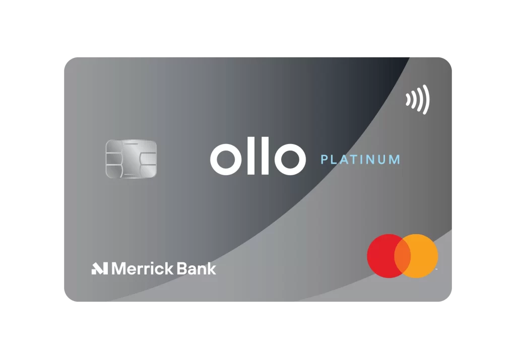
A sleek, metallic gray surface dominates the visual field, featuring a sophisticated diagonal gradient that transitions from a darker charcoal on the left to a lighter silver tone toward the right edge. Centered prominently, the word 'ollo' appears in bold white lowercase letters, accompanied by the word 'PLATINUM' in a smaller, light blue sans-serif font to its right. In the upper left quadrant sits a realistic silver EMV chip with fine engraved details, while the top right corner displays a white contactless payment symbol consisting of four curved lines. The bottom left corner features the 'Merrick Bank' name in crisp white text alongside a stylized 'M' logo, and the lower right showcases the iconic Mastercard branding with overlapping red and orange circles.
What sets this particular card design apart is its minimalist yet premium aesthetic that relies heavily on subtle tonal variations rather than flashy patterns or elaborate graphics. The sweeping diagonal curve creates dynamic movement across an otherwise static rectangular form, giving the impression of depth and modern sophistication without cluttering the visual space. Clean typography hierarchy ensures immediate brand recognition while maintaining an uncluttered, professional appearance that signals exclusivity through restraint rather than ornamentation.
Financial product designers might study this layout to understand how to balance essential security features like chip placement with brand identity elements without creating visual chaos. Marketing teams developing credit card promotions could analyze the color psychology of the gray-silver palette combined with strategic accent colors to evoke trust and premium status. User experience researchers examining payment interface designs would find value in noting how the contactless icon positioning aligns with natural hand-holding orientations during tap-to-pay transactions.