BBVA Credit Card B
Topics
Details
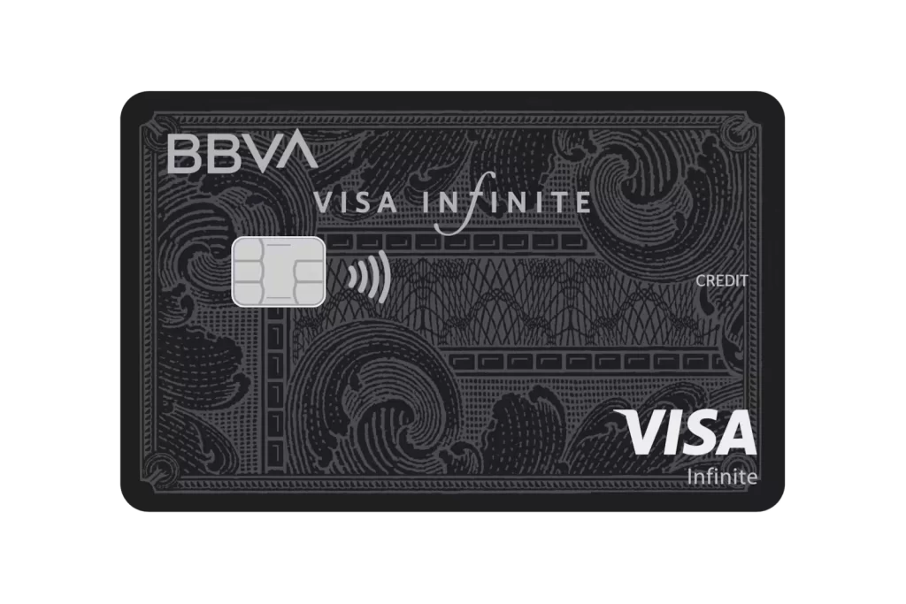
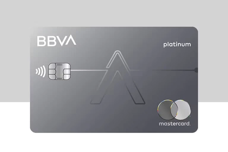
A sophisticated metallic gray surface with a subtle matte finish defines the BBVA Platinum card, featuring the bold 'BBVA' logo in the upper left corner balanced by the lowercase 'platinum' designation on the right. A large, translucent geometric 'A' watermark dominates the center, while a contactless chip with signal waves sits to the left of the emblem and the Mastercard branding appears in the lower right corner. The card rests on a neutral split-tone background of light gray and white.
Visual interest stems from the card’s minimalist monochromatic palette and the interplay between solid typography and the faint, linear watermark. The gradient shading across the rectangular form suggests a premium metal or composite material rather than standard plastic. Clean lines connect the chip to the stylized central letter, creating a sense of technological integration and modern banking aesthetics.
Financial product designers might study this layout to understand current trends in premium card hierarchy and branding placement. Marketing teams could analyze the specific font choices and spatial distribution when developing mockups for new tiered credit offerings. Researchers focusing on fintech visual identity would find the specific combination of contactless iconography and network branding particularly relevant for comparative analysis.