Clarins Double Serum Skin Care Product
DownloadTopics
Details
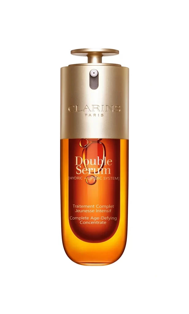
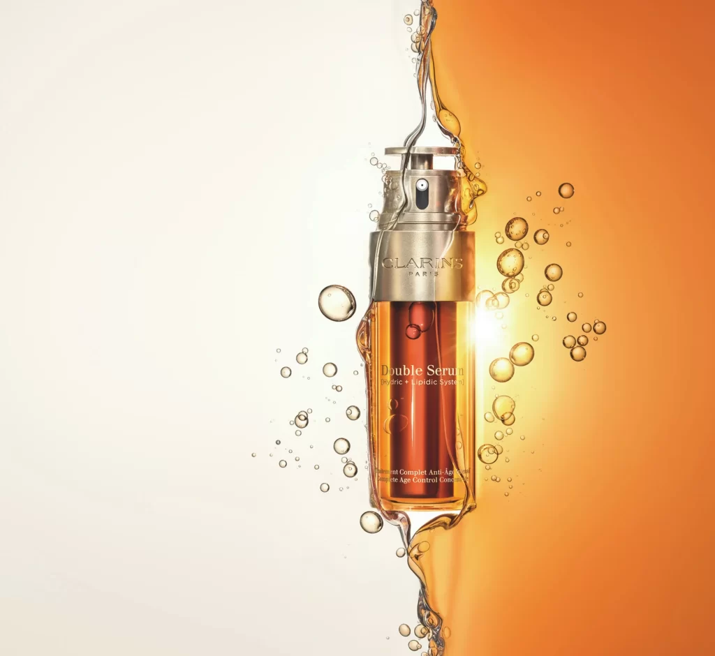
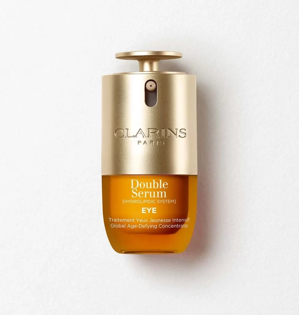
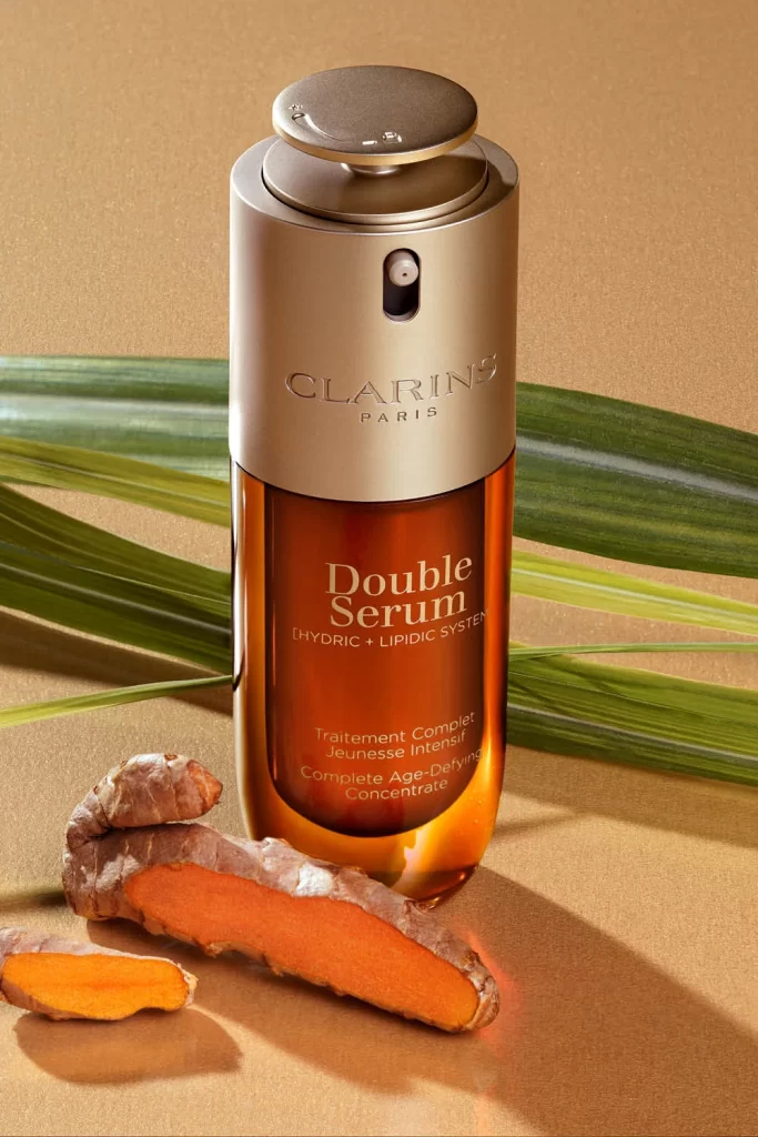
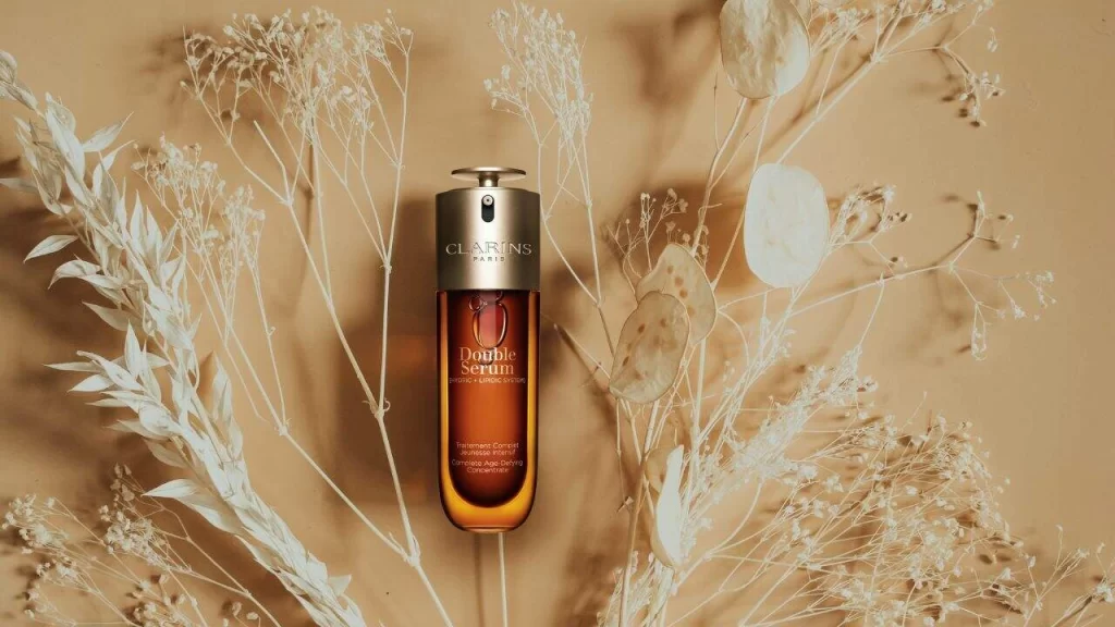
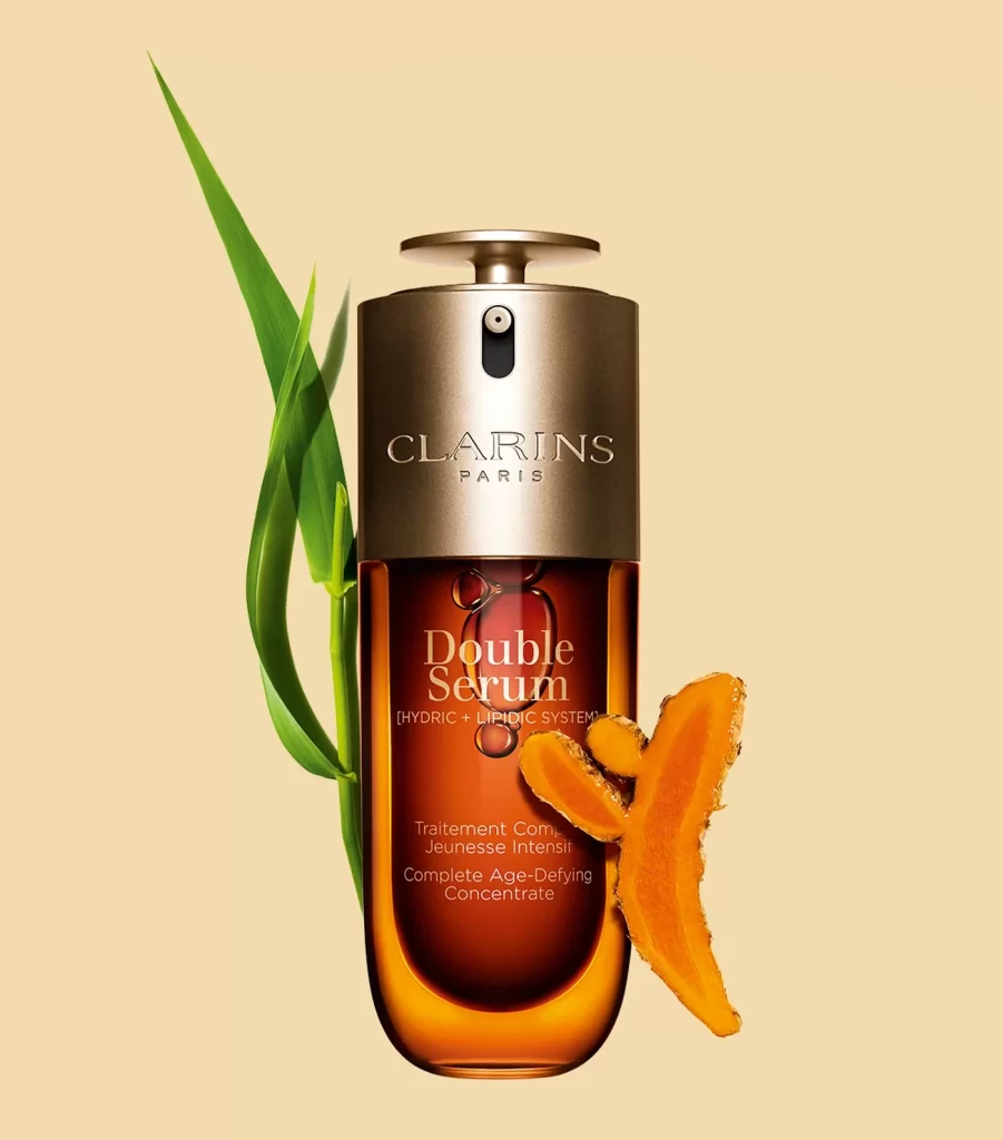
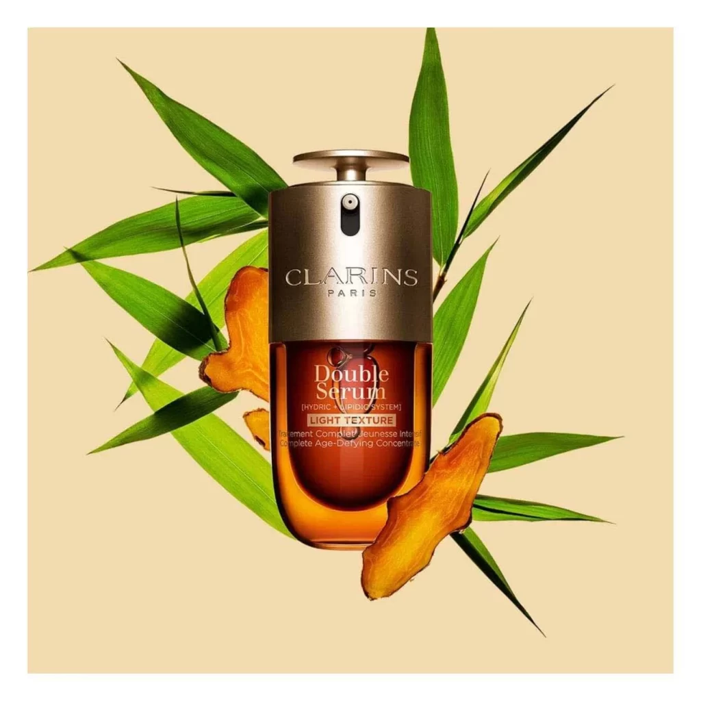
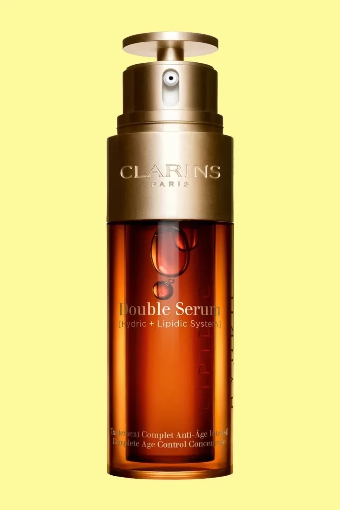
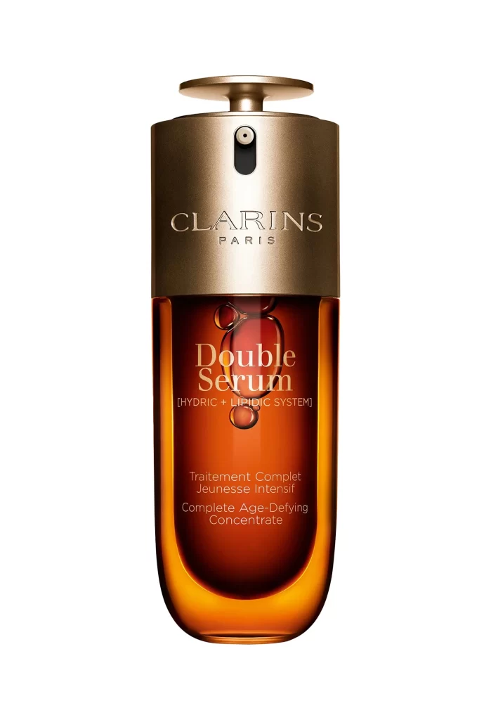
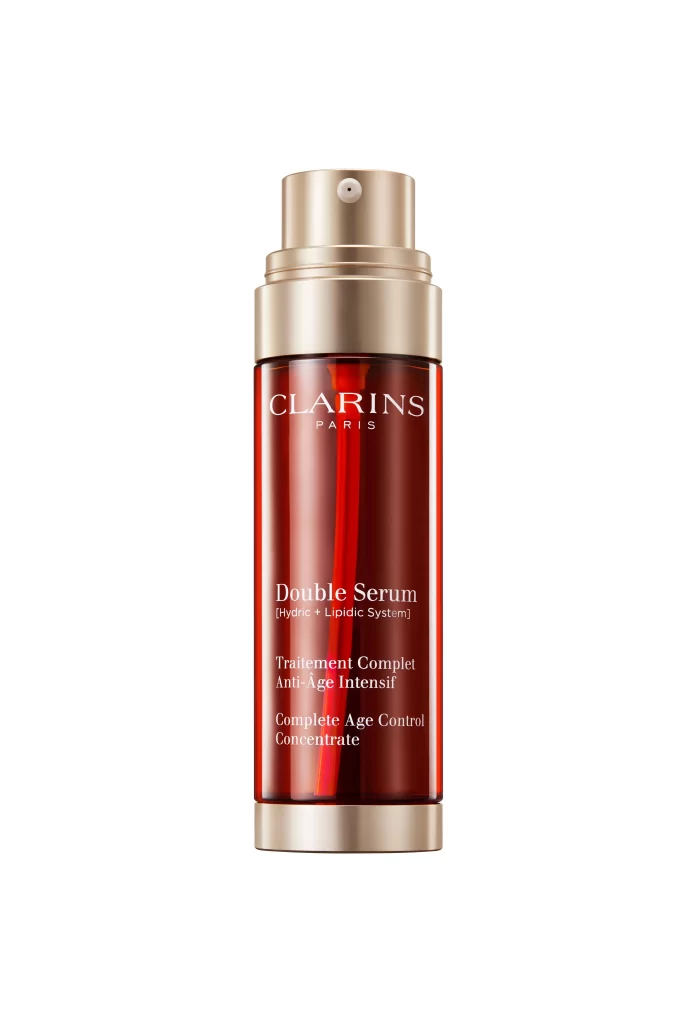
A deep amber glass cylinder stands as the central focus, capped with a brushed metallic gold pump and collar that catch the light with a subtle sheen. The brand name 'CLARINS PARIS' appears in crisp white serif lettering near the top, followed by the product title 'Double Serum' and its technical subtitle '(Hydric + Lipidic System)' in a clean, elegant typeface. Below this, bilingual descriptions in French and English outline the item's anti-aging purpose, all set against a bright, neutral backdrop that emphasizes the rich red tones of the bottle.
The visual appeal lies in the striking contrast between the warm, translucent burgundy of the container and the cool, reflective quality of its gold-toned hardware. This particular presentation highlights how luxury skincare packaging balances functional pump mechanisms with premium aesthetic choices, creating an object that feels both clinical and indulgent. Designers studying this composition will note how the vertical text alignment and color saturation work together to convey sophistication without overwhelming the viewer. You can grab the full-resolution file for closer inspection of these material textures and typographic details.
3D artists modeling cosmetic containers might use this shot to study accurate light behavior on curved glass surfaces and metallic finishes. Packaging designers could reference the hierarchy of information to understand how multiple languages coexist on limited real estate without cluttering the design. E-commerce photographers may analyze the even, shadowless lighting setup that makes product colors appear true to life across different screens.