Lancome Skincare Moisturizer Sunscreen
DownloadTopics
Details
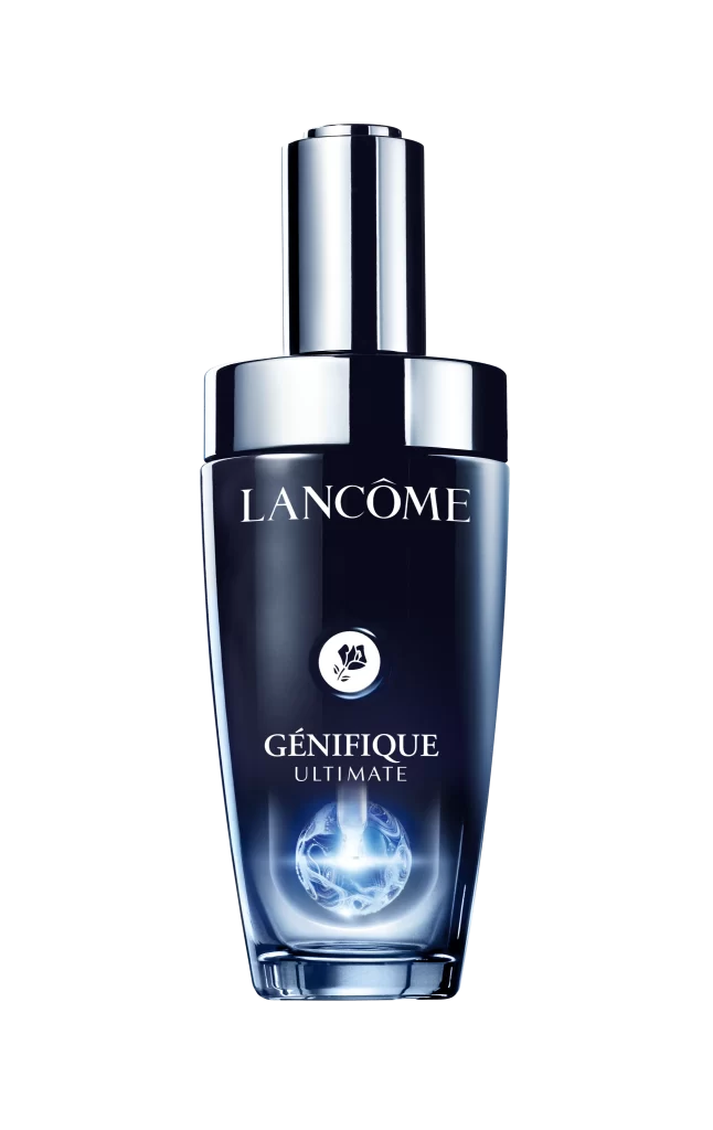
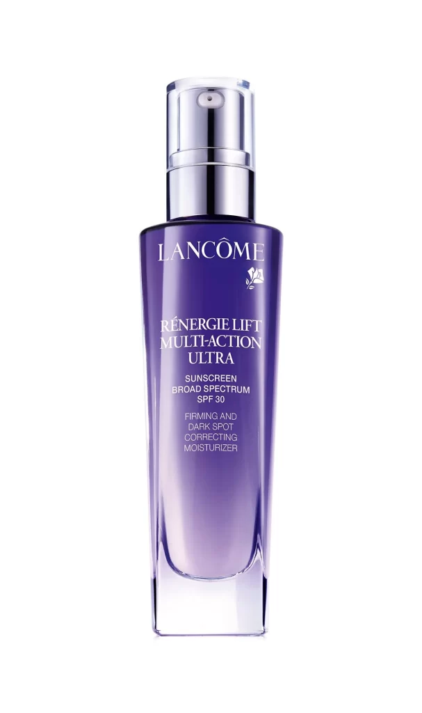
A deep violet glass bottle stands tall with a sleek, rectangular silhouette that tapers gently toward a clear base. Silver metallic accents crown the container in the form of a cylindrical pump mechanism, while crisp white typography spells out the Lancôme brand name above the RÉNERGIE LIFT MULTI-ACTION ULTRA product designation. The composition captures the item head-on under even studio lighting that highlights the glossy finish of the packaging and the subtle gradient of the purple hue against an uncluttered backdrop.
What sets this particular moisturizer apart visually is the rich saturation of the amethyst-toned vessel combined with the clinical precision of its pump dispenser. The interplay between the opaque upper body and the transparent lower section creates an interesting dual-material aesthetic that feels both luxurious and functional. Designers studying premium beauty packaging will appreciate how the minimalist color palette and refined type hierarchy communicate sophistication without unnecessary ornamentation.
Product photographers and e-commerce specialists can study this shot to understand how neutral backgrounds allow luxury skincare items to command full visual attention. Brand identity developers might examine the typographic spacing and logo placement as a case study in high-end cosmetic labeling conventions. Anyone needing detailed visuals of anti-aging sunscreen packaging for mood boards or client presentations can grab the full-resolution file at no cost directly from the resource library.