Coffee Brand Logo New Jersey Typography
Topics
Details
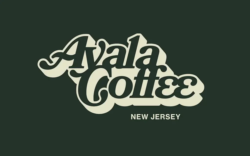
Heavy, retro-style serif lettering spelling out 'Avala Coffee' dominates the composition with pronounced curves and swashes in a deep charcoal tone, surrounded by a thick cream-colored offset outline that creates a distinct three-dimensional extrusion effect. The text 'NEW JERSEY' appears in a clean, sans-serif font centered beneath the main wordmark against a solid dark forest green background.
Visual interest derives primarily from the interplay between the vintage script aesthetic and the bold dimensional shadow technique applied to the primary text. The contrast between the organic, flowing forms of the main brand name and the rigid geometric simplicity of the geographic identifier establishes a clear typographic hierarchy. This combination of 1970s-inspired lettering with modern offset layering produces a nostalgic yet contemporary visual identity that stands out through its substantial physical presence on the flat field.
Brand identity developers working on café or hospitality projects might examine this composition when exploring retro-modern fusion aesthetics for client presentations. Typography students could analyze the weight distribution and kerning decisions within the condensed serif faces to understand how decorative elements affect readability at various scales. Print designers producing merchandise such as apparel or signage would find value in studying how the offset outline technique translates across different production methods and material surfaces.