Cold Beauty Tea Culture
Topics
Details
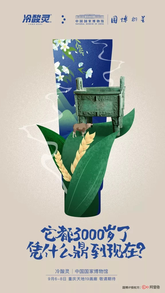
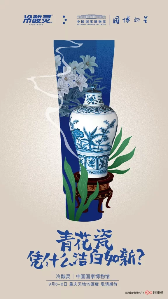
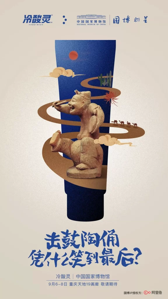
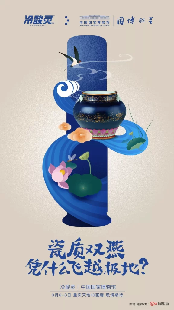
Layered depth compositions define the poster, which features the Cold Beauty (冷酸灵) brand logo alongside the National Museum of China and Guobo Xingxing (国博衍星) branding. A dark blue ceramic jar with gold patterns sits atop a stylized, swirling blue wave that incorporates lotus flowers and leaves, while a swallow flies above the composition against a beige background. Large Chinese characters at the bottom ask ‘Why does porcelain double-swallow fly to the extreme?’, with event details for September 6-8 in Chongqing listed below.
The layout employs a strong vertical central axis with the wave creating dynamic S-curve movement through the frame. Typography mixes modern sans-serif for brand names with bold, brush-stroke calligraphy for the headline, establishing visual hierarchy between institutional authority and cultural poetry. The illustration style blends flat graphic shapes with subtle gradients, using a restrained palette of deep blues, soft pinks, and cream to evoke traditional Chinese aesthetics while maintaining contemporary cleanliness.
Marketing professionals reference this campaign when studying how consumer brands leverage museum partnerships for cultural credibility without overwhelming product presence. Graphic designers examine the balance between illustrative elements and negative space, particularly how traditional motifs adapt to modern commercial contexts. Brand strategists analyze the integration of historical artifacts into promotional materials as a case study in heritage marketing execution.