Qinghua Porcelain Vase
Topics
Details
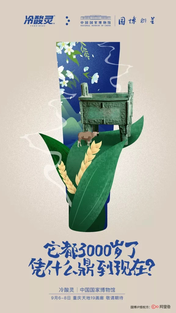
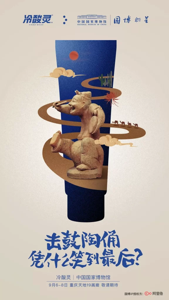
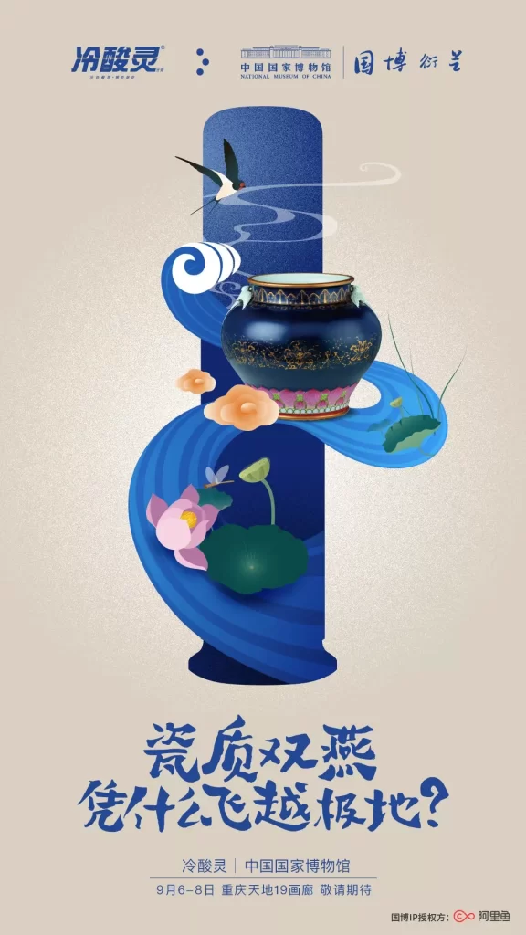
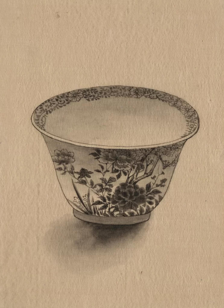
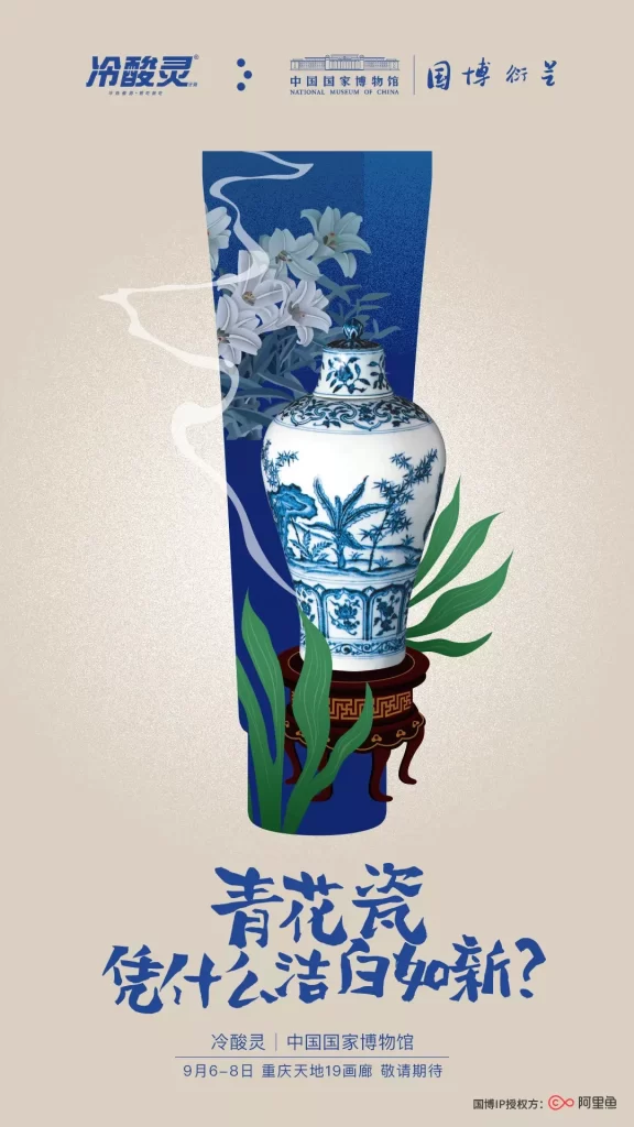
Centered on a beige background, a detailed blue-and-white Qinghua porcelain vase sits atop a dark wooden stand, flanked by green leaves and white lilies against a deep blue vertical panel. The top left displays the brand name '冷酸灵' (Lengsuanling) alongside the National Museum of China logo and the phrase '国博 衍艺'. Large, bold blue Chinese characters at the bottom ask '青花瓷 凭什么洁白如新?' (Why is blue-and-white porcelain as white as new?), with event details for a Chongqing exhibition dated September 6-8 below it.
The layout employs a clean, vertical composition that draws the eye from the branding at the top down to the prominent product and finally to the inquisitive headline. Typography varies between modern sans-serif for the brand and expressive, brush-stroke style calligraphy for the main question, creating a dynamic visual hierarchy. The color palette is restrained yet striking, utilizing traditional cobalt blues and creamy whites to evoke a sense of heritage and purity, while the illustration style blends realistic porcelain rendering with stylized botanical elements.
Marketing professionals and graphic designers often examine such posters to understand how cultural heritage can be effectively integrated into commercial advertising. Students of brand management use this case study to analyze cross-industry collaborations between consumer goods and national institutions. Packaging specialists also look to these visuals for inspiration on how to communicate product benefits through artistic metaphor and historical reference.