Colorful Wine Bottle
Topics
Details
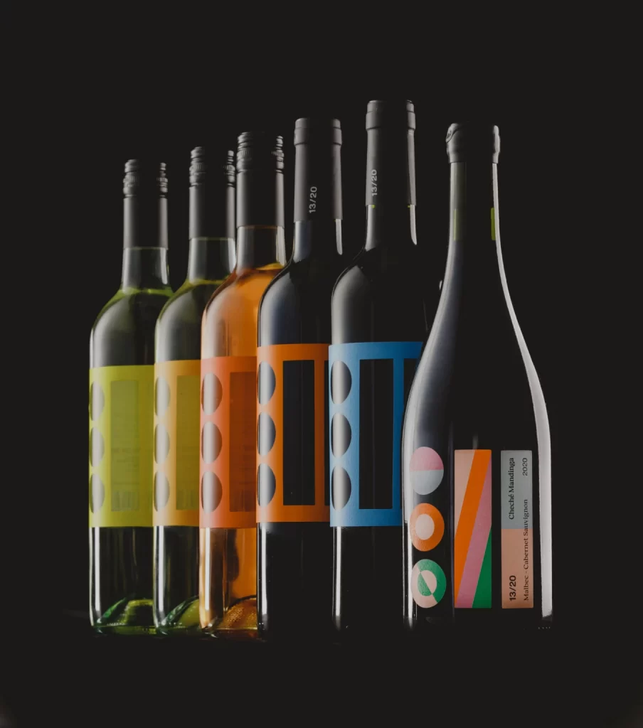
Six wine bottles stand in a tight, staggered row against an absolute black void, their forms carved out by precise studio lighting that catches the glass curves and metallic screw caps. From left to right, the palette shifts from pale chartreuse through golden yellow and burnt orange to deep cobalt, while the rightmost bottle breaks the pattern with a dark vessel bearing a complex label of geometric circles and diagonal stripes in pink, green, and orange. Visible text includes vertical vintage markings like "13/20" on the dark bottles and horizontal type reading "Cherche Midi" and "Malbec Cabernet Sauvignon 2020" on the final piece.
What distinguishes this collection is its rigorous adherence to a modular graphic system that treats labels as architectural elements rather than mere decorations. The first five bottles employ a consistent template of circular cutouts and rectangular frames that scale across a warm-to-cool spectrum, creating visual rhythm through repetition, while the sixth bottle introduces an entirely different vocabulary of overlapping shapes that suggests a premium or limited edition within the same family. This dual approach demonstrates how a brand can maintain cohesion while allowing for hierarchical variation between standard and specialty lines.
Packaging designers studying systematic brand identity will find this arrangement particularly useful for analyzing how color coding communicates product categories without textual explanation. Art directors working on beverage photography could reference the lighting setup to understand how to make transparent and opaque glass coexist in a single frame without losing detail in either. Anyone developing retail display strategies might study the staggered height arrangement to see how to guide the eye across a product line while maintaining individual bottle legibility.