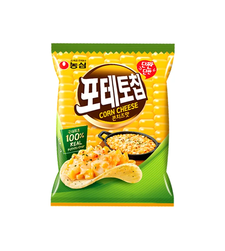
Corn Cheese Snack Yellow Green Bold Packaging Design
Topics
Details
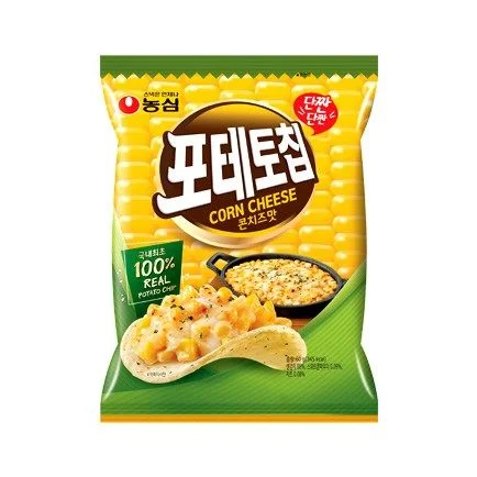
Vibrant yellow and deep green hues dominate the flexible plastic pouch, which features a serrated top edge mimicking corn kernels. The Nongshim brand logo sits above a large brown oval containing the bold white Korean characters for Corn Cheese, with English text layered beneath. A curved potato chip in the foreground displays a textured topping of diced corn and melted cheese, while a black skillet holding a similar dish rests slightly behind it against a backdrop of repeating golden corn patterns.
Visual weight is strategically distributed through the contrast between the warm yellow upper field and the solid green lower band that anchors the composition. The typography employs a heavy, rounded sans-serif style for the main product name, creating an approachable yet assertive presence that stands out from the photographic elements. A small red burst badge containing Korean text adds a focal point of urgency in the upper right quadrant, balancing the green certification box on the opposite side.
Packaging designers studying snack food aesthetics might analyze this layout to understand how color blocking guides consumer attention across different flavor indicators. Marketing teams developing campaigns for savory chip products could reference the specific way ingredients are styled to suggest freshness and abundance. Brand identity specialists examining Asian market trends would find value in the integration of bilingual text systems within a cohesive visual hierarchy.