Nongshim Corn Cheese Potato Chip Packaging
Topics
Details
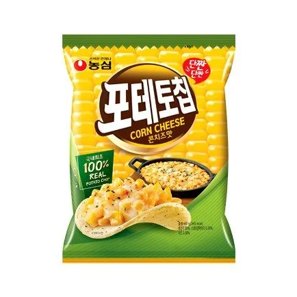
A vertical Nongshim snack bag dominates the frame, featuring a vibrant yellow upper half textured with a corn-kernel pattern that transitions into a solid green lower section. The brand's red circular logo sits in the top-left corner, while the central brown oval contains bold white Korean characters for 'Corn Cheese' with smaller English text beneath. A photographic image of a single chip topped with melted cheese and corn kernels occupies the lower foreground, accompanied by a small black skillet showing the prepared dish to its right, all set against a clean white studio backdrop.
Visual hierarchy is established through the contrast between the organic yellow corn texture and the stable green base, creating immediate flavor association before text is even read. The photorealistic food styling on the chip serves as the primary appetite appeal element, while the red 'new' badge in the upper right introduces a secondary accent color that draws the eye upward. Typography choices balance the heavy, rounded Korean logotype against lighter sans-serif English subtitles and the sharp green certification box claiming 100% real potato content.
Product photographers studying food packaging composition can analyze how the diagonal division between yellow and green zones guides viewer movement from brand mark to product visualization. Packaging designers examining Asian market aesthetics might reference the integration of photographic elements with graphic patterns, particularly how the corn texture reinforces the flavor profile without overwhelming the central branding. Marketing teams developing snack launches could study the placement of certification claims and novelty badges relative to the hero product shot.