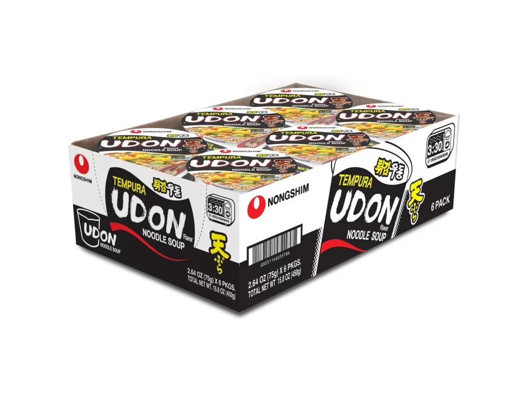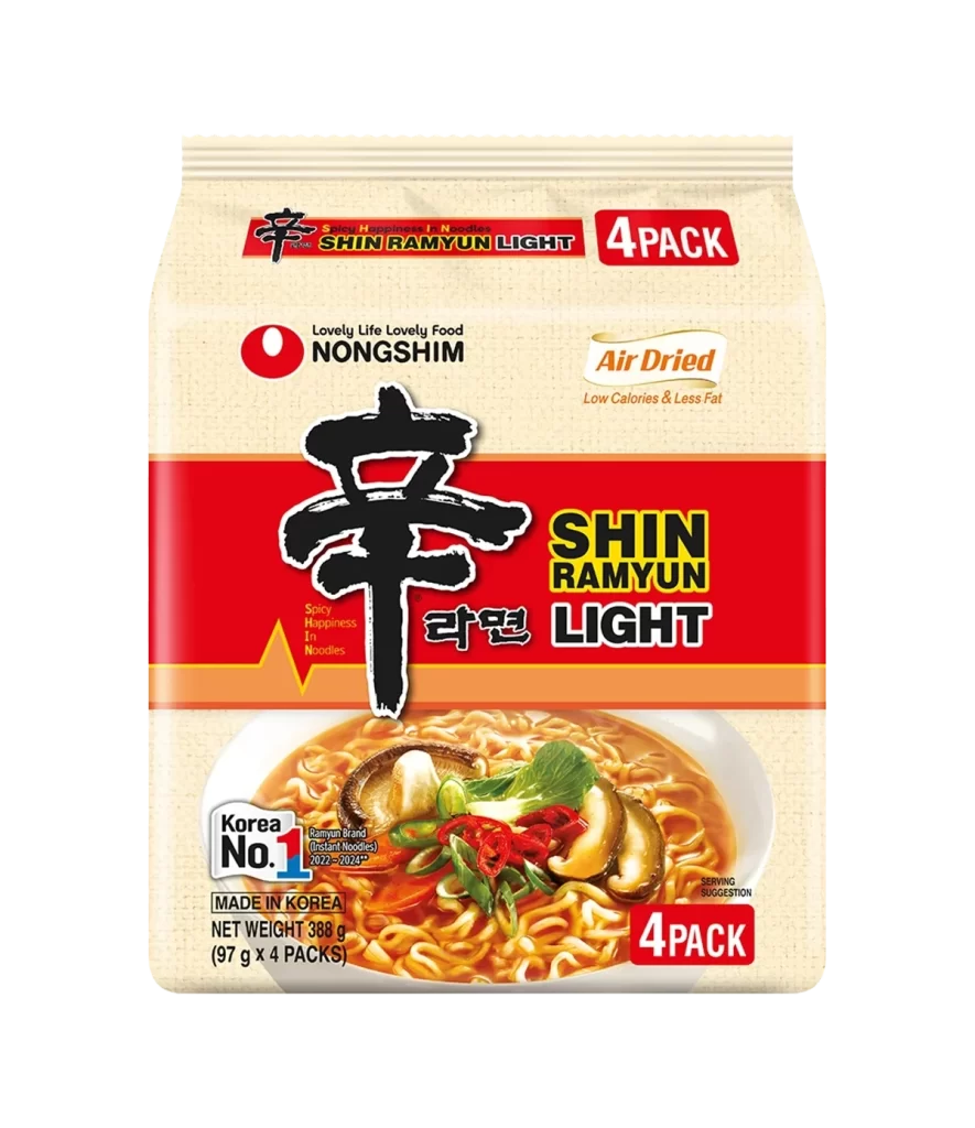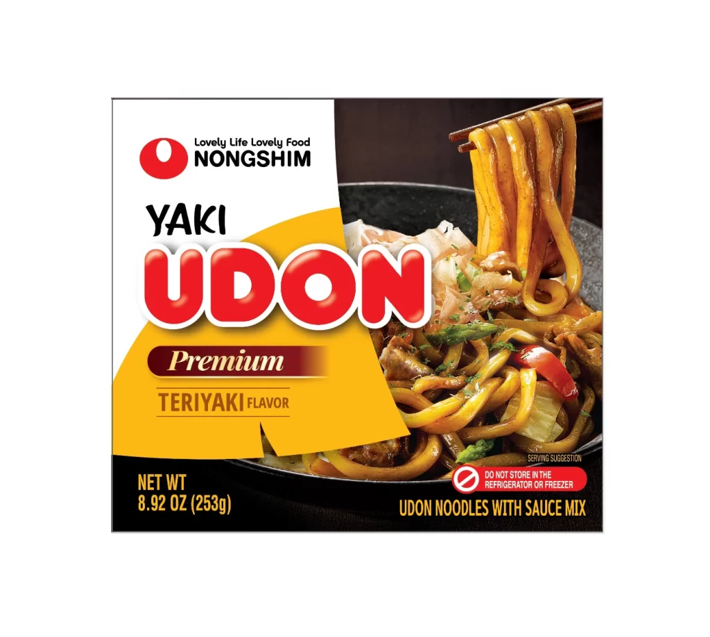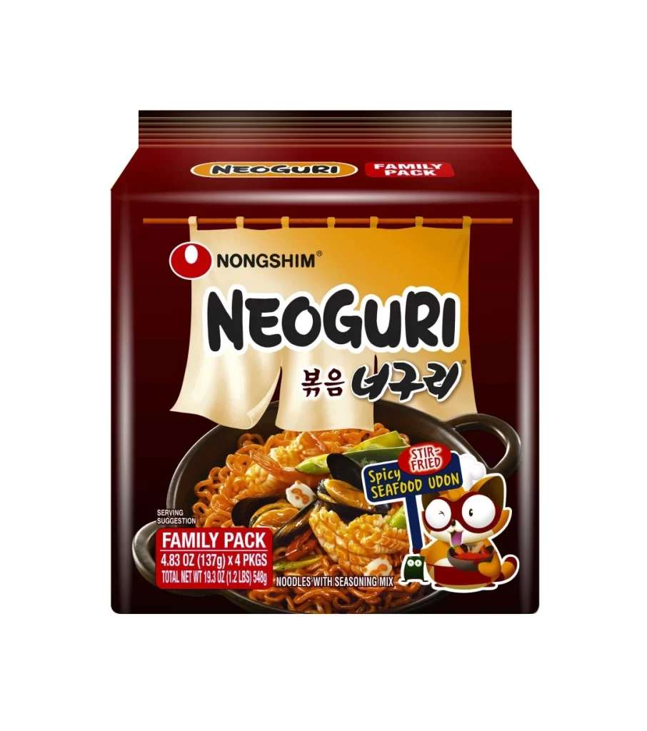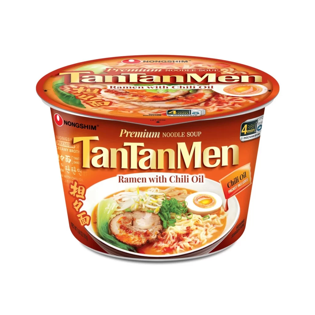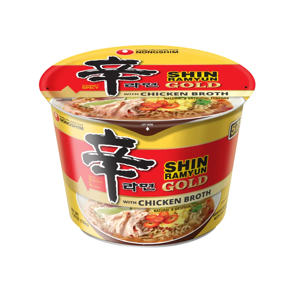
Nongshim SHIN RAMYUN red ramyun noodles Packaging
Topics
Details
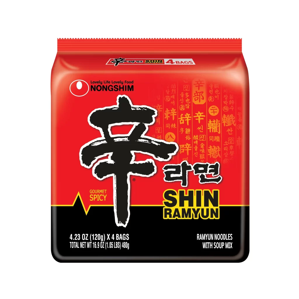
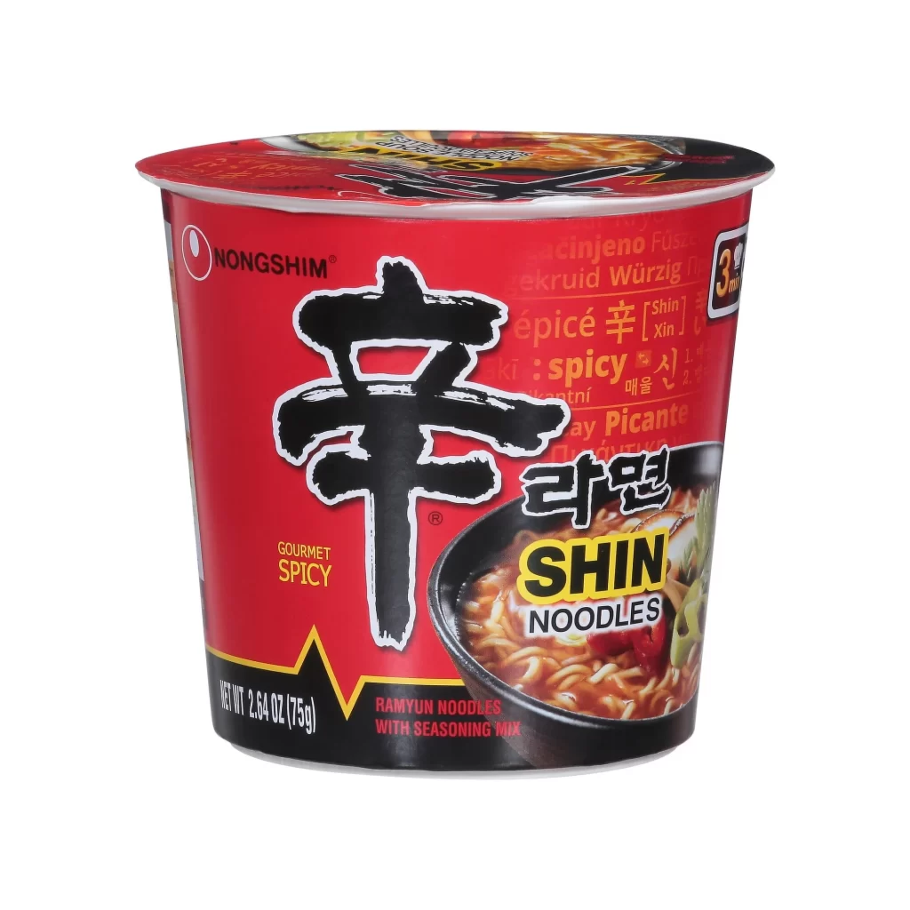
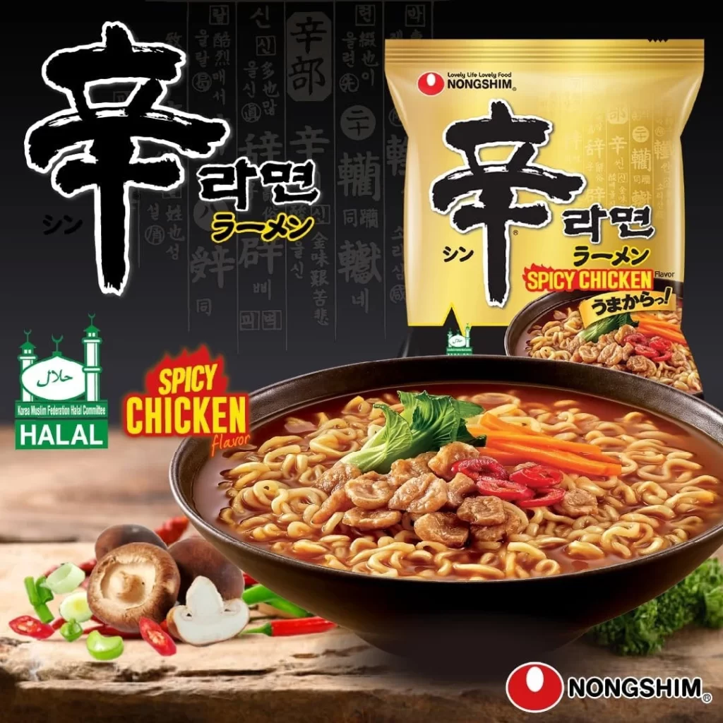
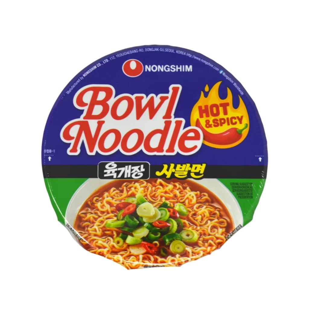
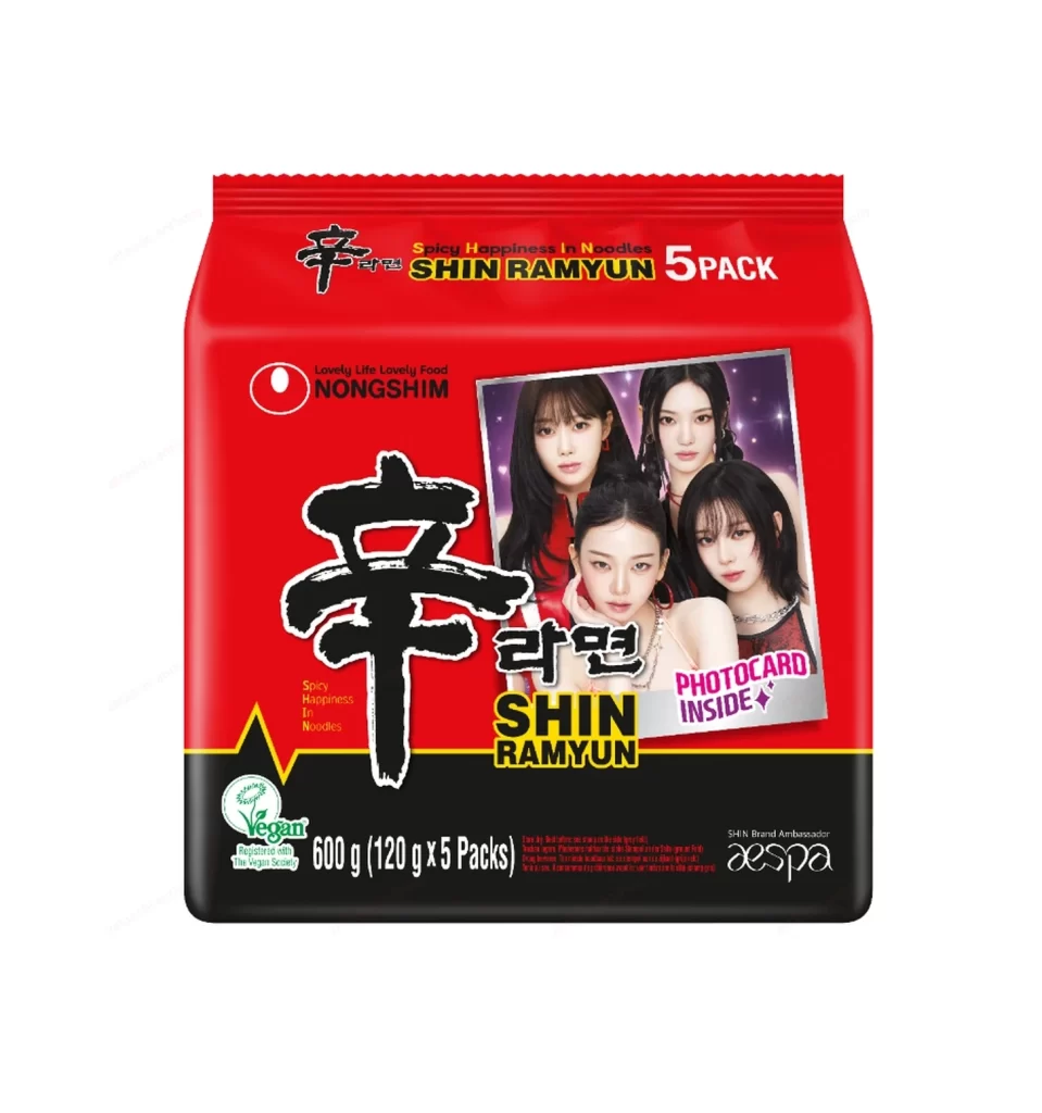
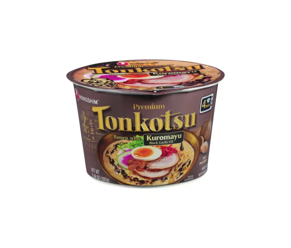
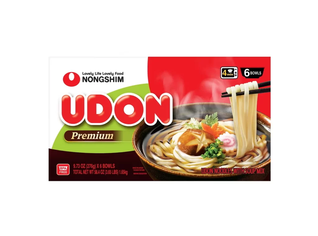
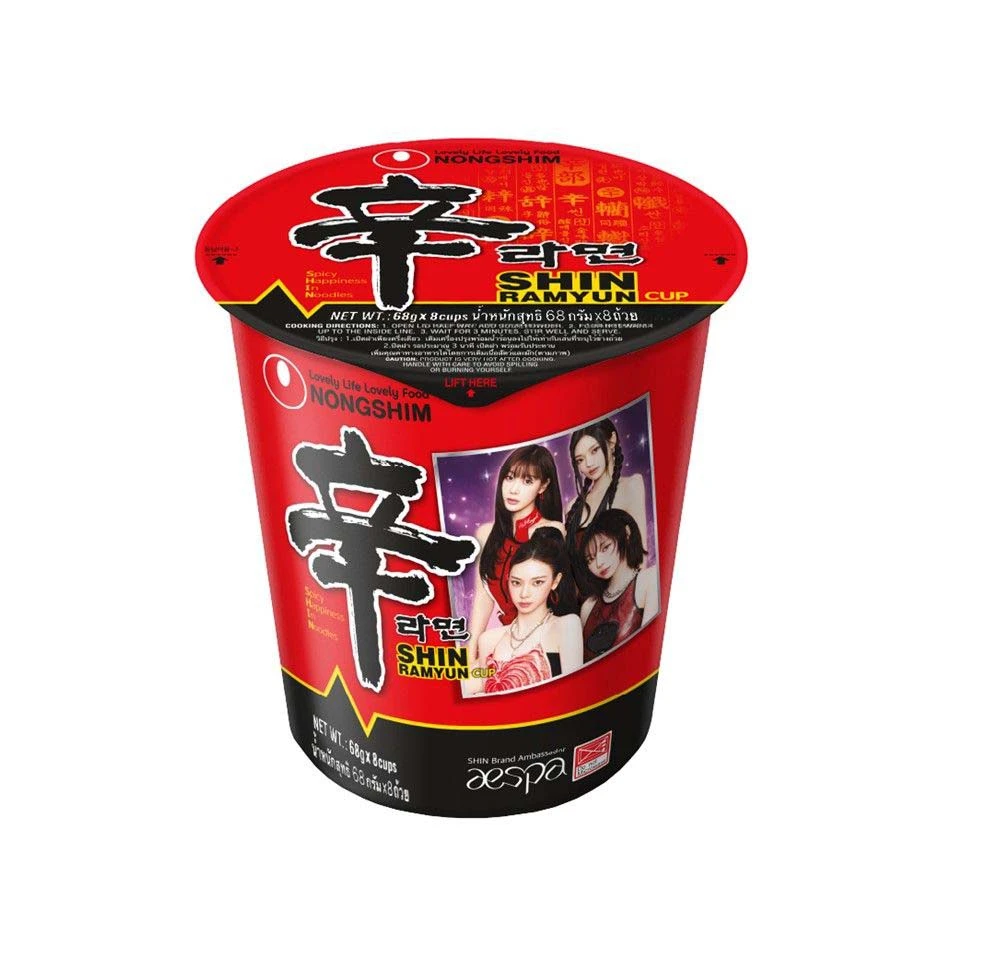
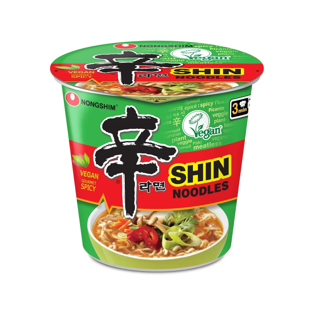
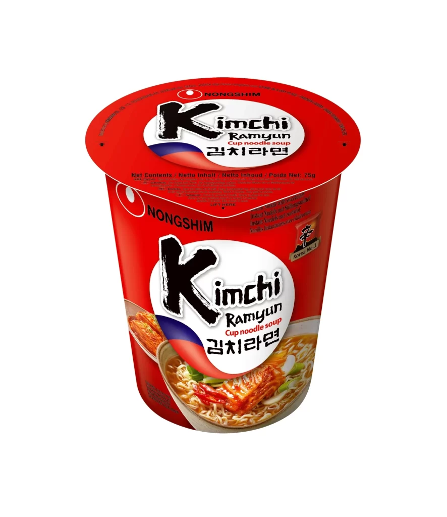
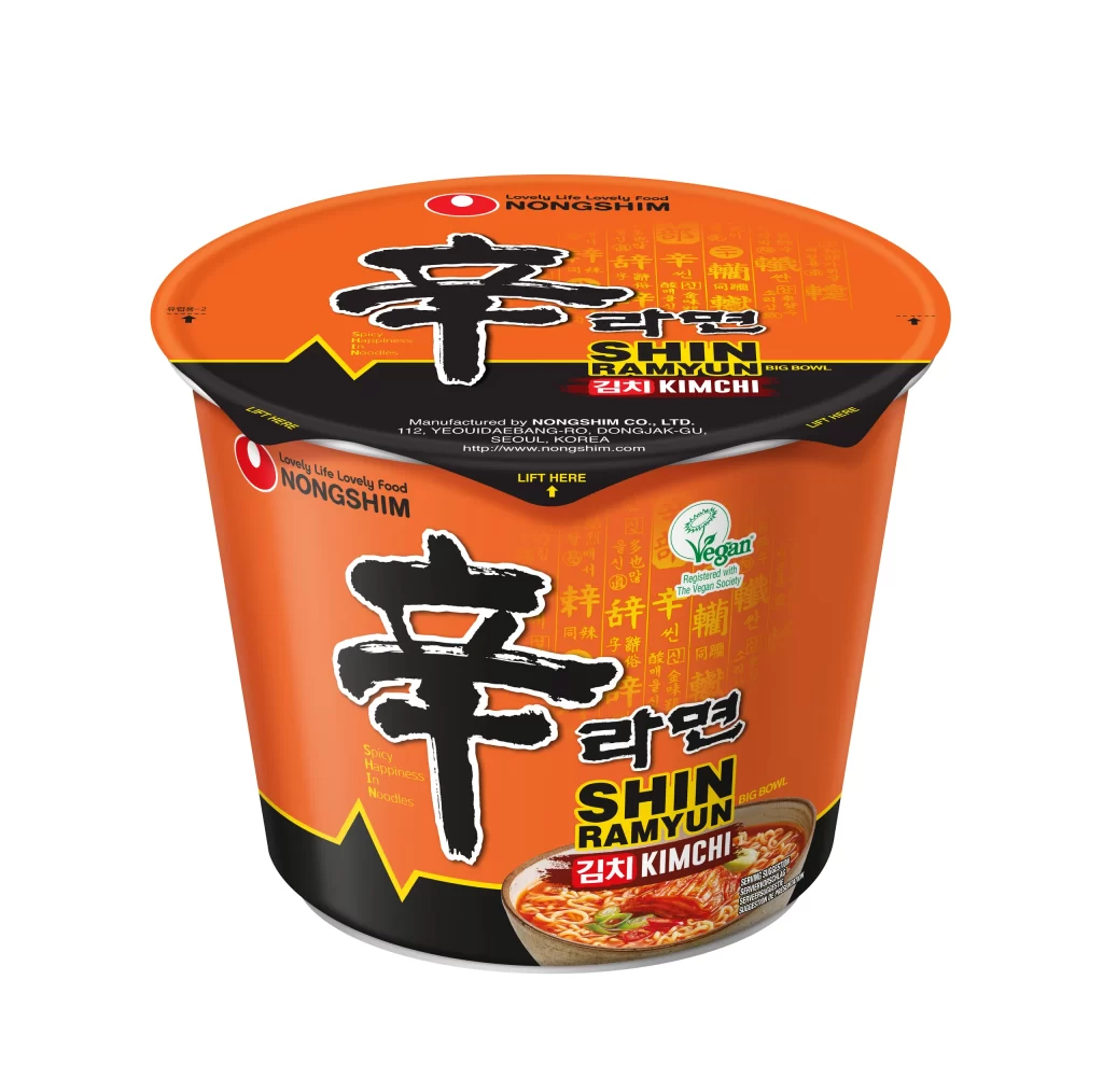
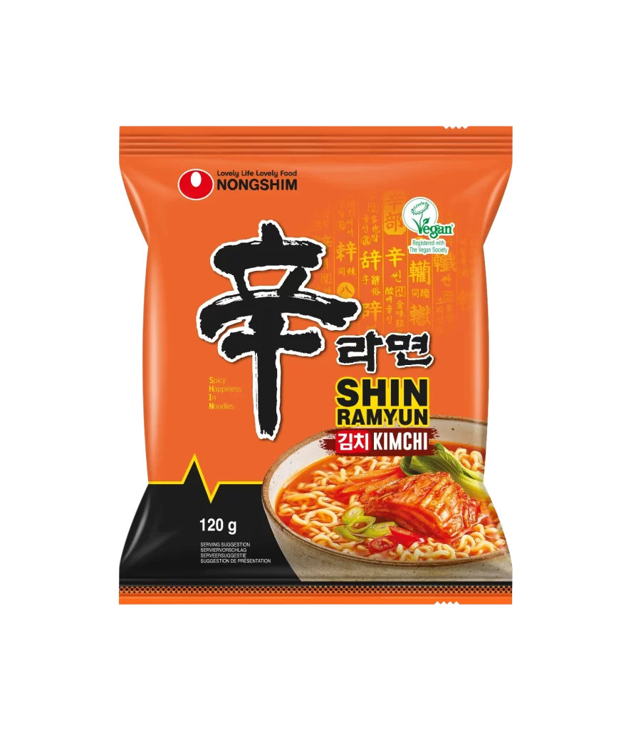
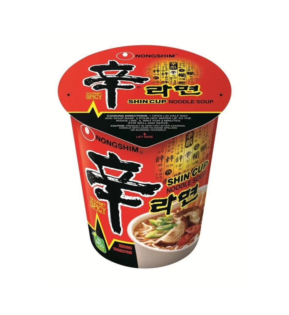
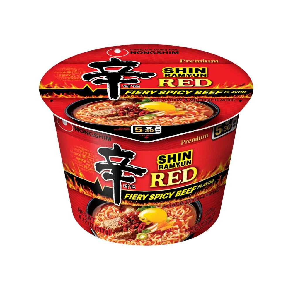
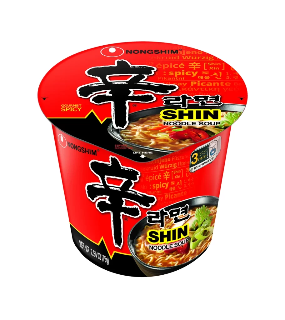
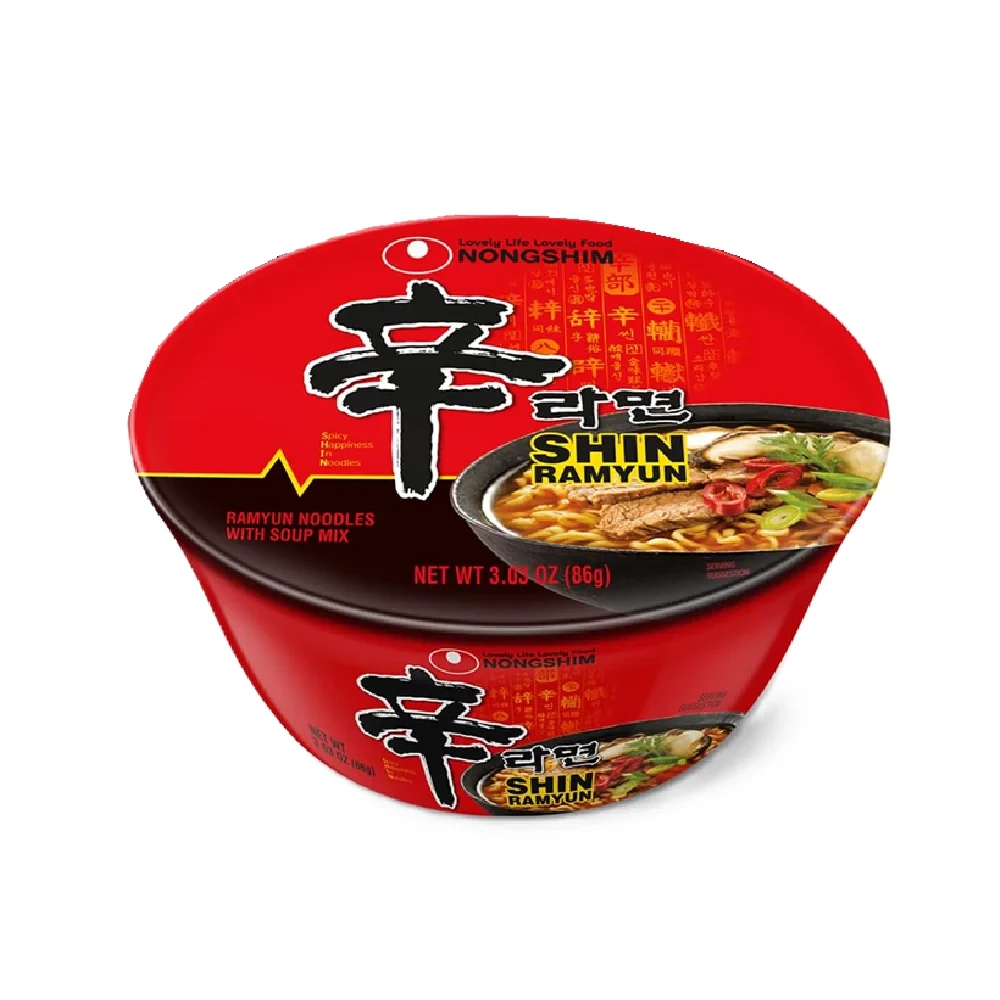
Dominating the frame is a vibrant crimson cup of Nongshim Shin Ramyun, photographed from a slight three-quarter angle that reveals both the lid and the curved body. The packaging features a stark black lower band contrasting sharply with the red upper section, where a large, brush-stroke style Korean character '辛' (shin) serves as the primary focal point. White and yellow typography identifies the brand as NONGSHIM and the product as SHIN RAMYUN, while a photographic inset on the right displays the prepared noodles with visible beef slices, mushrooms, and green onions in a steaming broth.
Visual hierarchy is established through the aggressive use of scale on the central calligraphic element, which immediately communicates the product's spicy identity before any text is read. The composition balances traditional East Asian typographic aesthetics with modern commercial food photography, creating a dense yet organized information layout. Subtle background patterns resembling traditional seals add textural complexity without overwhelming the primary brand messaging, while the color palette of red, black, and yellow ensures maximum shelf visibility.
Packaging designers analyzing Asian market trends would examine this reference to understand how cultural typography integrates with contemporary food branding standards. Illustrators requiring accurate depictions of commercial noodle products could utilize the specific proportions and color values shown here for technical accuracy in their work. Marketing teams developing visual identities for spicy food products might study the psychological impact of the red-black contrast and the placement of appetite-stimulating food photography within the overall design architecture.