Nongshim Korean UGUA Rice Crunch white snack Packaging
Topics
Details
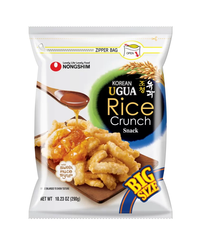
A vertical plastic zipper pouch features the Nongshim brand logo in red and black at the upper left, positioned above bold typography reading 'KOREAN UGUA Rice Crunch Snack' set within a green and blue oval. A wooden spoon drizzles translucent amber syrup over a pile of golden, ridged rice sticks resting on a dark brown rectangular board, while stalks of wheat appear in the upper right corner.
Visual hierarchy is established through the contrast between the crisp white film and the saturated colors of the product photography, specifically the warm golden tones of the fried snack against the cool blue and green backdrop of the brand name. The inclusion of Korean characters alongside English text creates a bilingual authenticity that appeals to international markets, while the dynamic action of the pouring syrup suggests freshness and flavor intensity. Graphic elements like the scalloped ‘sweet rice syrup’ callout and the diagonal stripes on the size indicator add playful energy to an otherwise clean, commercial layout.
Food stylists and commercial photographers might study this composition to understand how to effectively showcase texture and liquid dynamics on dry snacks using controlled lighting. Packaging engineers could analyze the placement of functional icons like the zipper instruction to optimize user experience on resealable bags. Marketing teams developing products for export markets would benefit from examining how this design balances local cultural markers with universal appetitive imagery to create broad consumer appeal.