Nongshim Shin Ramyun red ramyun noodles Packaging
Topics
Details
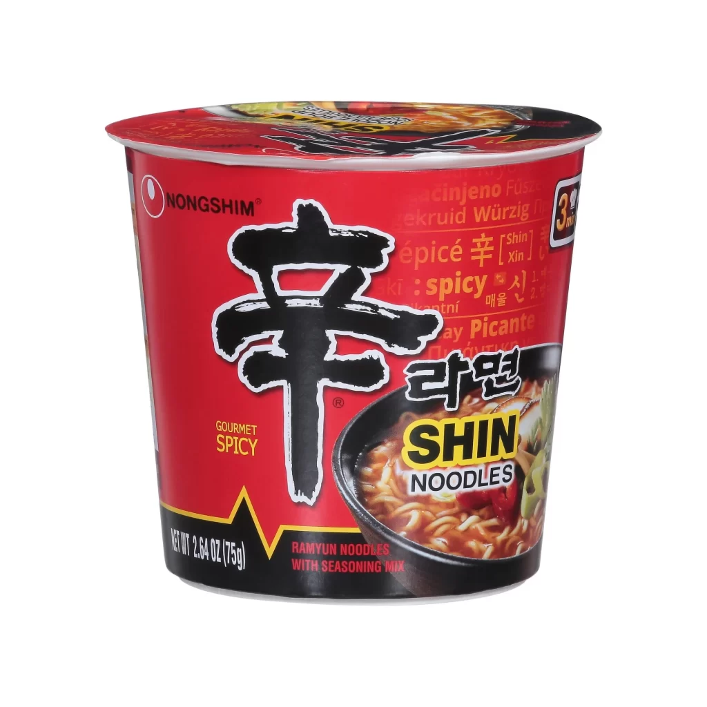
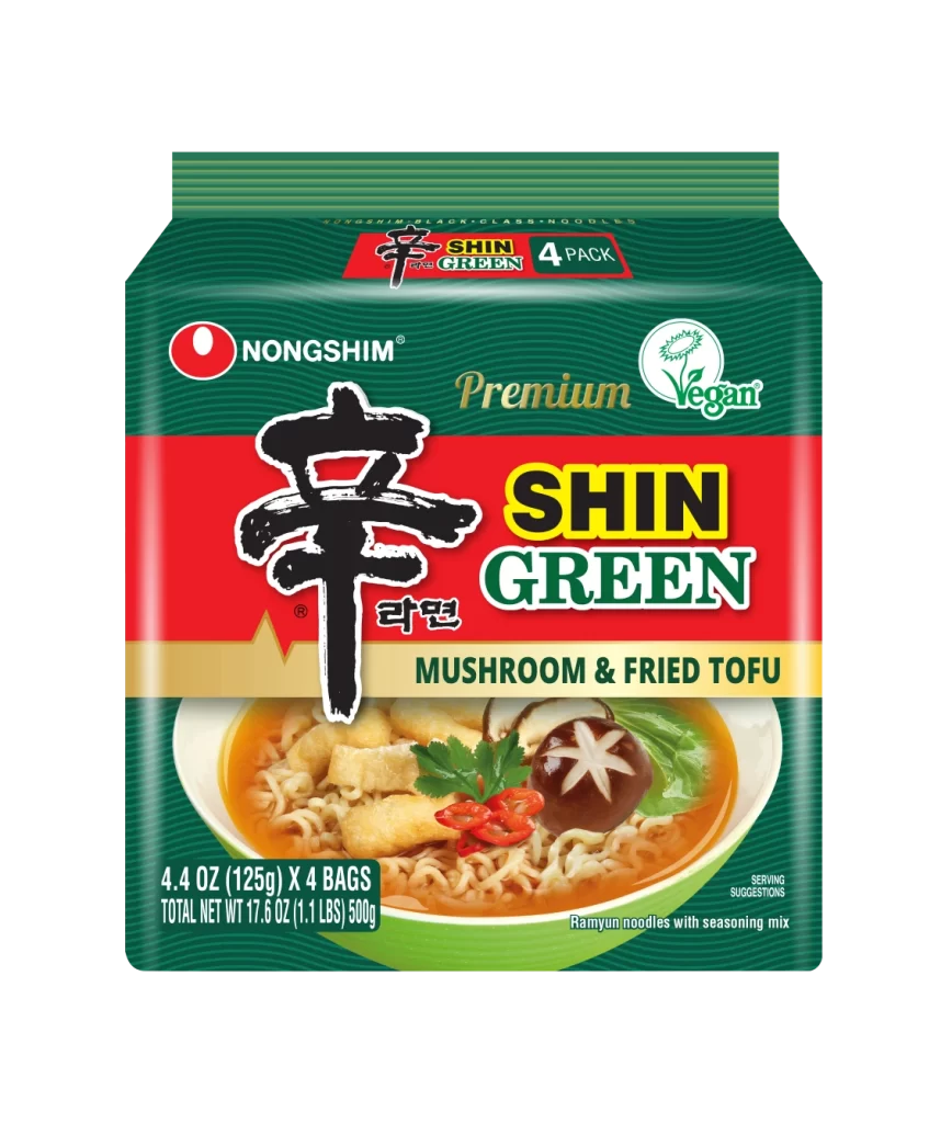
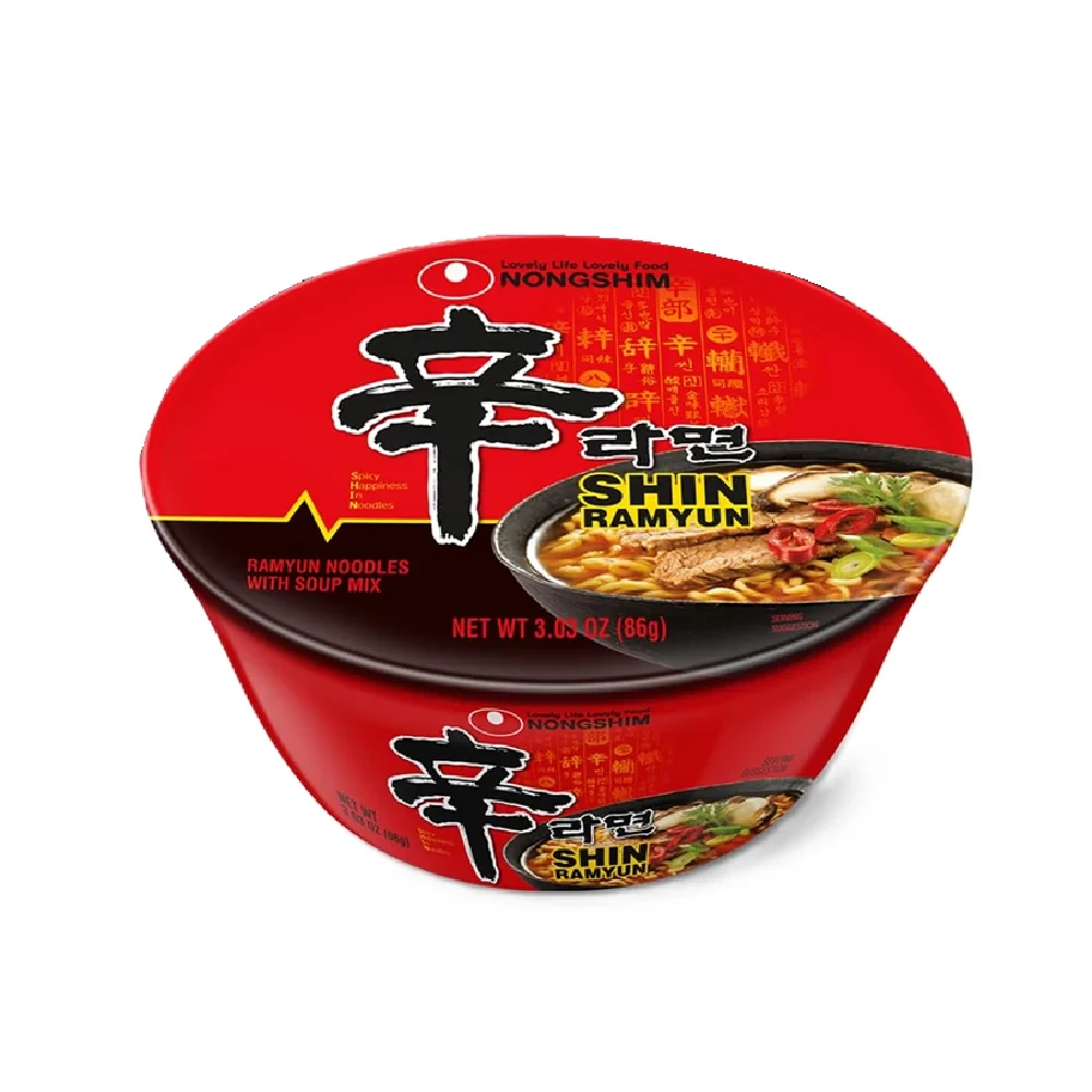
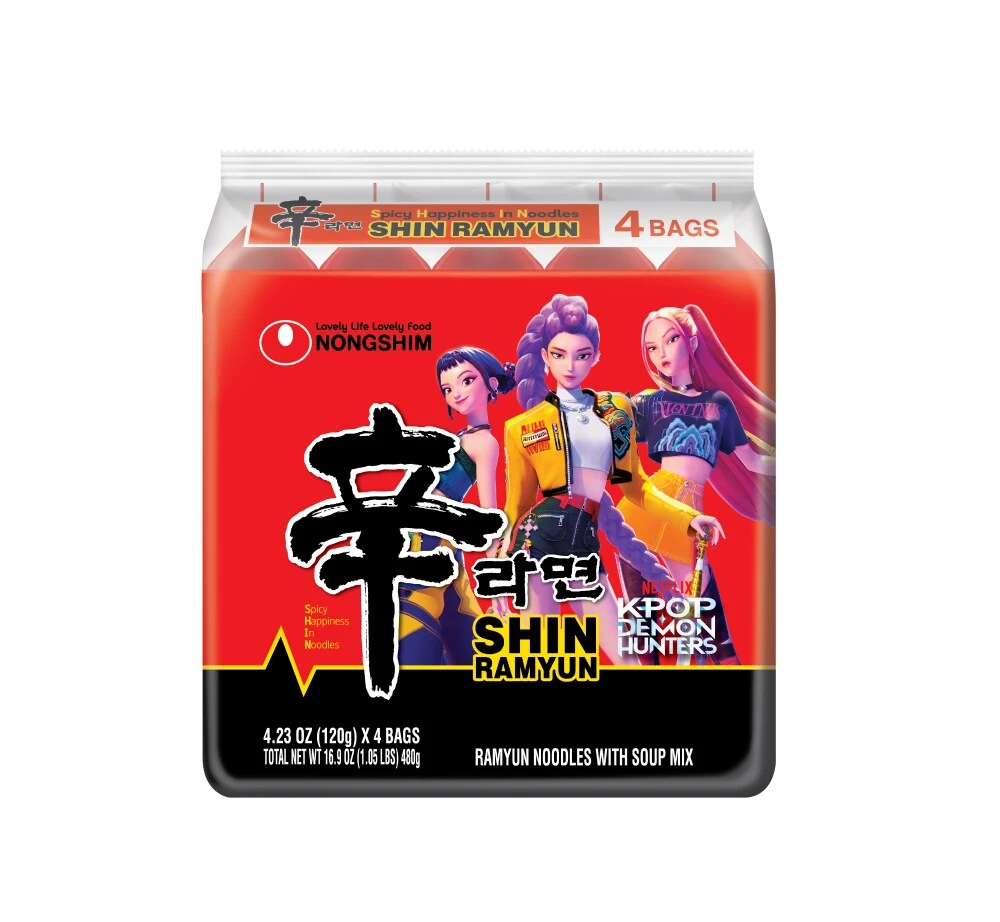
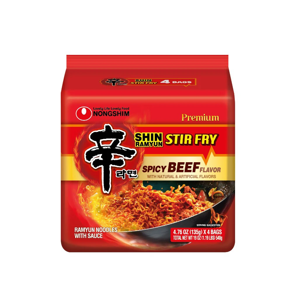
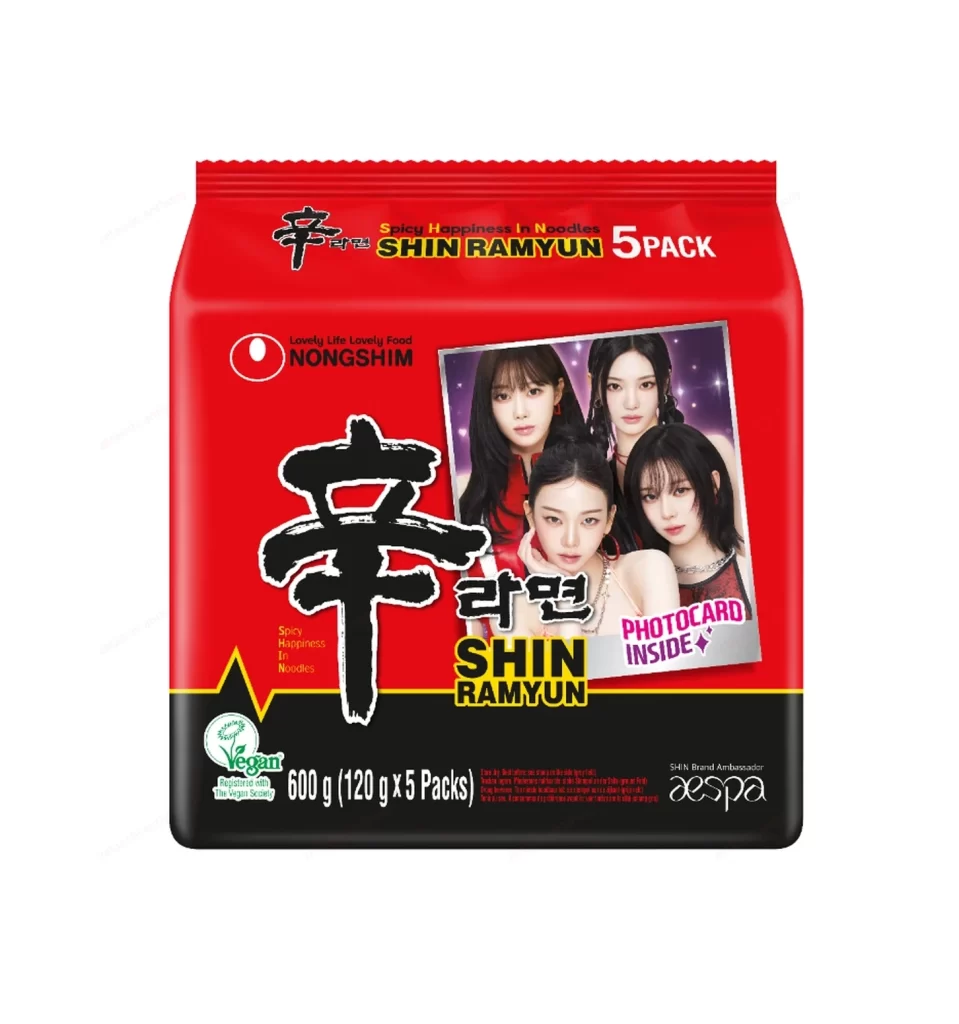
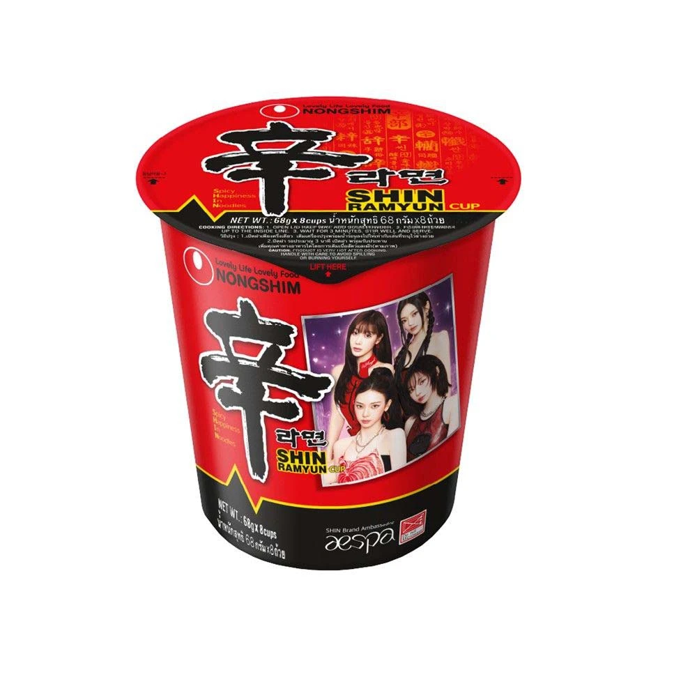
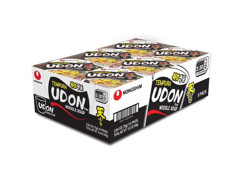
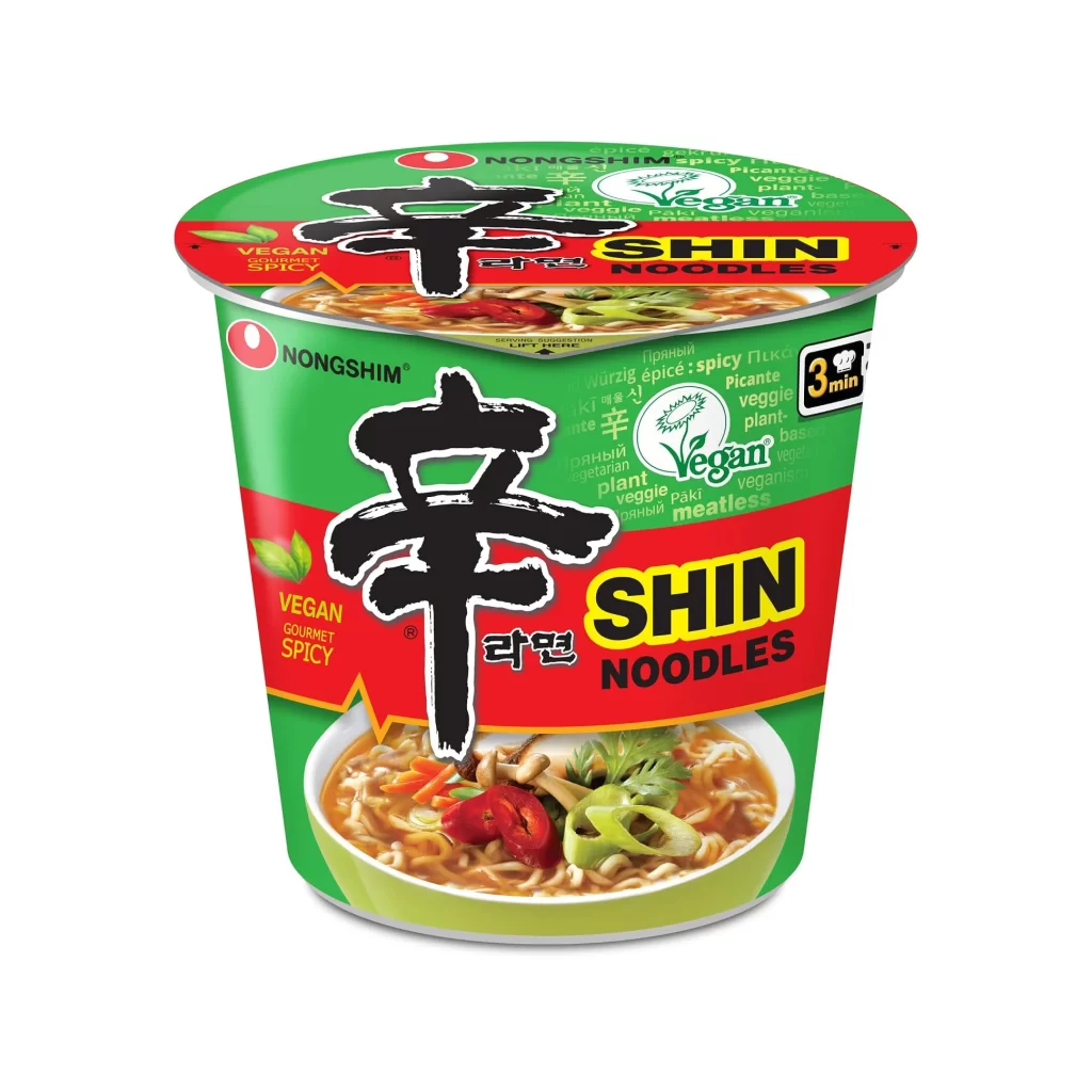
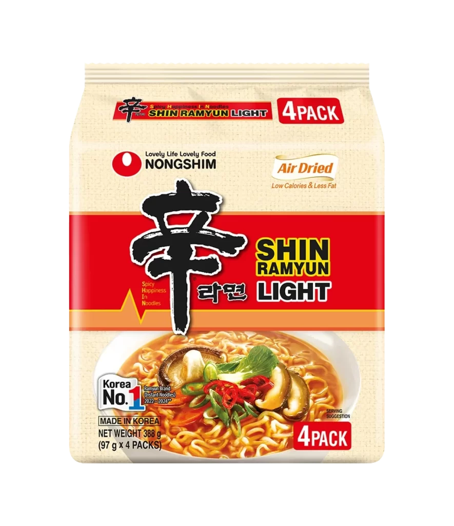
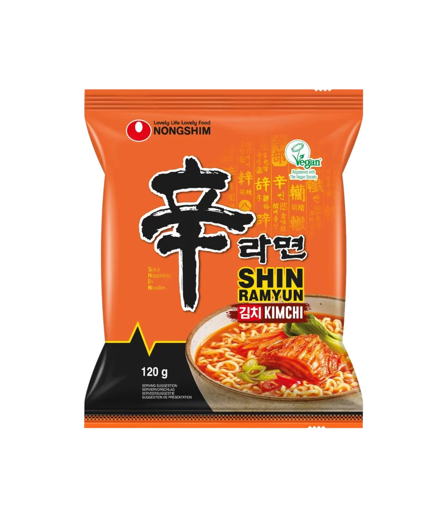
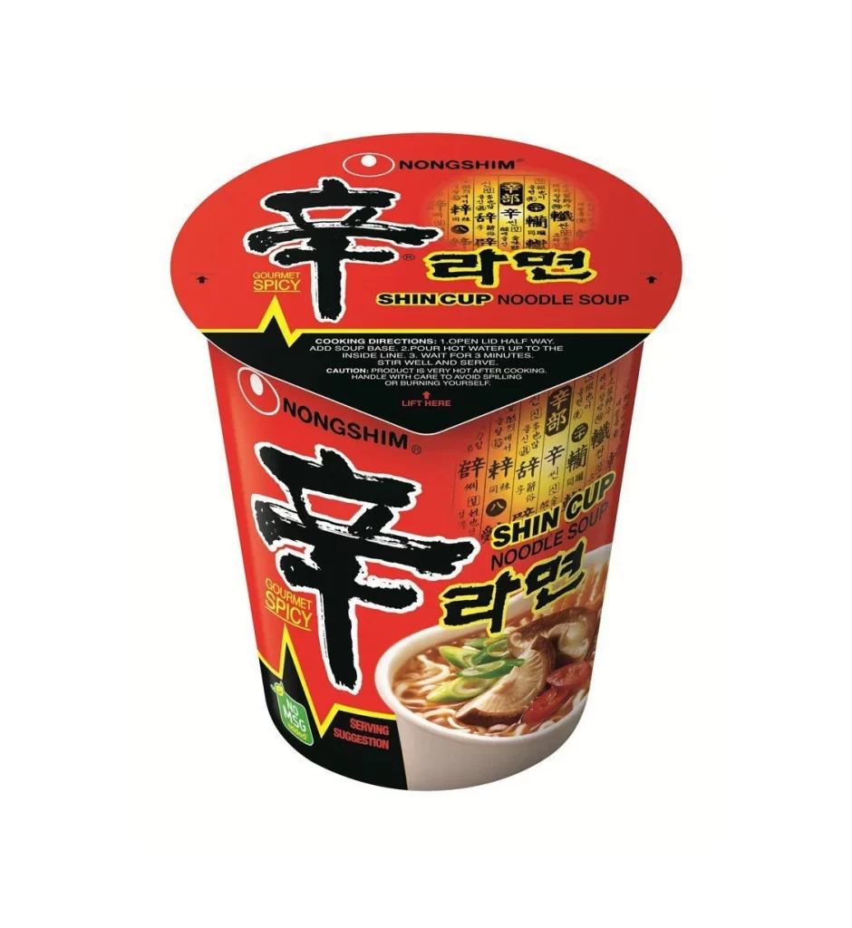
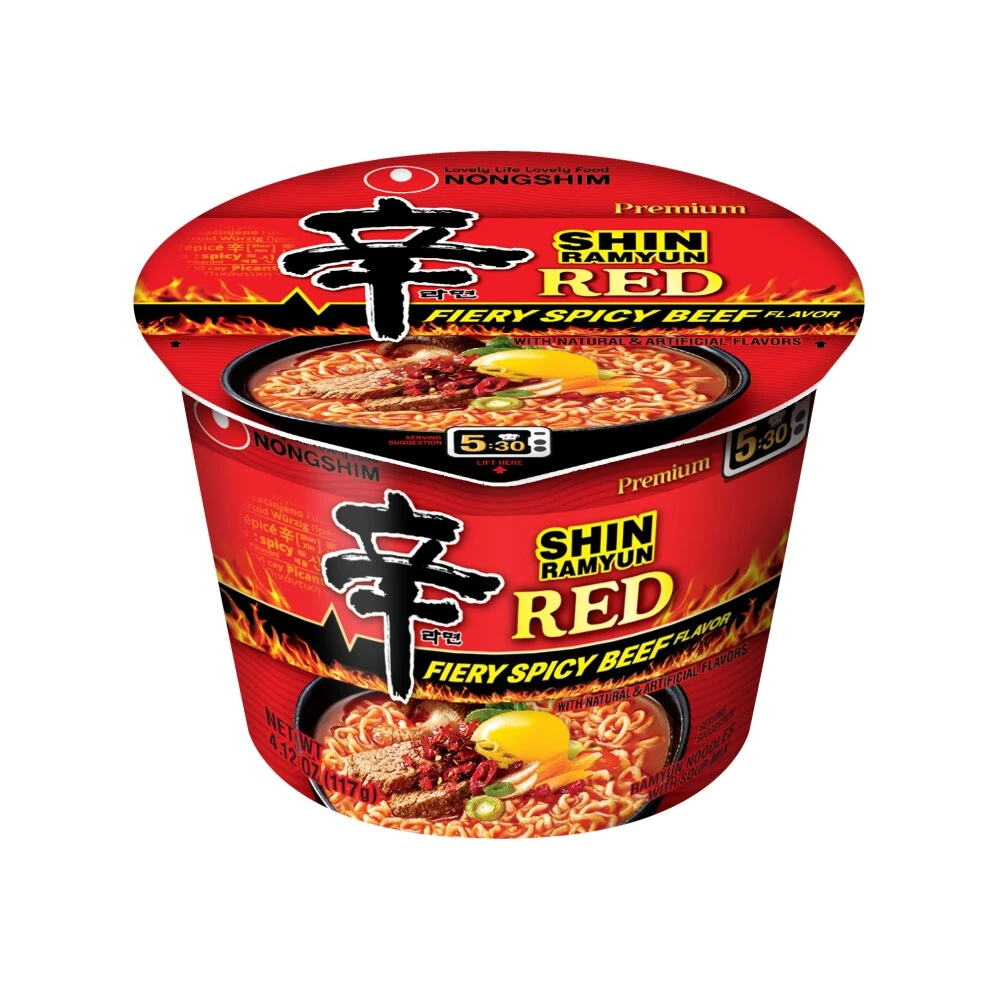
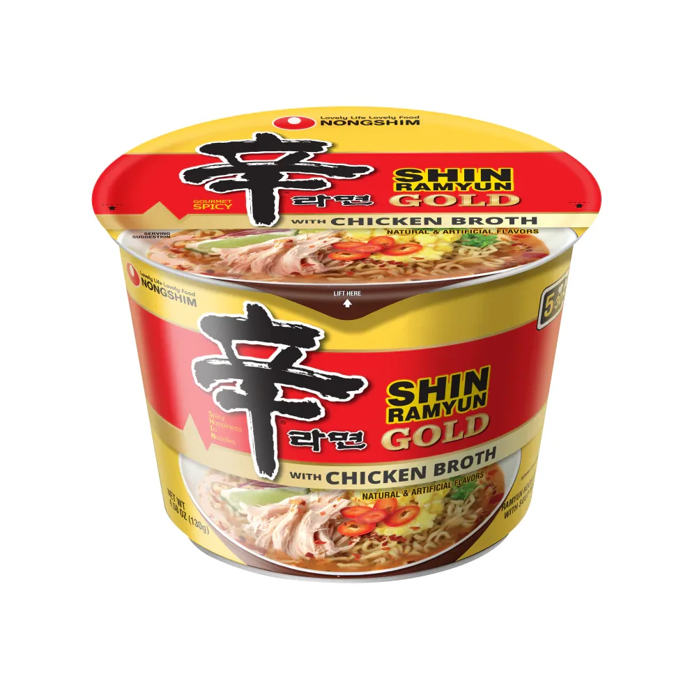
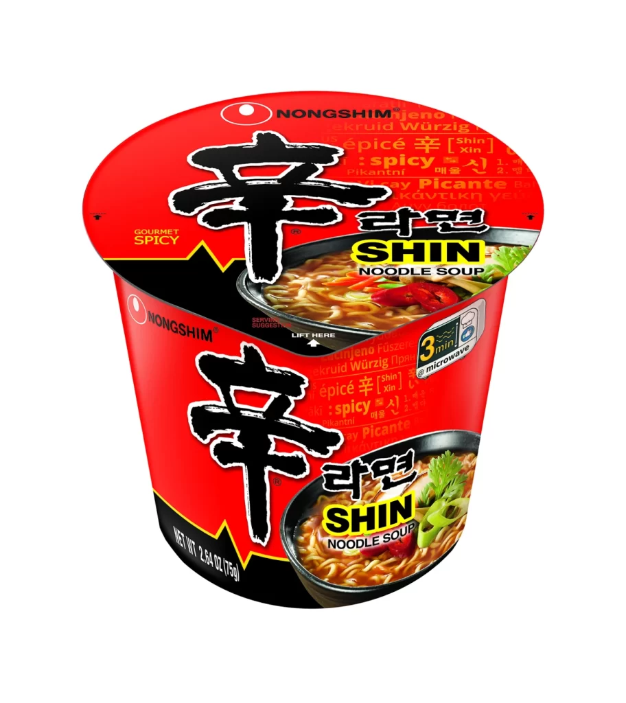
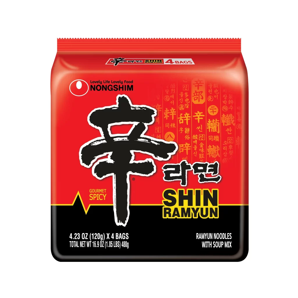
A vibrant crimson field dominates the visual composition, serving as the backdrop for a bold black calligraphic character that anchors the center of the package. The design features a striking horizontal division where the red upper section meets a solid black base, creating a high-contrast foundation for the yellow 'SHIN RAMYUN' typography and white product specifications. Subtle golden Korean characters are layered into the background texture behind the main logo, while the Nongshim brand name sits cleanly in the upper left corner next to its circular emblem.
Visual hierarchy is established through the dramatic scale difference between the massive brushstroke-style 'Shin' character and the smaller supporting text elements that surround it. The specific color palette of fire-engine red, jet black, and warning-yellow creates an immediate association with heat and intensity, which is reinforced by the 'Gourmet Spicy' descriptor placed near the central graphic. This particular multi-bag configuration balances the traditional calligraphic aesthetic with modern packaging requirements, displaying the '4 Bags' count prominently at both the top seal and bottom information panel.
Brand historians analyzing the evolution of Korean food exports would find this specific layout useful for comparing regional packaging variations across different markets. Packaging engineers studying material constraints might examine how the serrated top edge and rectangular form factor optimize shelf space while maintaining structural integrity for four individual noodle blocks. Culinary researchers documenting global spice-product branding could reference the typographic choices here to understand how traditional script is integrated with Latin alphabet marketing for international audiences.