Nongshim Shin Black and red noodle soup mix Packaging
Topics
Details
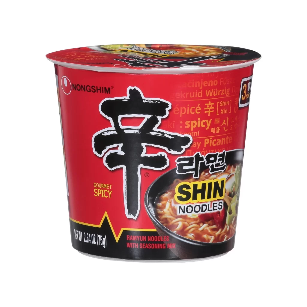
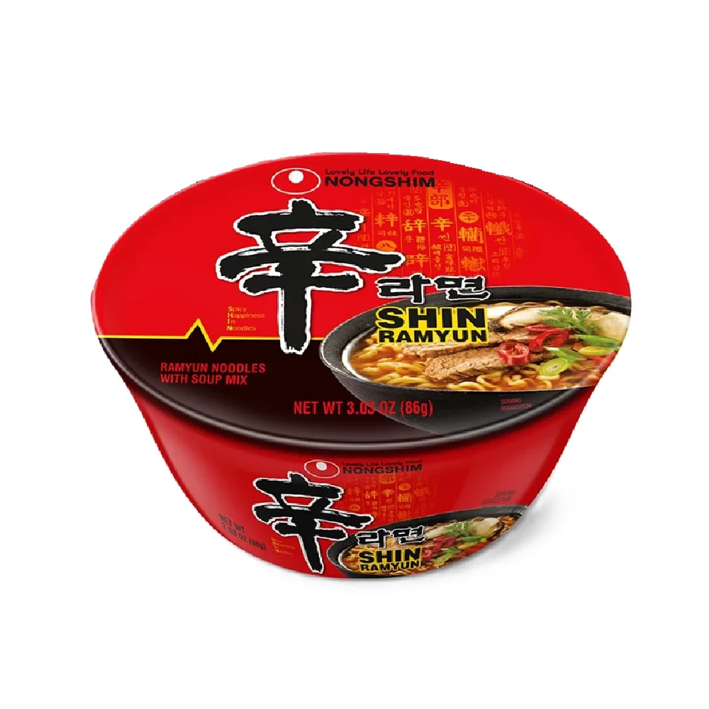
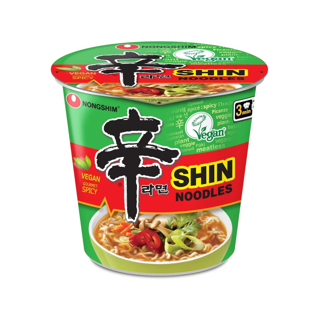
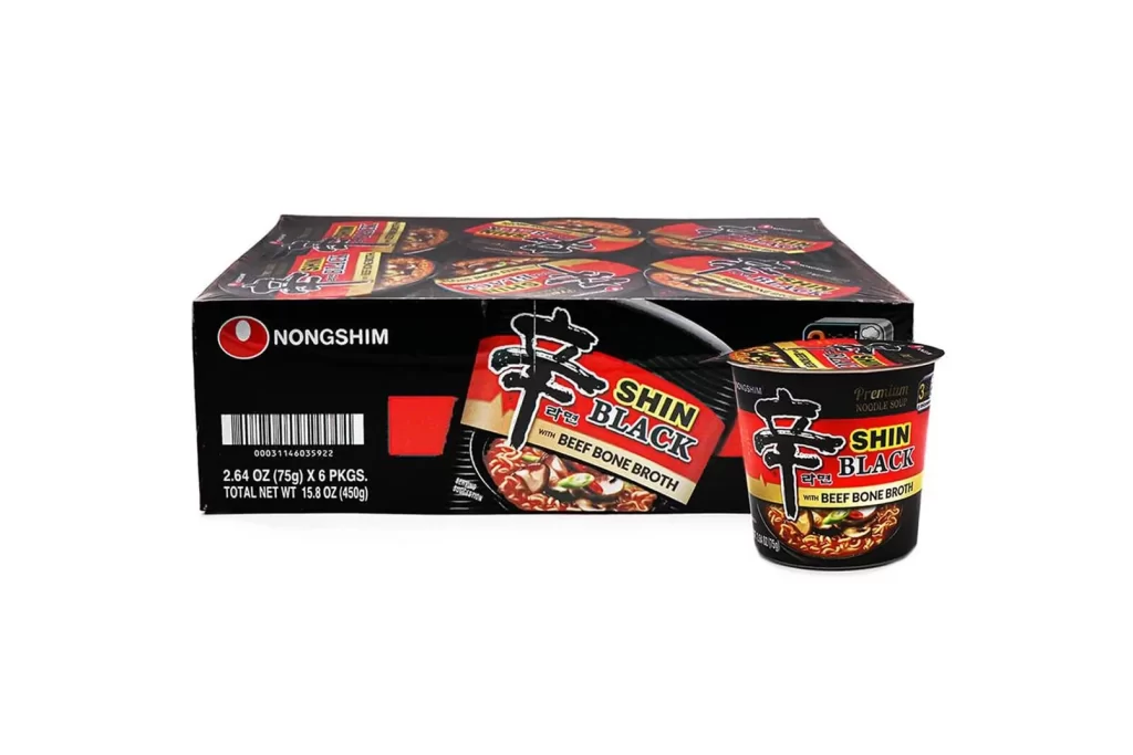
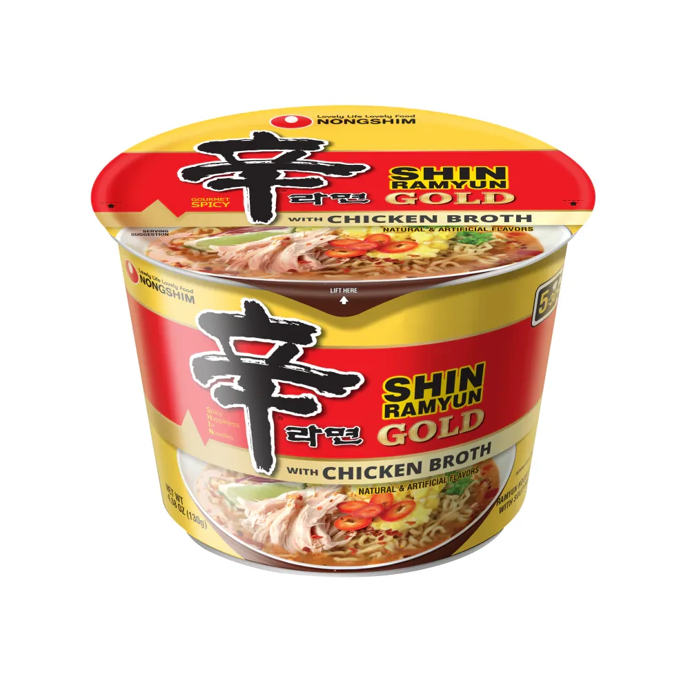
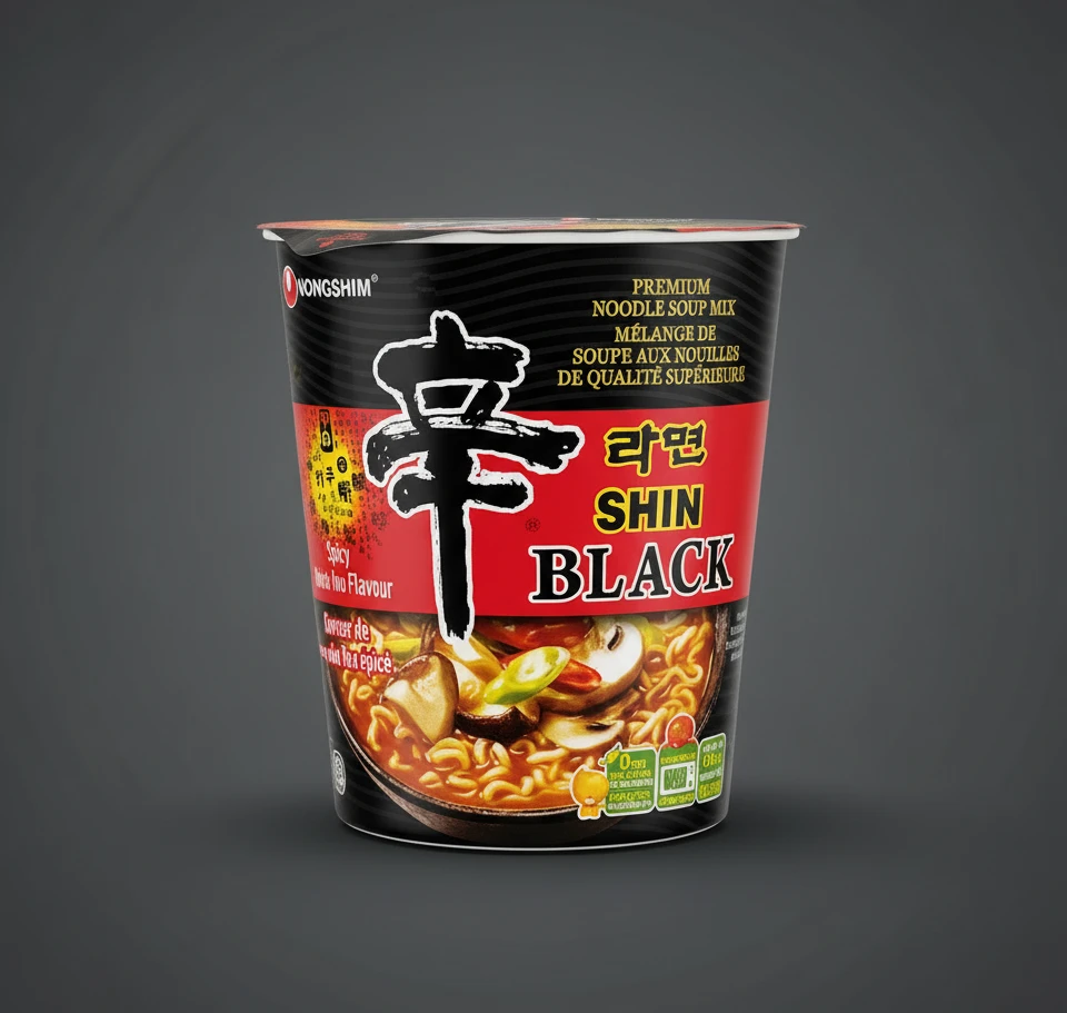
A deep black cylindrical cup with a vibrant crimson central band dominates the frame, showcasing the Nongshim Shin Black noodle soup mix packaging. The design features a large, calligraphic black Korean character ‘辛’ (Shin) as the primary focal point, positioned above bold yellow and white ‘SHIN BLACK’ typography. A photographic image of noodles with mushrooms and vegetables appears at the bottom, while a neutral charcoal background provides subtle contrast behind the container.
Visual hierarchy is established through the aggressive contrast between the matte black texture of the cup and the saturated red accent stripe that cuts horizontally across the middle. The inclusion of both English and French text—’PREMIUM NOODLE SOUP MIX’ and ‘MÉLANGE DE SOUPE AUX NOUILLES’—indicates a specific market positioning for international distribution or bilingual regions. Small nutritional icons and flavor descriptors like ‘Spicy Mushroom Flavour’ are tucked into the lower-left quadrant, balancing the heavy graphic weight of the main logo without cluttering the overall aesthetic.
Brand strategists might examine this reference to understand how premium instant food products utilize color blocking to differentiate standard lines from gourmet offerings. Packaging engineers could study the structural integration of the photographic element with the printed graphics to ensure visual continuity around the curved surface. Marketing teams analyzing competitive landscapes would find this useful for documenting how established Korean brands adapt their visual identity for Western retail environments while maintaining core cultural design elements.