Cup Noodles Stir Fry Rice with Noodle Can
Topics
Details
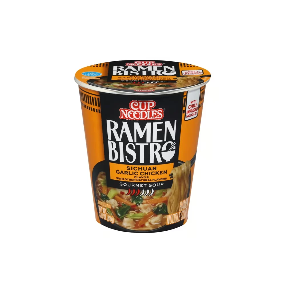
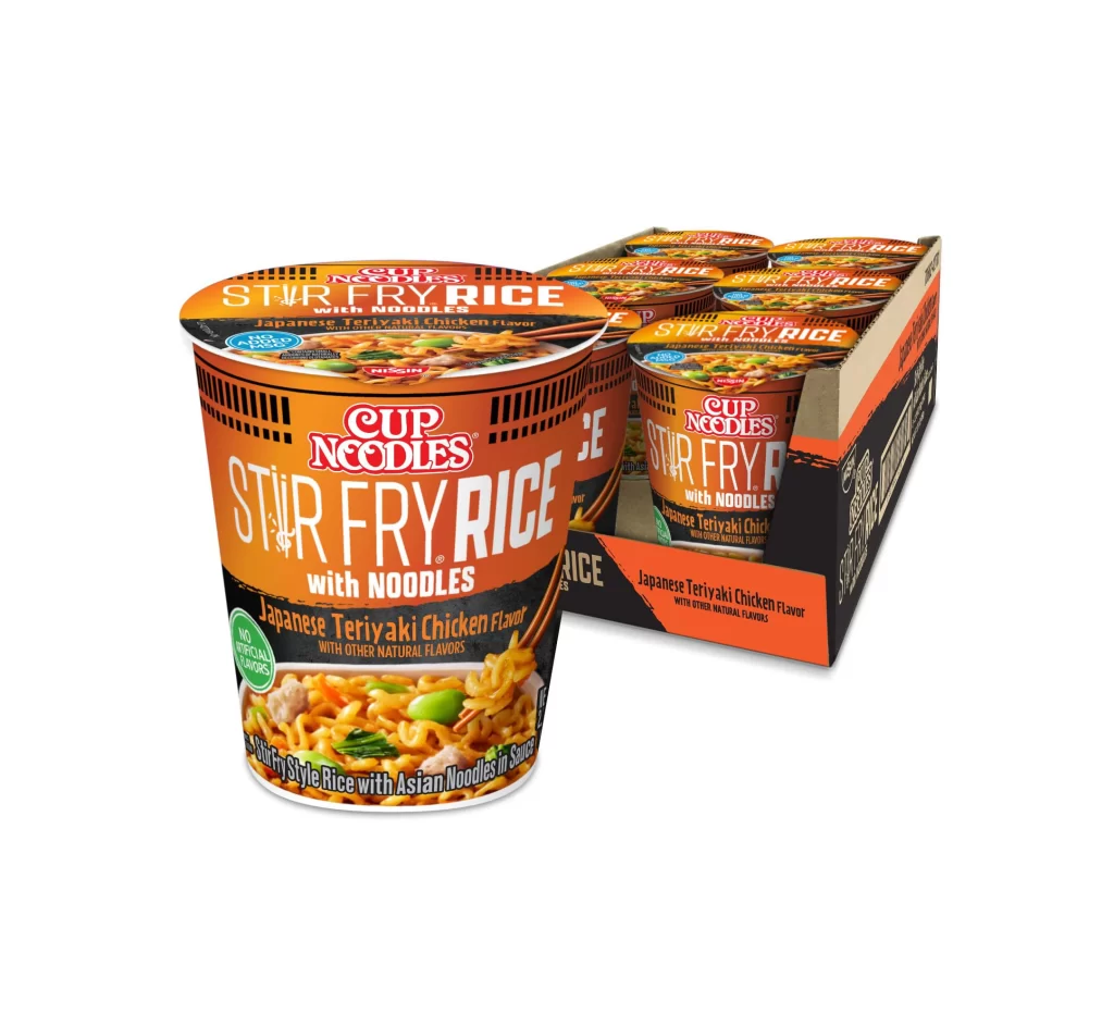
Vibrant orange and black packaging dominates the frame, showcasing a single Cup Noodles Stir Fry Rice container positioned prominently in the foreground with its cardboard carrier of additional cups receding to the right. Bold white typography spells out 'STIR FRY RICE with NOODLES' across the cylindrical surface, while the lid displays 'Japanese Teriyaki Chicken Flavor' above an appetizing food photograph. The product sits at a slight three-quarter angle under even studio lighting, revealing the ribbed texture of the cup's lower portion and the glossy finish of the printed graphics.
Visual distinction arises from the aggressive color blocking that separates the warm upper tones from the dark lower band, effectively drawing the eye to the flavor designation. The inclusion of realistic food photography on the lower curve—depicting saucy noodles and green vegetables—adds textural contrast to the otherwise graphic-heavy industrial design. Furthermore, the vertical black stripes mimicking grill marks reinforce the stir-fry concept through subtle pattern repetition rather than explicit iconography.
Brand historians and packaging analysts might examine this composition to understand how Nissin adapts its classic cup architecture for hybrid grain products. Industrial designers could study the structural relationship between the individual unit and its bulk shipping container to optimize retail display efficiency. Additionally, color theorists may reference this specific palette when researching appetite-stimulating hues in fast-moving consumer goods.