Dear Crete Mastiha Cookies Packaging
Topics
Details
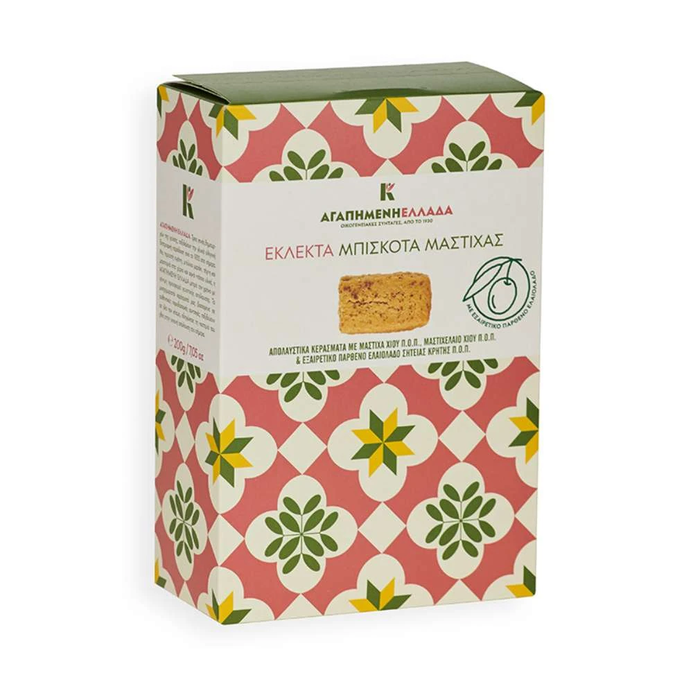
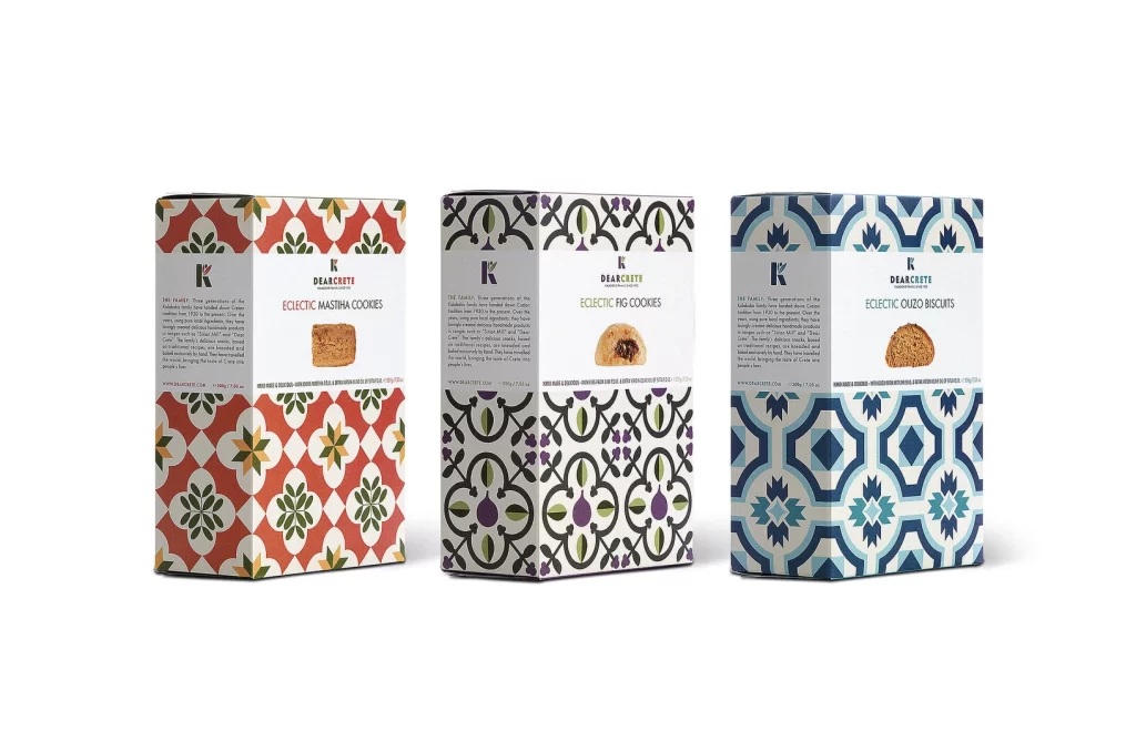
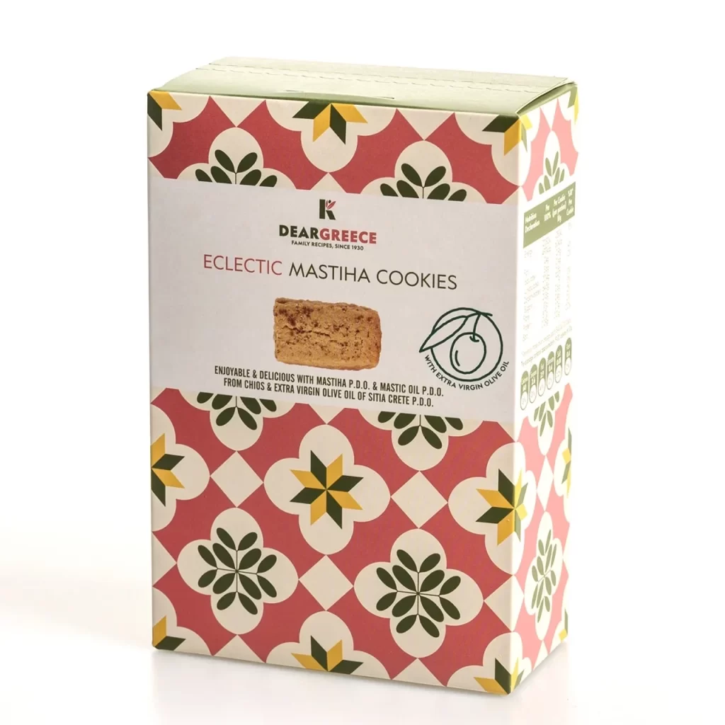
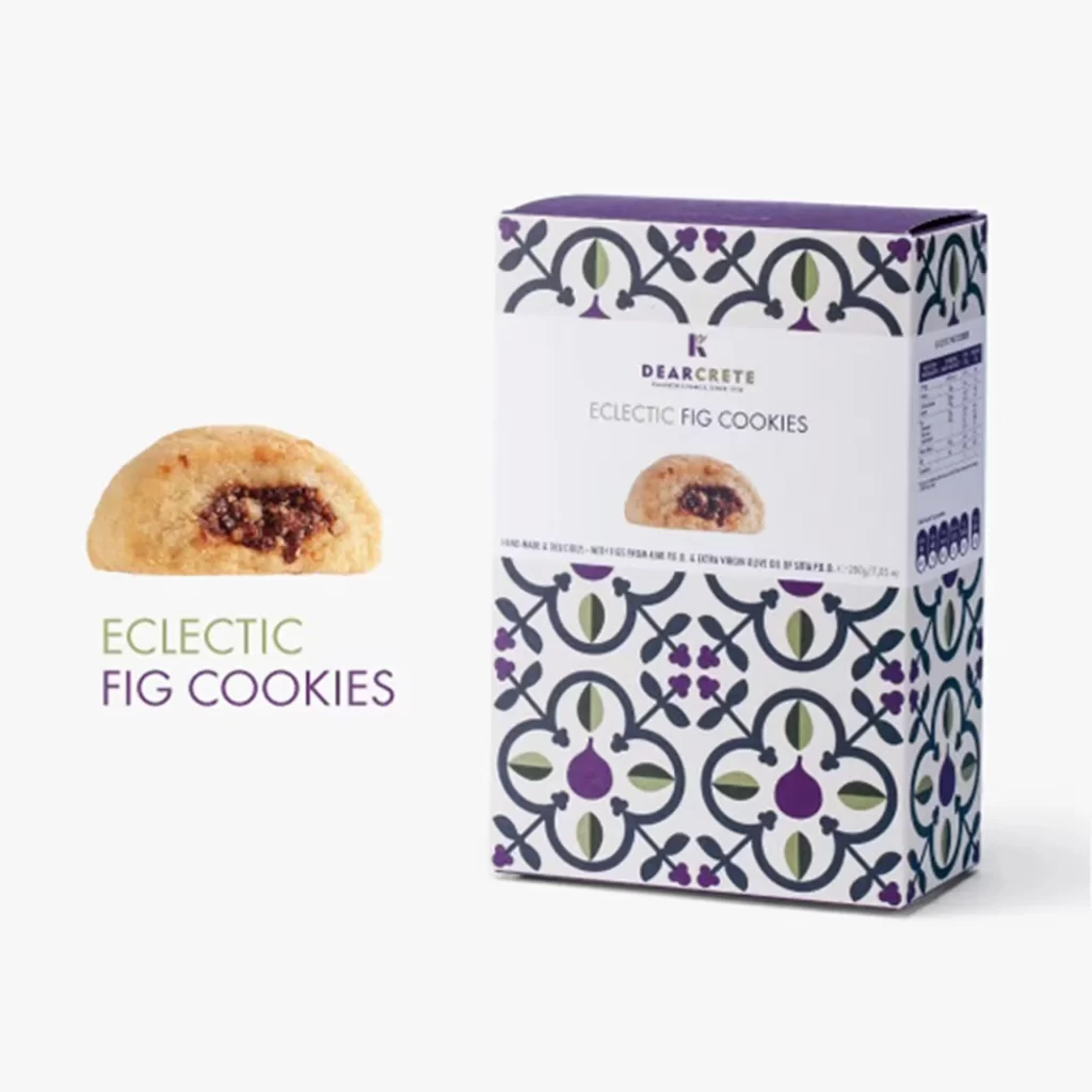
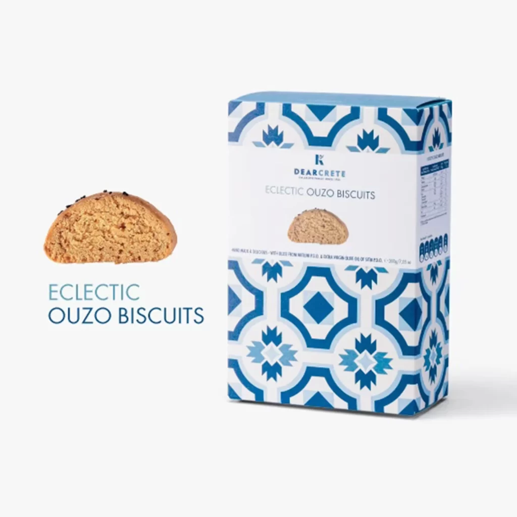
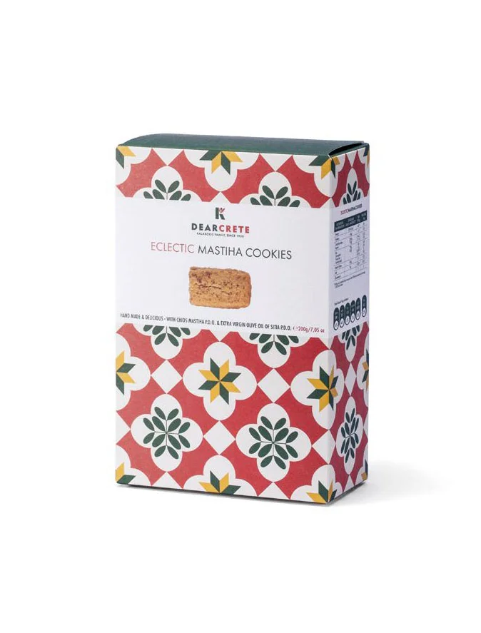
A rectangular cardboard box for Dear Crete Eclectic Mastiha Cookies stands at a three-quarter angle, revealing its front and right side panels. The packaging features a bold geometric pattern of interlocking red, white, green, and yellow floral and star-like motifs covering the top and bottom sections. A clean white band across the center displays the brand name 'DEARCRETE' above the product title in gray serif lettering, with a realistic photograph of a single textured cookie positioned below the text.
The visual strength lies in the contrast between the vibrant, almost folk-art inspired tile pattern and the minimalist central label area. This specific version balances traditional Mediterranean aesthetic elements—suggesting regional craftsmanship—with modern typographic hierarchy that keeps product information legible. The color palette draws attention through saturated reds and greens while maintaining enough white space to prevent visual clutter on retail shelves.
Packaging designers studying confectionery branding could analyze how this layout separates decorative surface treatment from essential labeling zones. Brand strategists working on artisanal food products might reference the way cultural patterns are integrated without overwhelming the core product identity. Print production teams could also examine the registration between the repeating pattern edges and the solid-color structural panels for manufacturing consistency notes.