Maxine’s Heavenly Soft Baked Cookies Packaging
Topics
Details
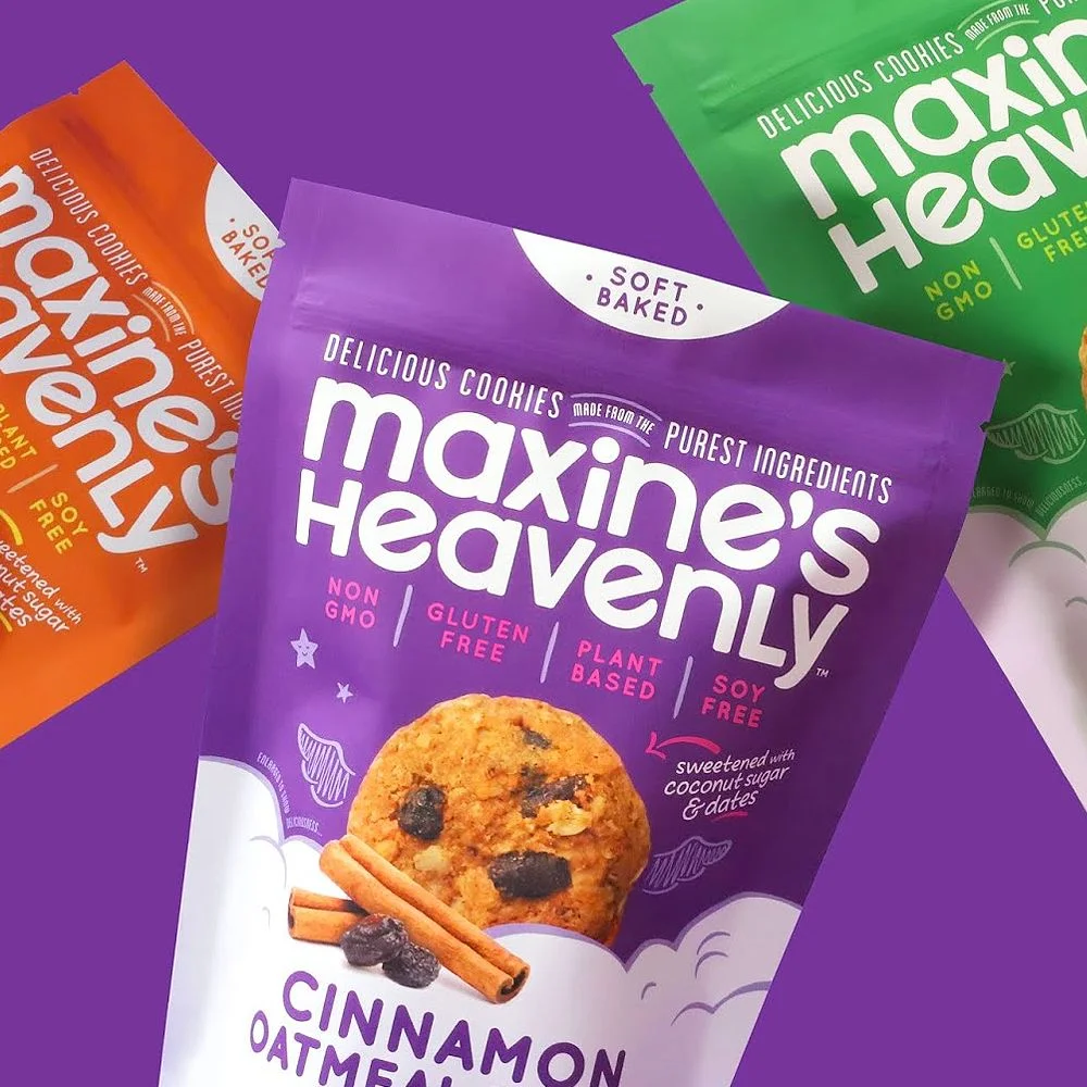
Vibrant purple dominates the central package of Maxine’s Heavenly soft-baked cookies, featuring bold white typography for the brand name and a realistic photograph of a cinnamon oatmeal cookie resting on stylized cloud graphics. The composition includes two additional bags in orange and green peeking from the edges, all set against a solid violet backdrop that makes the packaging colors pop. Soft, even lighting highlights the matte texture of the pouch material while casting gentle shadows that give the arrangement a three-dimensional quality from a slightly elevated camera angle.
What sets this particular design apart is its playful yet sophisticated color blocking that differentiates flavors while maintaining brand cohesion through consistent typography placement. The ‘Soft Baked’ badge sits prominently in a white semi-circle at the top, drawing immediate attention to the product’s texture claim before the eye travels down to the appetizing food photography. Pink accent text highlighting dietary attributes like Non GMO and Gluten Free creates a visual hierarchy that communicates key selling points without cluttering the clean layout.
Packaging designers studying snack food branding would find this reference valuable for understanding how to balance nutritional claims with indulgent imagery in the health-conscious market. Marketing teams developing plant-based product lines could analyze the color psychology used here to appeal to consumers seeking both taste and dietary accommodations. Brand identity specialists might examine how the whimsical cloud motifs soften the clinical feel often associated with allergen-free labeling.