Ditop Packaging White Geometric Patterns Modern
Topics
Details
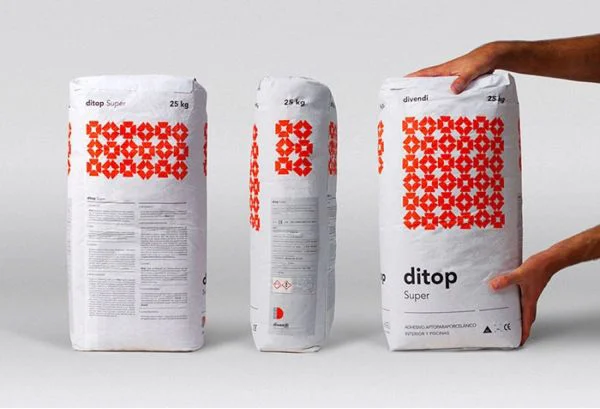
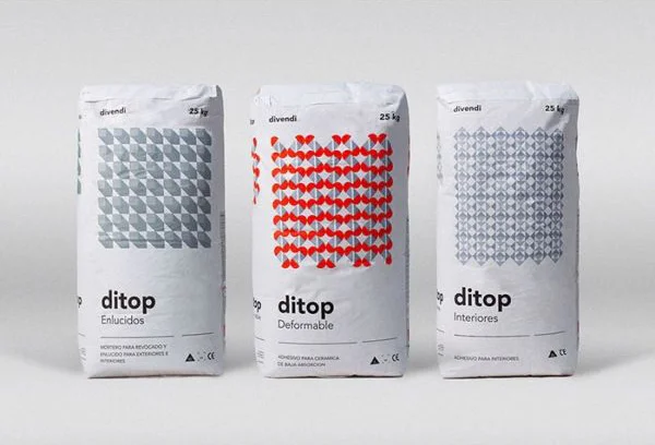
Three upright 25 kg paper sacks stand in a row, each bearing the brand name "ditop" and the manufacturer's mark "divendi" at the top. The left sack features a grid of overlapping grey ovals labeled "Elucidos," the center displays a lattice of red heart-like shapes marked "Deformable," while the right shows a silver geometric diamond pattern for "Interiores." Soft, even lighting illuminates the matte white packaging against a neutral grey surface, with the camera positioned straight-on to capture the full frontal design of each bag.
Visual distinction arises from the interplay between industrial utility and decorative graphic systems, where each product variant communicates its specific construction material through abstract pattern language. The restrained palette—limited to white, grey, red, and black typography—creates a cohesive family identity while allowing individual items to stand apart through their unique tessellated motifs. Clean sans-serif lettering anchors the composition, balancing the intricate repeating geometries that dominate the central field of each package.
Brand strategists developing visual identity systems for construction or agricultural commodities might study this approach to differentiate product lines through pattern rather than color alone. Packaging designers working on bulk material containers could reference how geometric repetition conveys texture and structural properties without photographic imagery. Art directors curating mood boards for minimalist industrial aesthetics would find value in the disciplined grid layouts and typographic hierarchy demonstrated across these three variations.