Ditop Super Cement White Red Geometric Pattern
Topics
Details
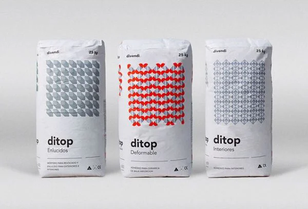
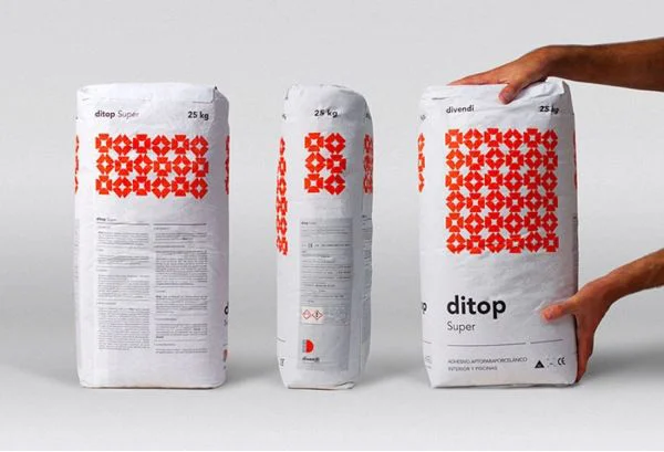
Three white paper sacks of Ditop Super cement stand in a row, each displaying a bold red geometric pattern of interlocking crosses. The left and right bags show the front face with the brand name 'ditop Super' in black lowercase letters beneath the 25 kg weight marking, while the center bag is turned to reveal its side panel with a 28 kg weight and smaller hazard symbols. A pair of hands grips the rightmost sack from both sides, suggesting the product's physical scale against a neutral light gray surface under even studio lighting.
The visual identity relies on the striking contrast between the matte white packaging material and the saturated red lattice motif that repeats across the upper half of each bag. Typography remains minimal and functional, with the manufacturer name 'divendi' appearing in small text above the weight specification, allowing the graphic pattern to dominate the field of view. This particular configuration demonstrates how industrial commodity packaging can achieve visual distinction through systematic repetition of a single geometric module rather than photographic imagery or complex color palettes.
Brand designers developing identity systems for construction materials or agricultural products might study this reference to understand how bold patterns function on large-format flexible packaging. Packaging engineers could analyze the placement of regulatory information relative to decorative elements to balance compliance requirements with shelf presence. Art directors working on industrial catalog layouts may find the composition useful for planning product photography sequences that showcase multiple viewing angles of three-dimensional packages.