Dong Lai Shun
Topics
Details
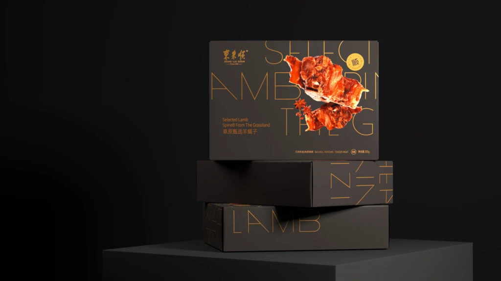
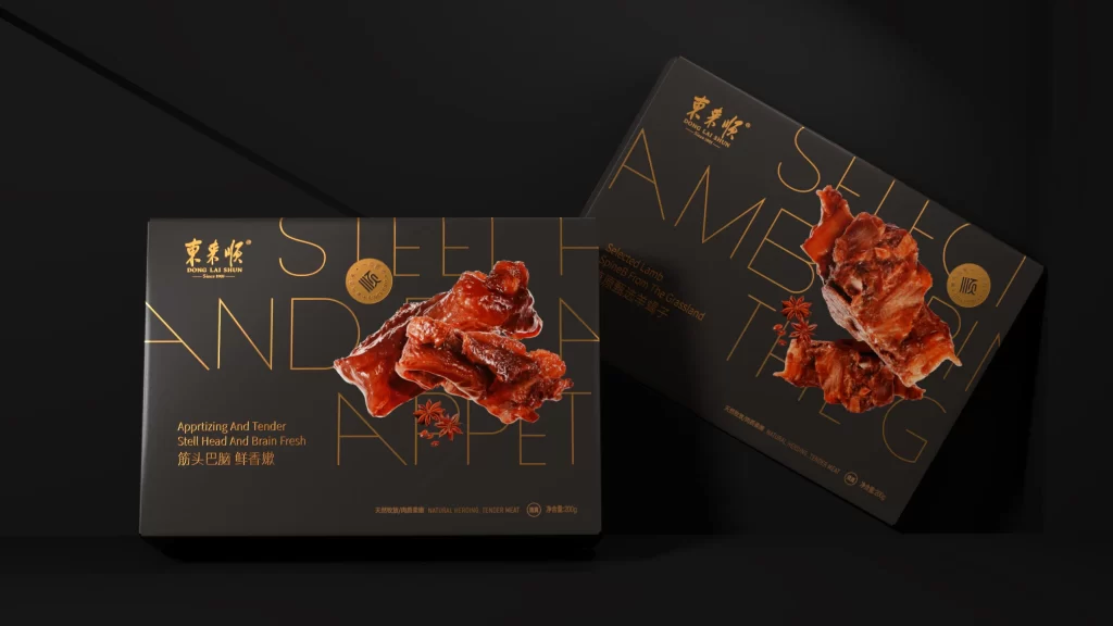
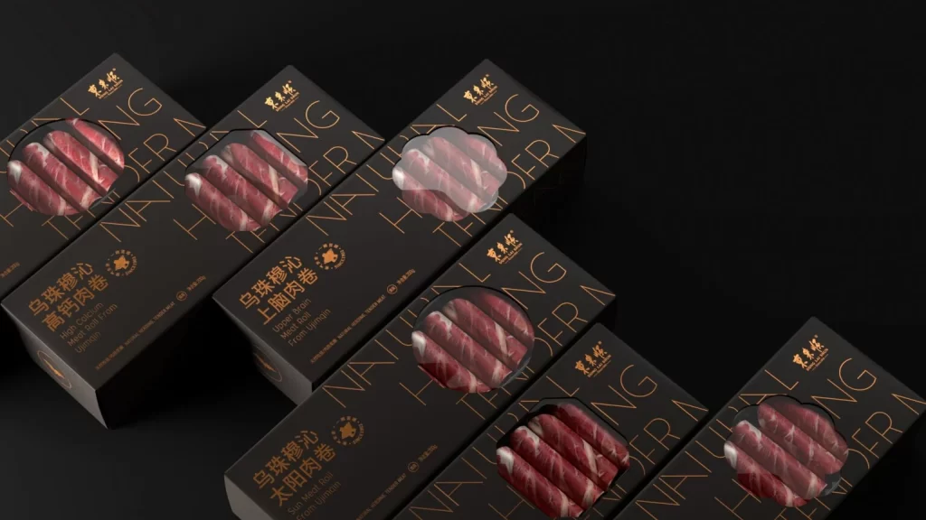
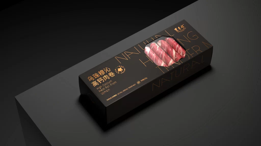
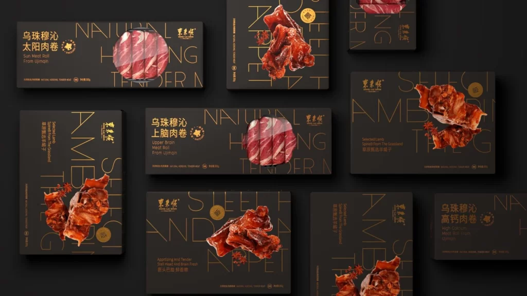
Against a matte charcoal backdrop, nine rectangular packaging boxes are arranged in a loose grid, each featuring a deep black surface with elegant gold foil typography and photorealistic meat imagery. The composition showcases various cuts—ranging from thinly sliced beef rolls to rich lamb spines—rendered in vibrant crimson and amber tones that contrast sharply with the dark substrate. Overlaid across the designs are large, translucent English words like 'NATURAL' and 'TENDER' in thin golden lines, while Chinese characters for 'Dong Lai Shun' and specific product names such as 'Sun Meat Roll' anchor the branding in the upper corners.
Visual hierarchy is established through the interplay of opaque product photography and delicate linear typography, creating a sense of premium luxury typical of high-end food retail. The consistent use of a monochromatic dark base allows the metallic gold accents and the organic reds of the meat to pop with significant visual weight. Circular gold seals and small spice illustrations add textural variety without cluttering the minimalist aesthetic, demonstrating how restrained color palettes can convey sophistication.
Brand strategists developing identity systems for gourmet food lines would find this layout useful for studying how to balance bilingual text elements within confined spaces. Packaging engineers could reference the spatial distribution of imagery versus copy to optimize their own box designs for maximum shelf impact. Art directors tasked with creating cohesive product families will appreciate the repeating motifs that maintain brand recognition across different SKUs while allowing individual items to retain distinct visual identities.