GARNACHA Wine Bottle
Topics
Details
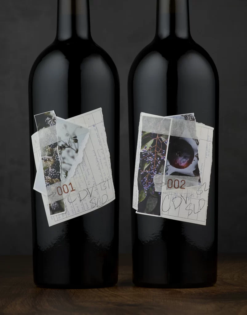
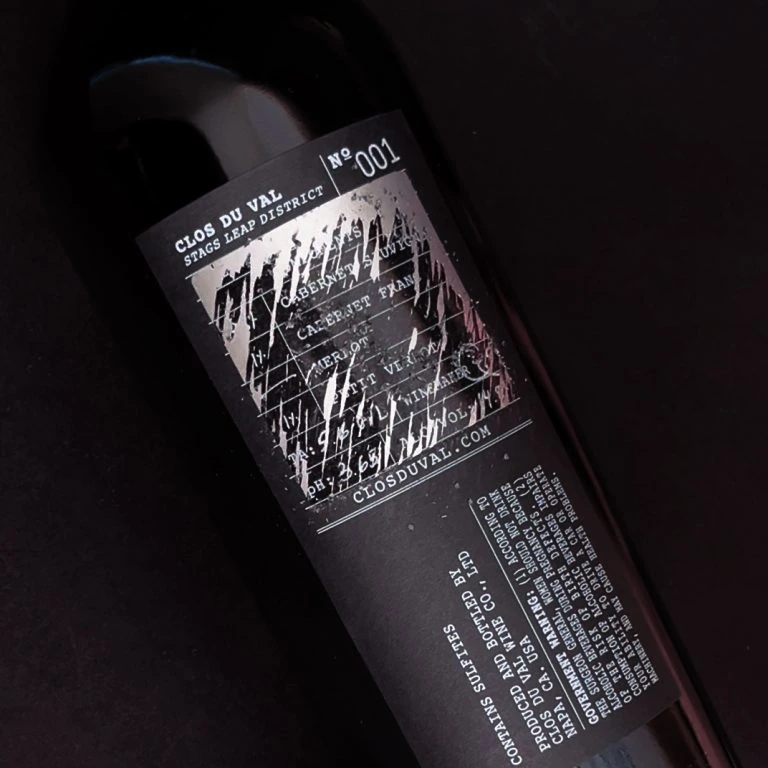
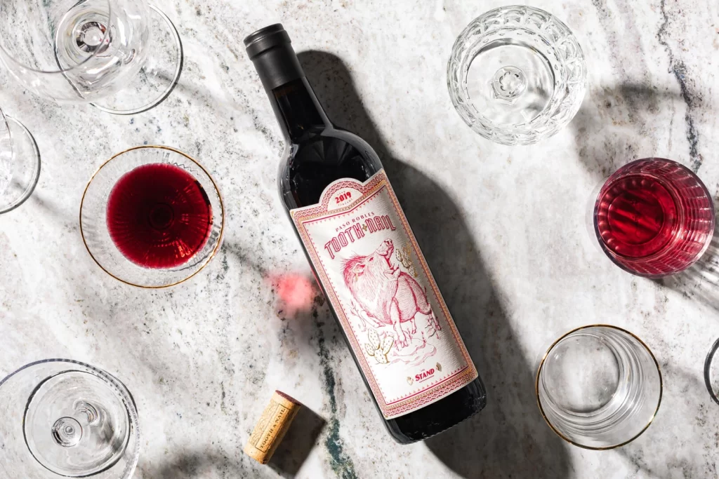
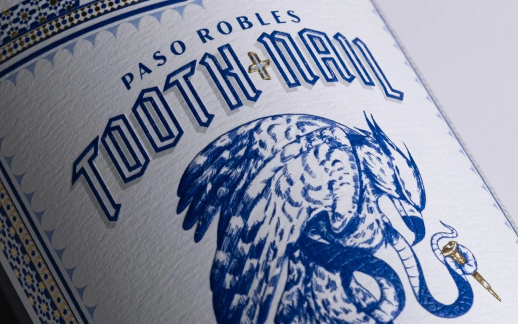
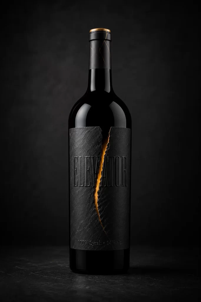
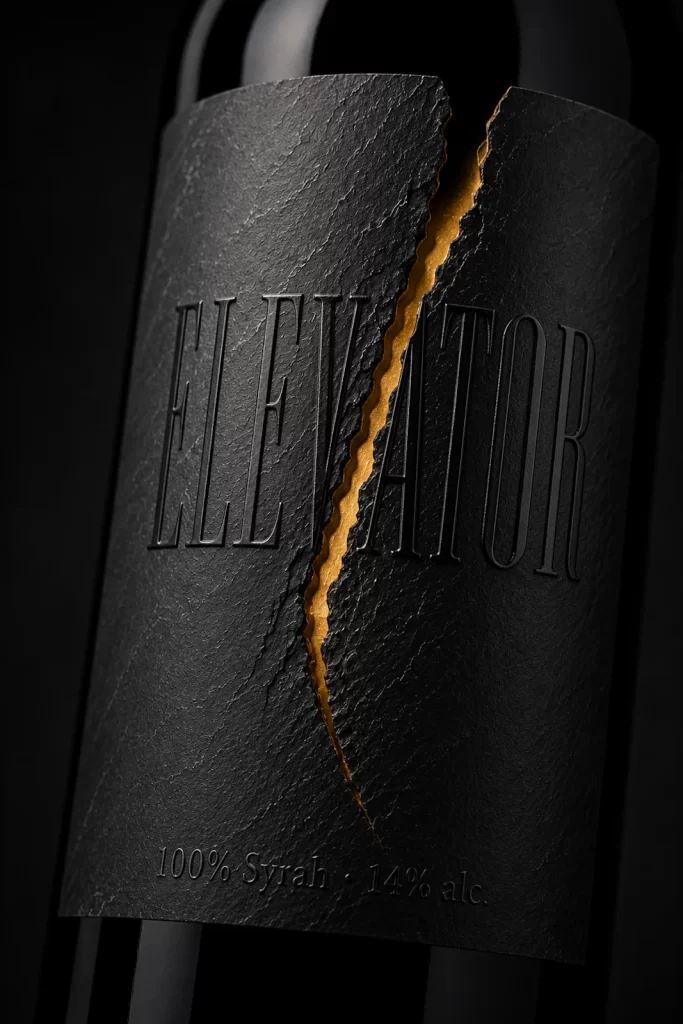
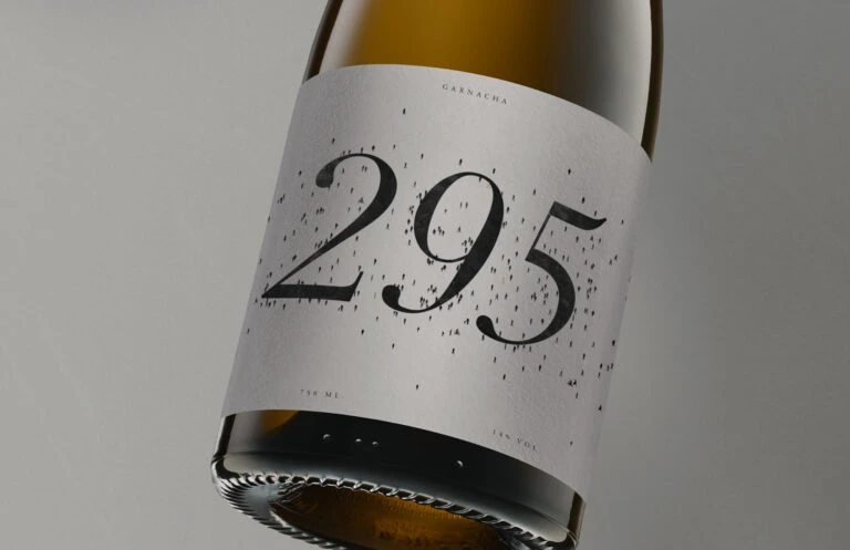
A wine bottle floats against a neutral gray backdrop, its neck and shoulder catching a warm amber glow that contrasts with the cool, matte surface of the label. The off-white paper label features the word 'GARNACHA' in small caps at the top, followed by the dominant number '295' rendered in an elegant black serif font. Tiny black specks are scattered across the label's surface like fine dust or ink splatter, while faint text reading '750 ML' and '14% VOL' sits near the bottom edge.
Visual interest here stems from the minimalist typographic hierarchy combined with the organic texture of the scattered dots, which breaks up the otherwise clean layout without cluttering it. The serif numeral '295' acts as the primary focal point due to its scale and weight, while the subtle grain of the paper material adds tactile depth to the flat design. This approach balances modern simplicity with artisanal character through restrained color choices and precise spatial arrangement.
Packaging designers studying premium wine branding would examine this example to understand how negative space and limited color palettes convey sophistication. Art directors working on beverage campaigns might reference the lighting setup to replicate similar product photography for their own shoots. Typography enthusiasts could analyze the specific serif style used for the numerals to inform font selection for luxury goods packaging projects.