Golden Oolong Tea Can Beverage
DownloadTopics
Details
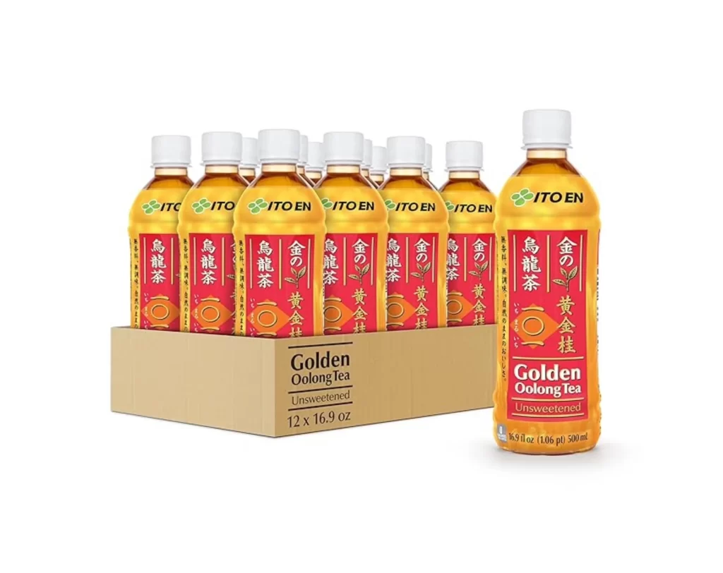
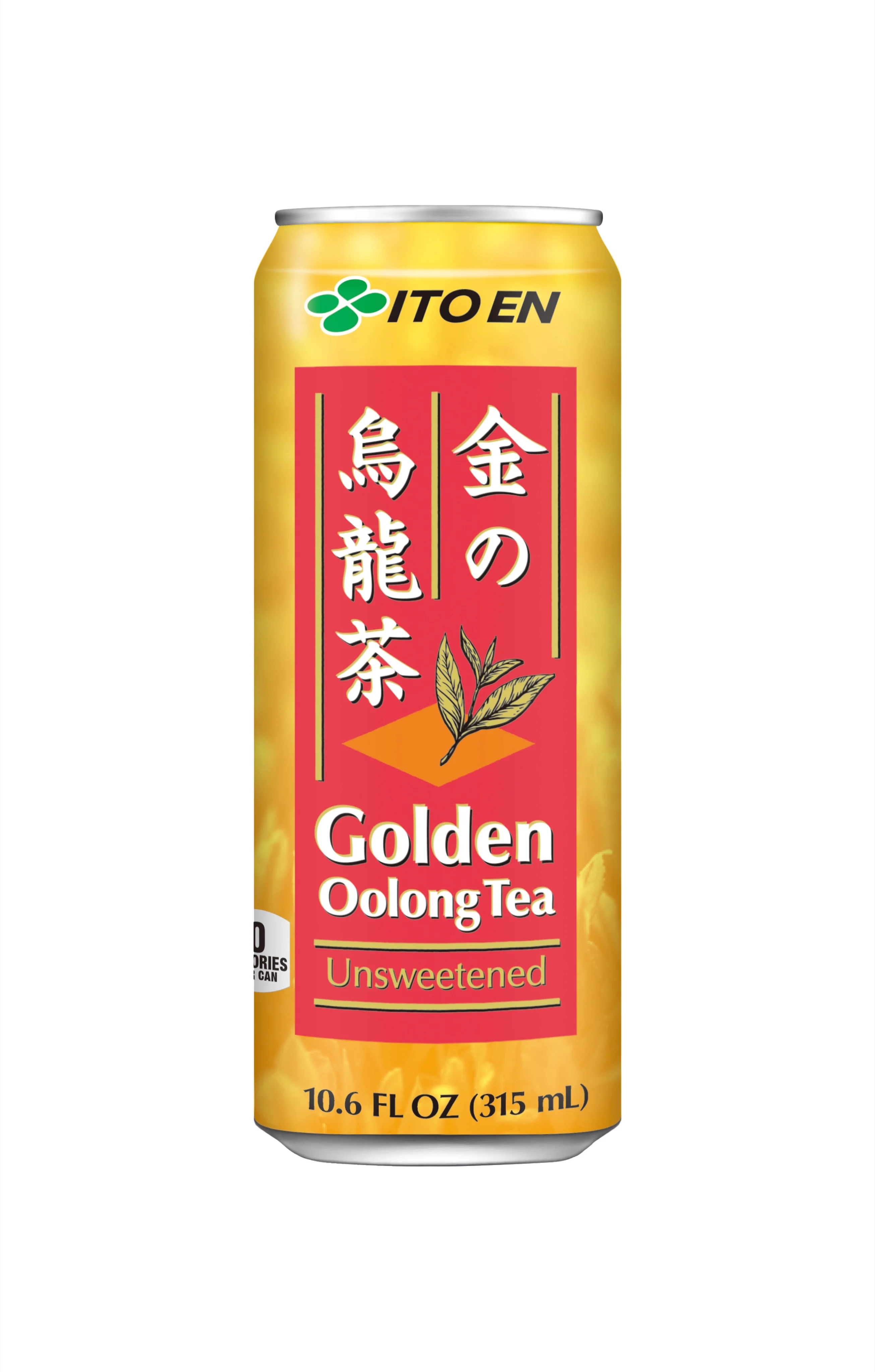
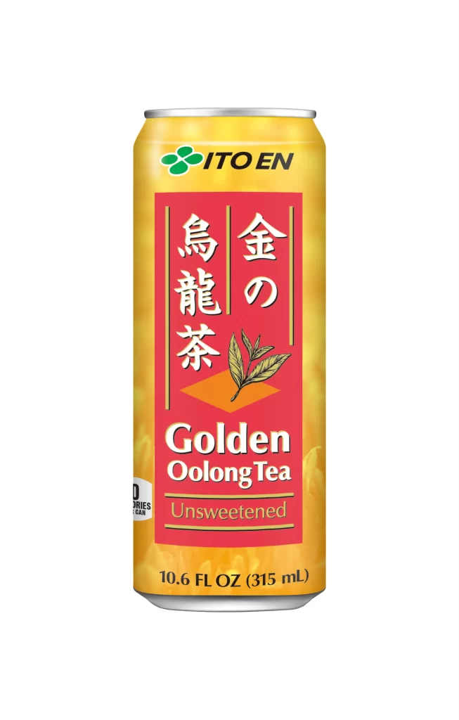
A cylindrical aluminum beverage can stands upright, its surface dominated by a warm golden-yellow gradient that transitions from a pale cream at the top to a richer amber hue toward the base. The central design element is a bold crimson rectangle containing white Japanese characters reading "金の烏龍茶" alongside the English text "Golden Oolong Tea" and "Unsweetened" in a clean serif typeface. A delicate illustration of two oolong tea leaves with visible veining sits above the English lettering, while the ITO EN brand logo—featuring a green four-leaf clover emblem—anchors the upper portion of the can just below the silver metallic rim.
Visual hierarchy on this packaging relies heavily on the striking contrast between the saturated red central panel and the surrounding yellow field, creating an immediate focal point that draws the eye to the product name. The vertical orientation of the Japanese typography complements the tall, slender proportions of the container itself, establishing a cohesive aesthetic that balances traditional East Asian calligraphic influences with modern beverage marketing conventions. Designers studying color theory in commercial packaging will appreciate how the limited palette of gold, red, green, and silver communicates both premium quality and refreshing simplicity without visual clutter.
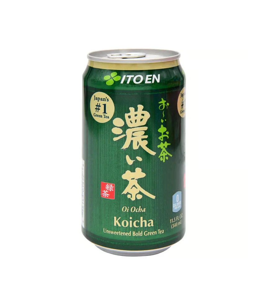
Product photographers and packaging specialists often utilize such isolated beverage shots to analyze lighting techniques that eliminate unwanted reflections on curved metallic surfaces. Brand identity consultants might reference this specific ITO EN iteration when developing visual systems for Asian-inspired food and drink products entering Western markets. The full-resolution asset is accessible at no cost for those needing detailed texture references of printed aluminum finishes or typographic layout studies for similar cylindrical applications.