ITOEN Tomato Soup Packaging
DownloadTopics
Details
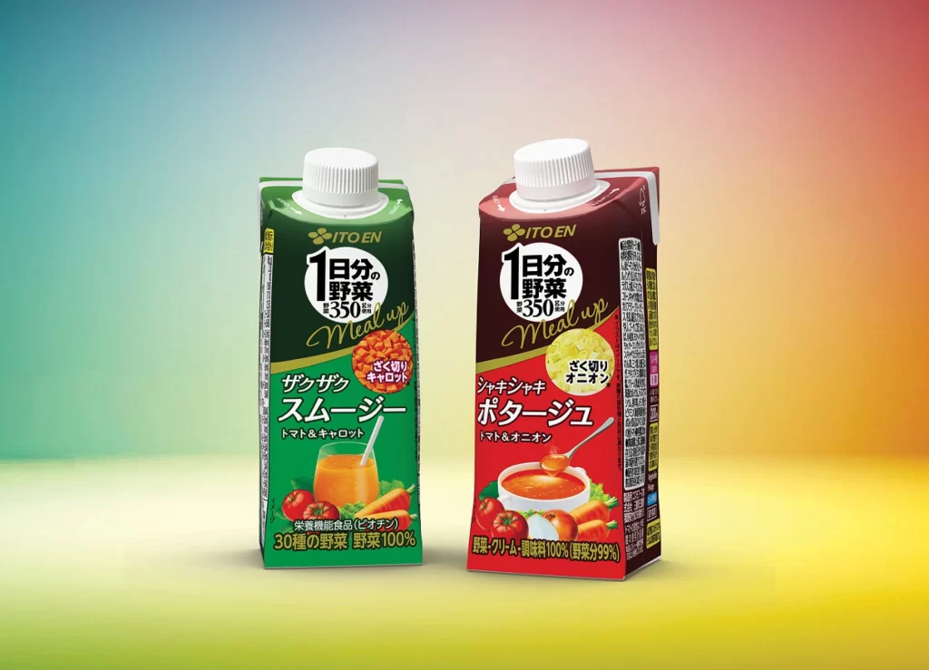
Two rectangular ITOEN cartons stand side-by-side, each topped with a white screw cap and featuring a distinct color scheme: the left container displays a deep forest green body with orange juice imagery, while the right counterpart presents a rich maroon-red design showcasing a bowl of soup. Bold Japanese typography dominates the front panels, including the prominent '1日分の野菜 350g' (One day's worth of vegetables, 350g) and the English brand name 'Meal up' rendered in elegant gold cursive. The composition utilizes a smooth gradient background transitioning from cool cyan through pale yellow to warm coral, with soft studio lighting that creates gentle highlights on the glossy packaging surfaces and a straight-on camera perspective that emphasizes the product's symmetrical arrangement.
Visual hierarchy is established through strategic color blocking and typographic contrast, where the green variant communicates freshness through vegetable illustrations and the red variant evokes warmth via its soup bowl photography. The circular flavor badges—featuring diced ingredients for the smoothie style and a creamy texture for the potato version—create focal points that break up the vertical text flow while maintaining brand consistency across both SKUs. Designers studying this reference will appreciate how the limited palette of green, red, and gold creates immediate product differentiation without sacrificing unified branding elements. A full-resolution copy of this photograph can be accessed at no cost for detailed examination of the print finishes and layout proportions.
Packaging engineers and beverage marketers would utilize this visual to analyze how nutritional claims are integrated into premium product positioning, particularly the emphasis on vegetable content percentages displayed prominently at the base of each carton. 3D artists requiring accurate material references for cardboard textures, plastic cap specular highlights, or liquid translucency in glass will find the lighting conditions particularly useful for texture mapping studies. Brand strategists could also employ this side-by-side comparison when presenting line-extension concepts to stakeholders, demonstrating how a single product architecture adapts across different flavor categories while preserving core identity markers.