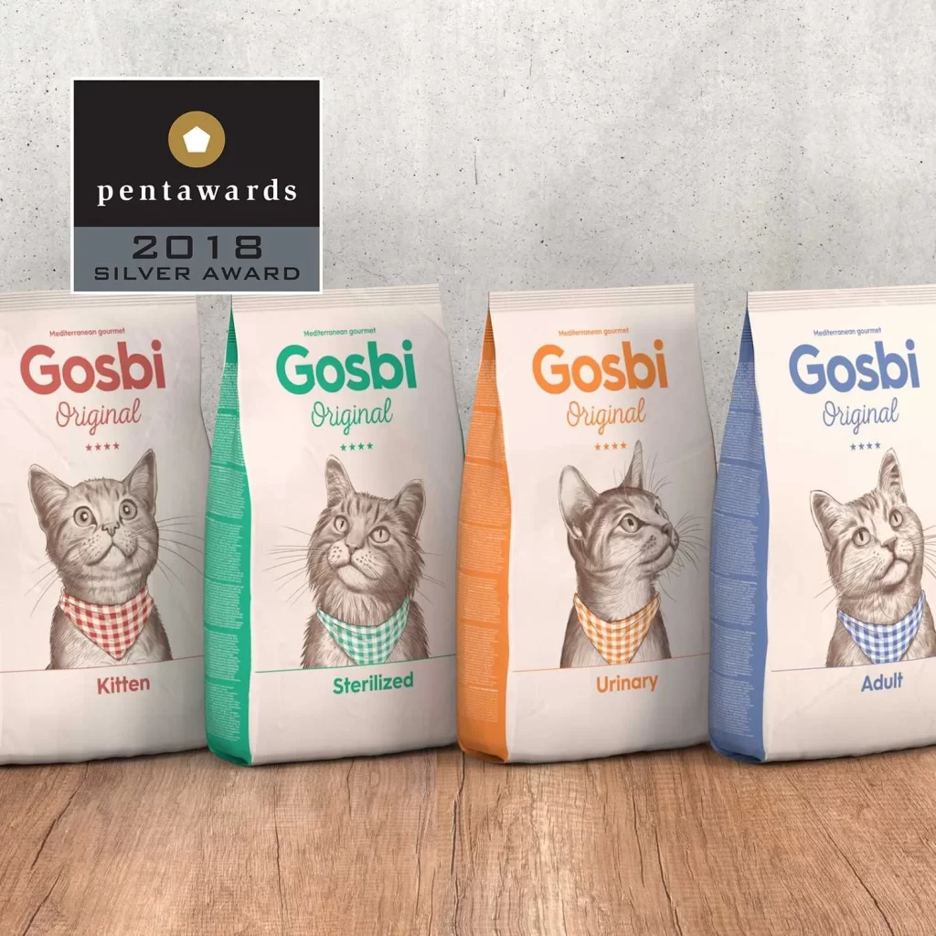
Gosbi Cat Food Kitten Sterilized Urinary Adult Illustration Red Green Orange Blue
Topics
Details
Four upright cat food bags stand in a row on a light wood-grain surface, each featuring a detailed pencil-style cat illustration wearing a checkered bandana. The packaging displays the brand name 'Gosbi' and 'Original' in bold, color-coded typography—red, green, orange, and blue—corresponding to the Kitten, Sterilized, Urinary, and Adult variants respectively. A textured gray concrete wall serves as the backdrop, while soft directional lighting from the left casts subtle shadows that emphasize the matte finish of the paper material and the dimensional quality of the sealed edges.
Visual differentiation relies on a systematic color-coding strategy where the side panels and primary text hues shift across the spectrum while maintaining identical structural layout and illustrative style. The hand-drawn feline portraits exhibit distinct expressions and head orientations for each variant, creating personality distinctions without disrupting brand cohesion. This approach demonstrates how limited palette variations can effectively segment product lines within a unified design system.
Brand managers developing pet nutrition product families could study this arrangement to understand how consistent illustration styles support category expansion while preserving recognition. Packaging engineers might analyze the gusseted bag construction and how color blocking integrates with functional panel placement. Marketing teams planning retail shelf configurations would benefit from examining how sequential color progression guides consumer eye movement across related SKUs.