Green Tea Supplement Yellow Green Abstract Minimalist Design
Topics
Details
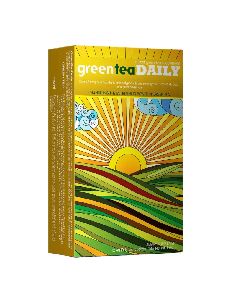
A rectangular supplement box stands at a slight three-quarter angle, revealing its front face and left spine against a white void. The packaging features a vibrant yellow-to-orange gradient sky with radiating sunbeams, a central golden sun disc, and stylized blue-white clouds floating above rolling green hills rendered in layered stripes of emerald, olive, and rust. Bold typography spells 'green tea DAILY' in mixed white and dark green lettering across the upper third, while smaller text details antioxidant content and the tagline about fat-burning power beneath it.
What distinguishes this particular design is its bold departure from typical health-product minimalism through an almost psychedelic landscape illustration that dominates the visual field. The wavy, contour-line aesthetic of the terrain creates a sense of organic movement and energy that contrasts sharply with the rigid rectangular form of the container itself. This interplay between geometric packaging structure and fluid natural imagery produces a memorable visual identity that feels both modern and refreshingly playful.
Brand strategists developing wellness product lines could study this example to understand how vibrant color palettes and illustrative elements can elevate commodity supplements into lifestyle objects. Packaging designers might reference the typographic hierarchy and spatial arrangement when creating their own consumer goods that need to communicate both scientific credibility and approachable warmth. Marketing teams planning retail displays would benefit from analyzing how such high-contrast graphics perform in crowded shelf environments where visual pop determines purchase decisions.