H.Theoria Liquor Bottle
Topics
Details
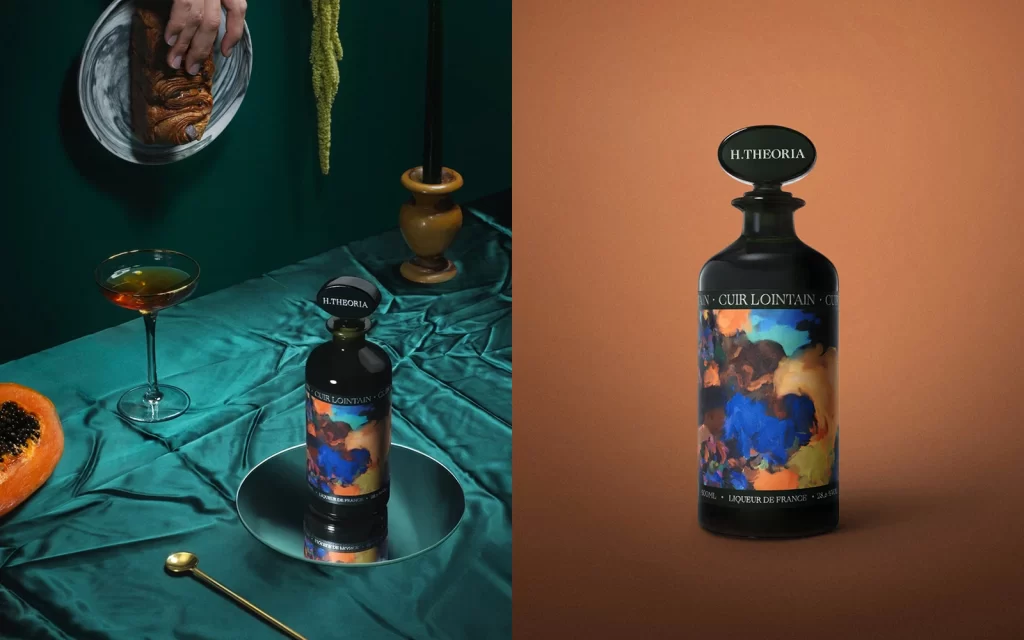
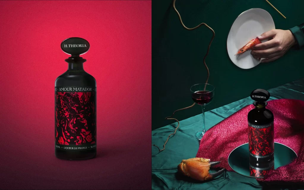
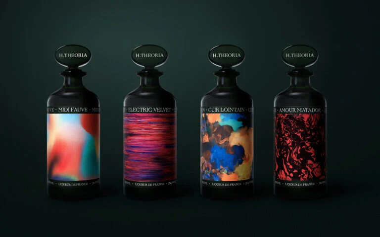
Four identical apothecary-style bottles stand in a rigid row against a void of deep forest green, each vessel crafted from opaque black glass with a rounded stopper bearing the brand name H.THEORIA in white serif capitals. The labels wrap around the lower torso of each bottle, displaying distinct abstract artworks: a soft gradient of coral and turquoise on the first, horizontal striations of magenta and violet on the second, swirling clouds of azure and amber on the third, and intricate crimson filigree patterns on the fourth. White text arches above and below these colorful panels, identifying the fragrance names—MIDI FAUVE, ELECTRIC VELVET, CUIR LOINTAIN, and AMOUR MATADOR—along with the L'OEUVRE DE FRANCE attribution at the base, all illuminated by soft directional lighting that creates subtle highlights along the curved shoulders.
Visual tension emerges from the juxtaposition of Victorian pharmaceutical silhouettes against contemporary digital art techniques, where the liquid-like color fields suggest movement frozen within static glass containers. The monochromatic black packaging serves as an aggressive canvas that amplifies the saturation of each label's unique palette, creating individual identities while maintaining strict brand cohesion through consistent typography and bottle architecture. Such deliberate contrast between historical form language and modern abstract expressionism positions these objects at the intersection of heritage craftsmanship and avant-garde aesthetic experimentation.
Product photographers studying luxury packaging compositions will find value in analyzing how the symmetrical arrangement creates rhythm while allowing each variant to command individual attention through chromatic differentiation. 3D environment artists constructing virtual apothecary or boutique settings can reference the material properties—specifically how matte black surfaces interact with colored translucent label elements under controlled studio illumination. Brand identity developers exploring premium positioning strategies might examine the hierarchy between the understated vessel form and the expressive artwork, noting how restraint in container design permits boldness in graphic application.