H.Theoria Liqueur de France Bottle
Topics
Details
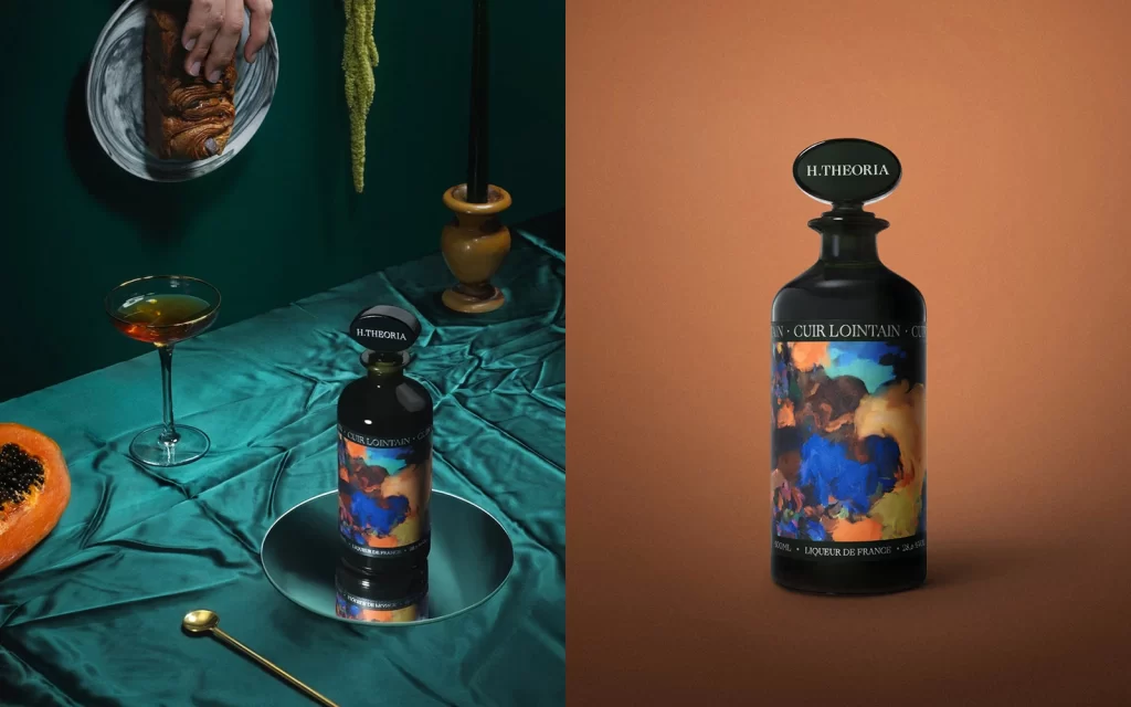
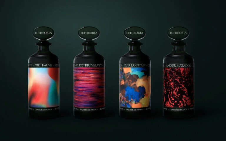
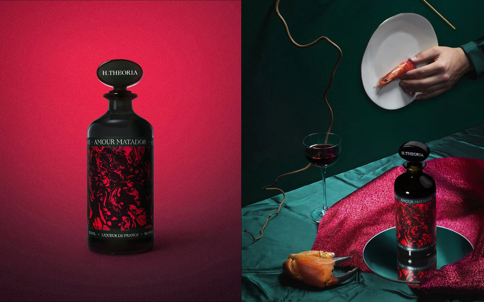
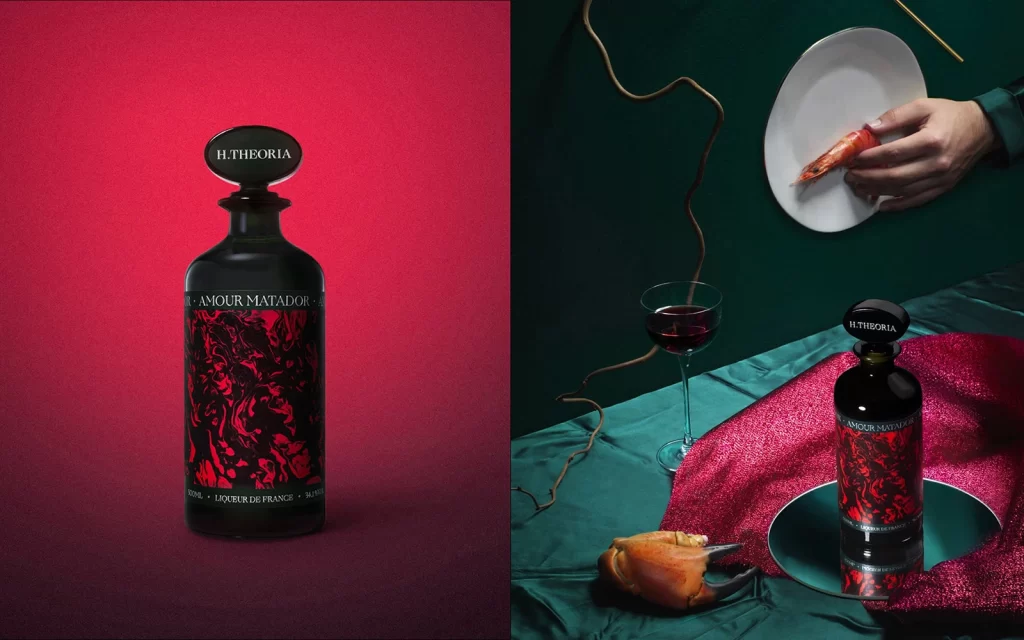
Matte black glass forms the vessel for H.Theoria's Amour Matador liqueur, its surface wrapped in swirling crimson and black marbled graphics beneath an oval stopper bearing the brand name. The left panel isolates the bottle against a flat red field, while the right situates it on a reflective teal disc atop crinkled emerald fabric, surrounded by a wine glass, a crab claw, and a hand holding shrimp above a white plate.
Visual tension emerges from the juxtaposition of pharmaceutical bottle architecture with baroque, almost violent graphic treatment that evokes bullfighting aesthetics through its swirling crimson vortex. The dual presentation strategy—sterile studio isolation versus decadent narrative tableau—demonstrates how packaging design transforms from mere container to protagonist within curated atmospheric contexts. Material contrasts between the dead-matte glass, glossy label finish, and reflective metallic base create a sophisticated hierarchy of surfaces that demands close material study.
Art directors developing luxury spirits campaigns will find the color palette and compositional balance particularly useful for mood-board development, while packaging designers can analyze how typographic hierarchy functions against high-contrast organic patterns. Photographers studying chiaroscuro lighting techniques benefit from observing how the red background absorbs light differently than the green fabric setup, offering lessons in color-theory application for commercial still-life work. The inclusion of food styling elements alongside the product provides concrete examples of lifestyle photography integration for editorial projects.