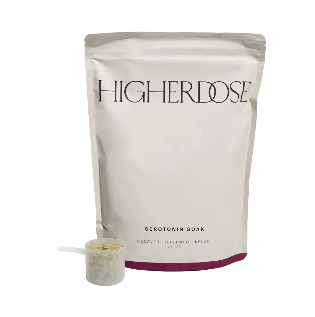
HigherDose Serotonin Soak Bath Soak Image 01 Packaging
Topics
Details
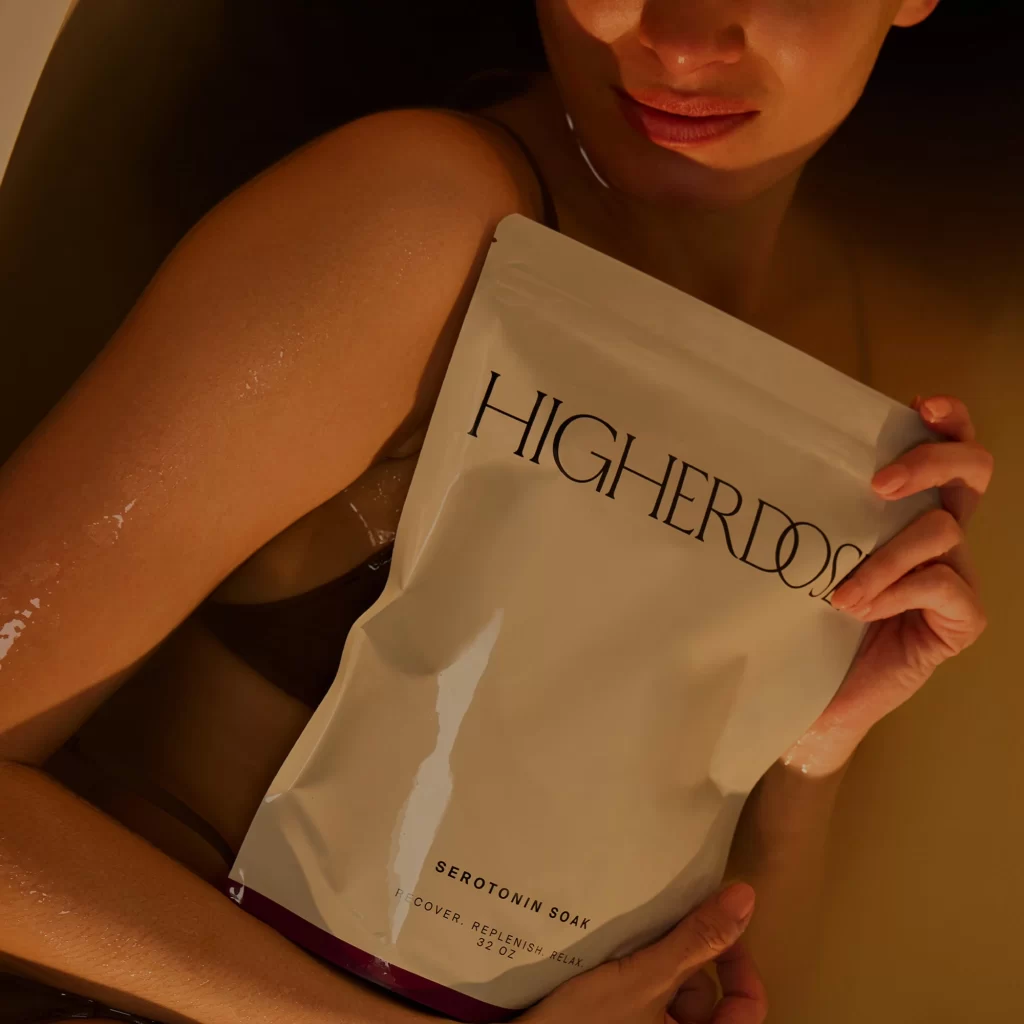
A matte silver pouch stands as the central protagonist, its surface catching soft, diffused light that reveals subtle creases and the tactile quality of its material. The brand name HIGHERDOSE dominates the upper third in an elegant, widely-spaced serif typeface, while the product identity SEROTONIN SOAK anchors the lower section in a smaller, clean sans-serif font above the tagline RECOVER. REPLENISH. RELAX. and 32 OZ weight notation. A translucent measuring scoop filled with pale, granular soak powder rests to the left of the bag's base, which features a deep burgundy accent band along the bottom edge.
Minimalism defines the visual strategy here, relying on typographic hierarchy and generous negative space rather than decorative graphics to communicate luxury and efficacy. The contrast between the refined, almost architectural lettering of the logo and the utilitarian clarity of the product specifications creates a sophisticated tension that feels both clinical and indulgent. By positioning the physical scoop as a secondary element, the composition bridges the gap between abstract packaging design and the sensory experience of the actual product, making the intangible promise of relaxation feel concrete and immediate.
Brand strategists analyzing modern wellness aesthetics would find this composition particularly useful for studying how restraint can convey premium positioning in saturated markets. Packaging designers tasked with creating refillable or bulk-format containers could reference the balance between the large-format bag and the accompanying measuring tool to solve similar UX challenges. Furthermore, art directors planning e-commerce photography for minimalist beauty brands might utilize this framing to understand how lighting and shadow play can elevate simple materials into objects of desire.