HigherDose Serotonin Soak Bath Soak Image 09 Packaging
Topics
Details
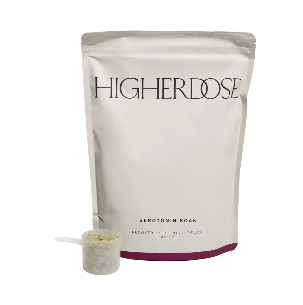
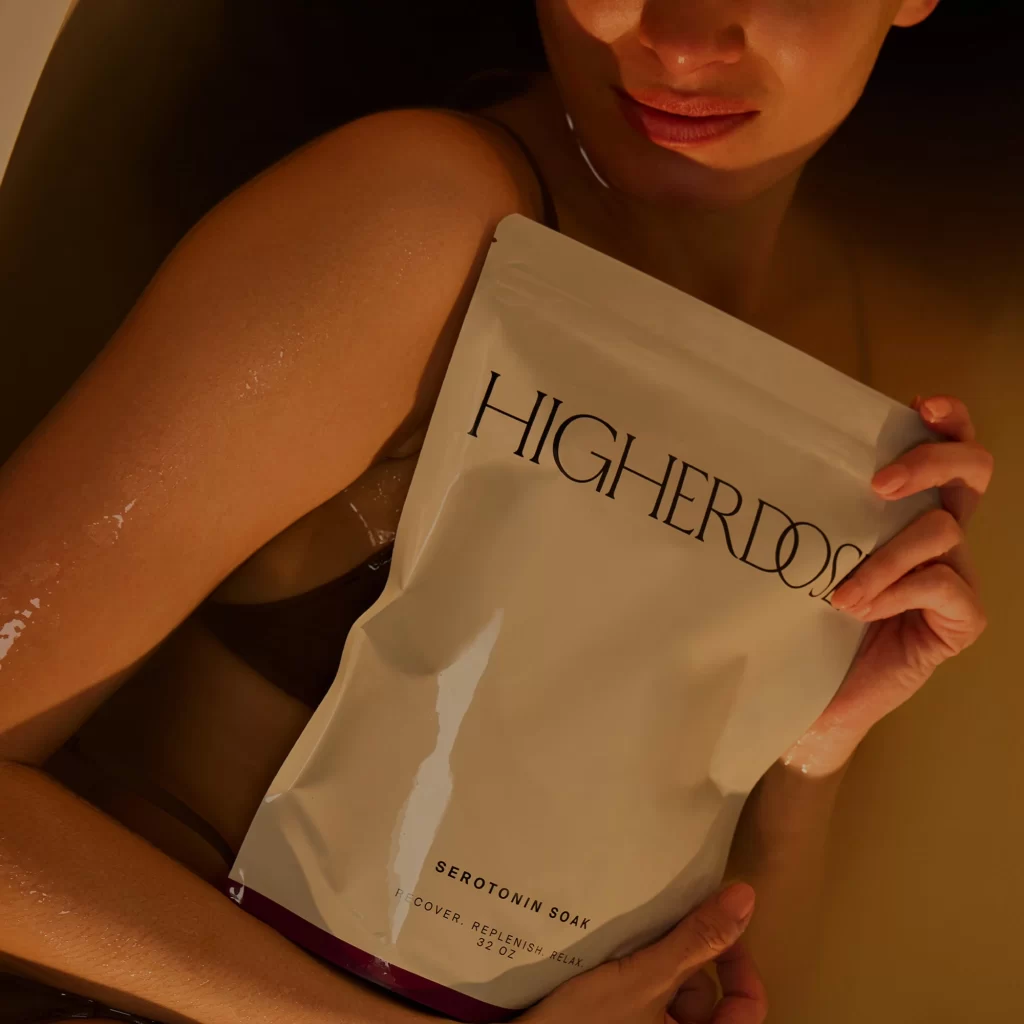
Warm amber light washes over a person's glistening, wet arm and shoulder as they hold a matte white pouch against a muted golden backdrop. The packaging features the brand name 'HIGHERDOSE' in an elegant serif typeface across the upper portion, with smaller text below reading 'SEROTONIN SOAK' followed by 'RECOVER. REPLENISH. RELAX.' and '32 OZ'. A deep burgundy band anchors the bottom edge of the flexible pouch, while the camera maintains a close, slightly upward angle that emphasizes both the product typography and the tactile moisture on skin.
Visual distinction emerges from the deliberate contrast between the clinical, minimalist packaging design and the organic, sensory context of actual bath use. The off-white material of the pouch catches subtle highlights that reveal its soft, non-glossy texture, while the dark purple accent provides a sophisticated color anchor without overwhelming the composition. Typography choices balance modern sans-serif clarity with refined letter spacing, creating a luxury wellness aesthetic that feels simultaneously medical and indulgent.
Art directors developing beauty or lifestyle campaigns might study this frame to understand how product photography can integrate human elements without losing focus on branding details. Packaging designers could reference the specific weight distribution of text elements and the strategic use of accent colors to convey premium positioning. Photographers working in the wellness space may find value in analyzing how warm directional lighting enhances both skin texture and matte surface materials within a single cohesive shot.