Honey Jar Black Red Gold Traditional Packaging Design
Topics
Details
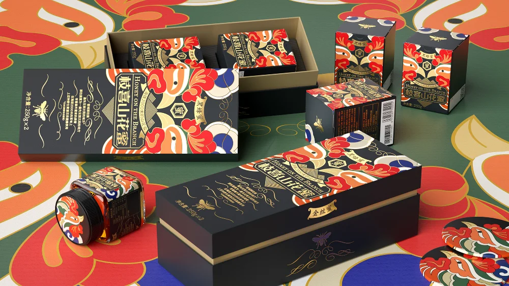
Deep matte black boxes and glass jars dominate the foreground, adorned with vibrant red and gold traditional motifs that resemble stylized phoenix wings or floral patterns. The packaging features prominent vertical Chinese characters reading '桉喜山花蜜' alongside English text like 'HONEY ON THE BRANCH' and '金丝蜜', all rendered in elegant gold foil. These items rest upon a surface decorated with large, sweeping abstract shapes in teal, orange, and cream, while soft studio lighting casts gentle shadows that emphasize the premium texture of the materials.
Visual interest stems from the bold contrast between the somber black substrate and the explosive warmth of the red and gold illustrations, creating a luxurious yet culturally grounded aesthetic. The intricate line work and symmetrical composition of the graphics suggest a fusion of modern minimalism with classical folk art elements. Such a palette immediately signals high value and artisanal quality, distinguishing the product from conventional clear-glass honey containers through its opaque, mysterious presentation.
Brand strategists developing luxury food products might study this layout to understand how to balance cultural heritage with contemporary market appeal. Packaging engineers could analyze the structural variety shown here, ranging from individual square units to nested sets within larger rectangular sleeves. Illustrators seeking to master the art of ornamental symmetry will find the repeating avian and botanical forms a perfect case study in cohesive pattern application across different dimensional surfaces.