Honor Play 50 5G Advertisement
DownloadTopics
Details
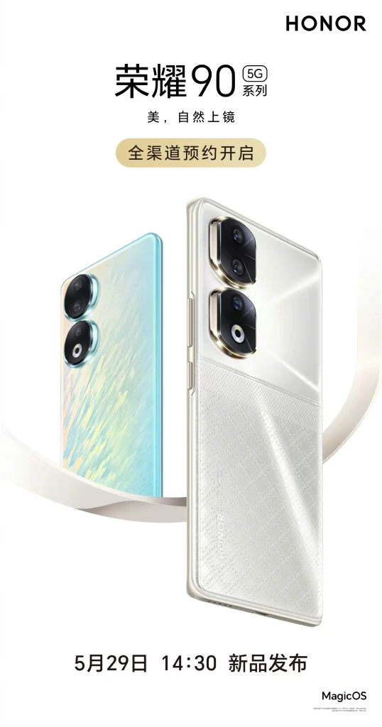
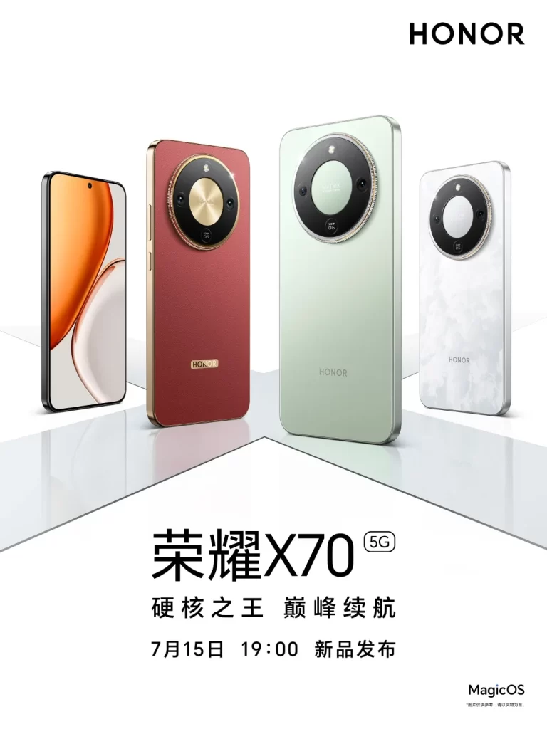
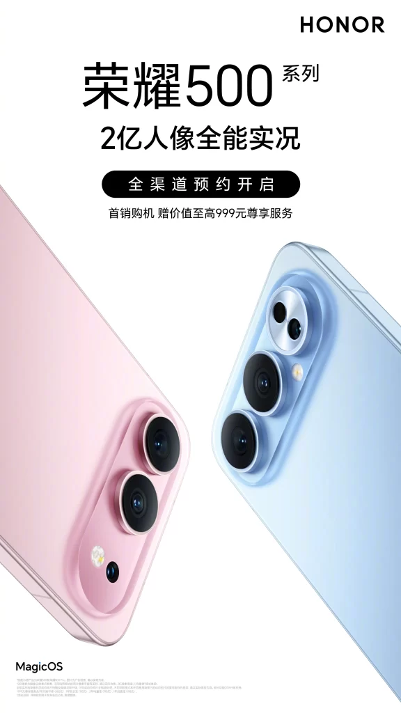
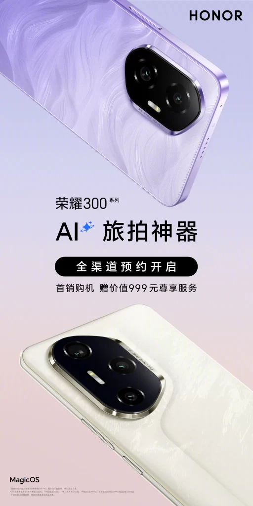
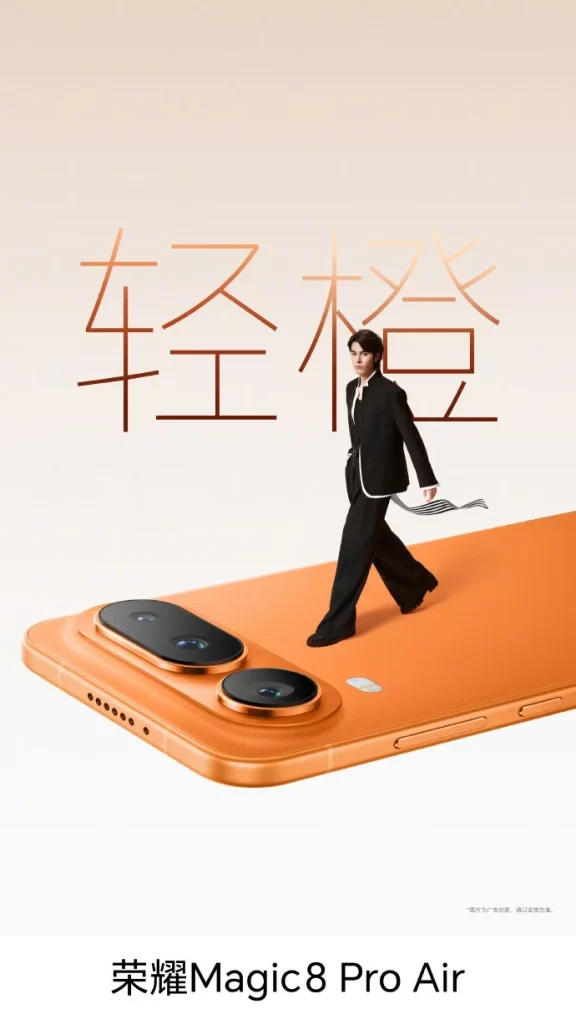
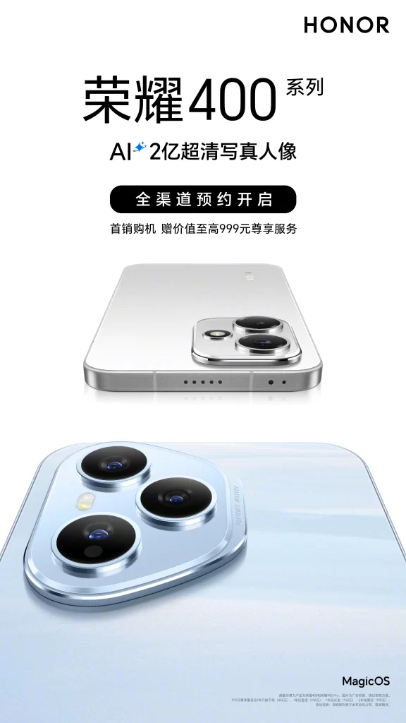
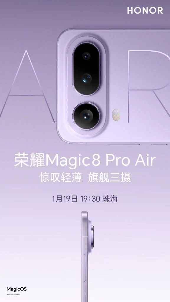
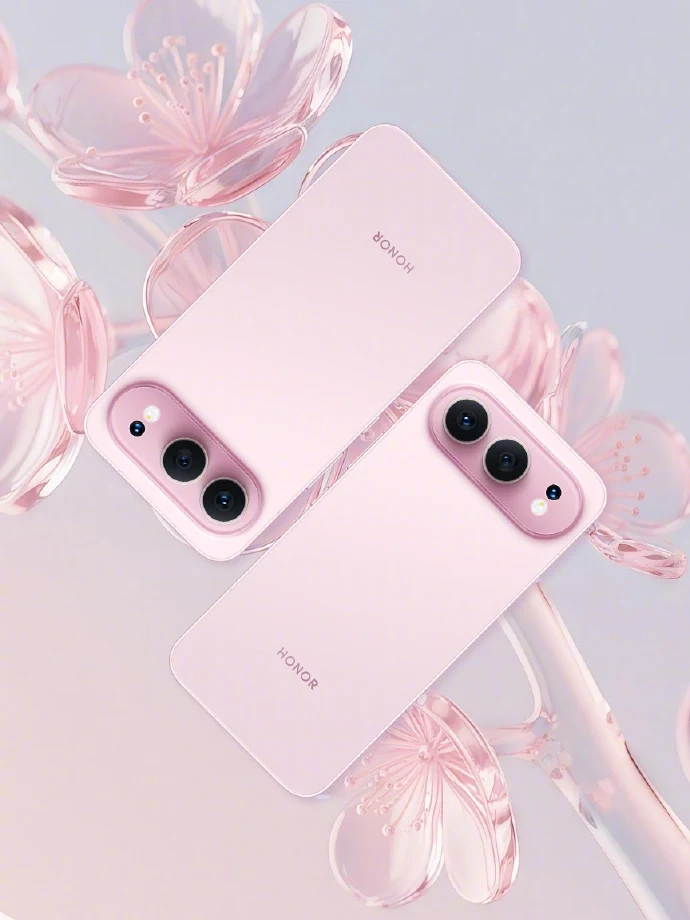
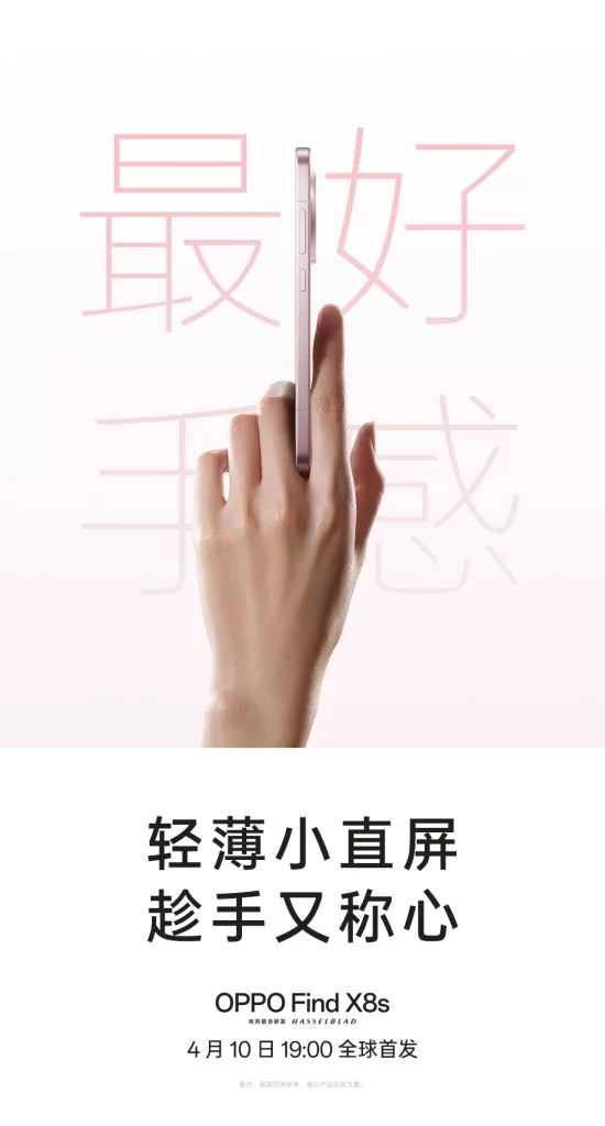
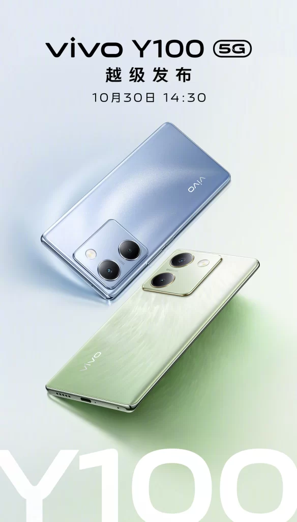
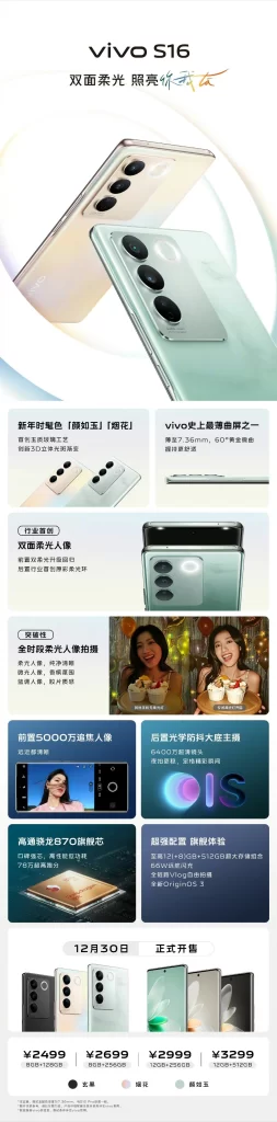
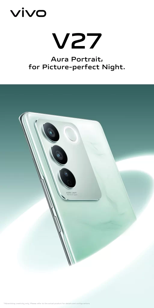
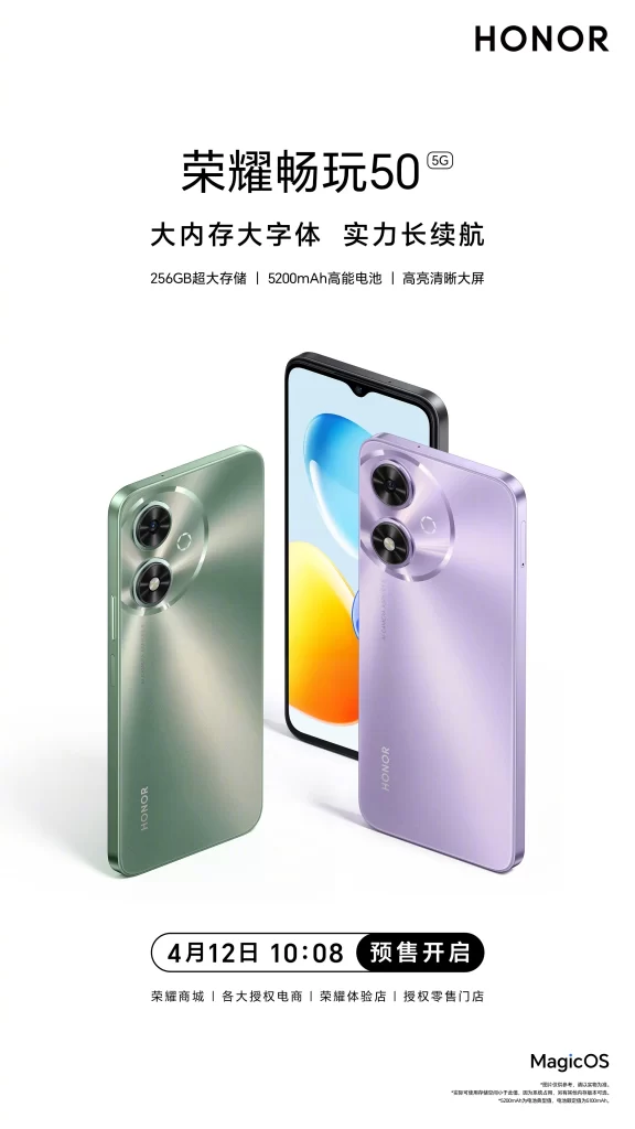
Neon accent lighting is not present, as the promotional poster for the Honor Play 50 5G features the brand logo in the upper right corner against a clean white background. Two smartphone models, one in a metallic green and another in a soft lavender purple, are displayed prominently in the foreground with a third device showing its screen behind them. The text is written in simplified Chinese, highlighting key specifications like ‘256GB’ storage and a ‘5200mAh’ battery alongside the pre-sale date of April 12th.
The layout utilizes a minimalist aesthetic with ample negative space to draw focus to the product’s sleek form and dual-camera circular module. Typography is bold and modern, using high-contrast black characters to ensure readability while maintaining a premium feel. The color palette combines neutral tones with vibrant product hues to create a fresh and approachable visual identity. A full-resolution file of this asset is freely available for detailed inspection.
Graphic designers often analyze such materials to understand effective spacing techniques and color theory in consumer electronics marketing. Marketing students utilize these examples to study how technical specifications are integrated into visually appealing campaigns without cluttering the composition. Phone enthusiasts also reference these images to compare physical design elements like finish textures and camera placements before making purchasing decisions.