OPPO Find X9 Pro Advertisement
DownloadTopics
Details
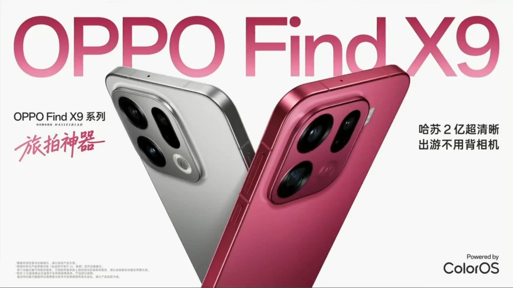
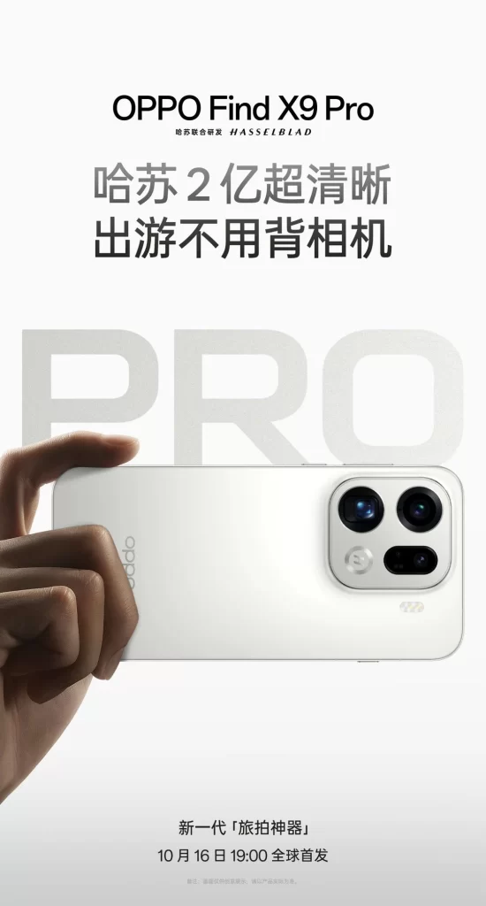
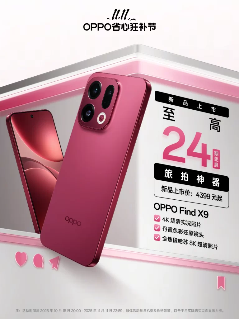
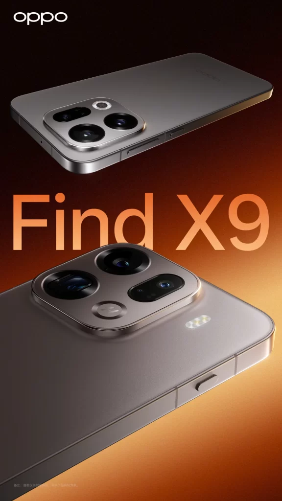
Dynamic speed blurs are absent from the promotional poster, which instead displays the OPPO Find X9 Pro smartphone from two distinct angles against a warm gradient background. The upper view shows the device’s full back panel, while the lower close-up highlights the intricate camera module and side profile, with bold orange typography spelling out ‘Find X9’ centrally between the product shots and the brand name ‘oppo’ positioned in the top-left corner.
Visual hierarchy is established through the large sans-serif typeface that dominates the middle ground, contrasting with the metallic silver finish of the hardware. Professional studio lighting creates subtle reflections on the phone’s surface while the amber-to-brown backdrop provides depth without distraction. A high-resolution file of this composition is freely available for detailed examination.
Graphic designers frequently reference this layout when structuring premium electronics campaigns that require balanced negative space. Marketing analysts study such materials to understand how color psychology influences consumer perception of flagship devices. Tech enthusiasts also utilize these official renders to compare physical dimensions with competing models before purchase decisions.