OPPO Reno10 Pro Plus Advertisement
Topics
Details
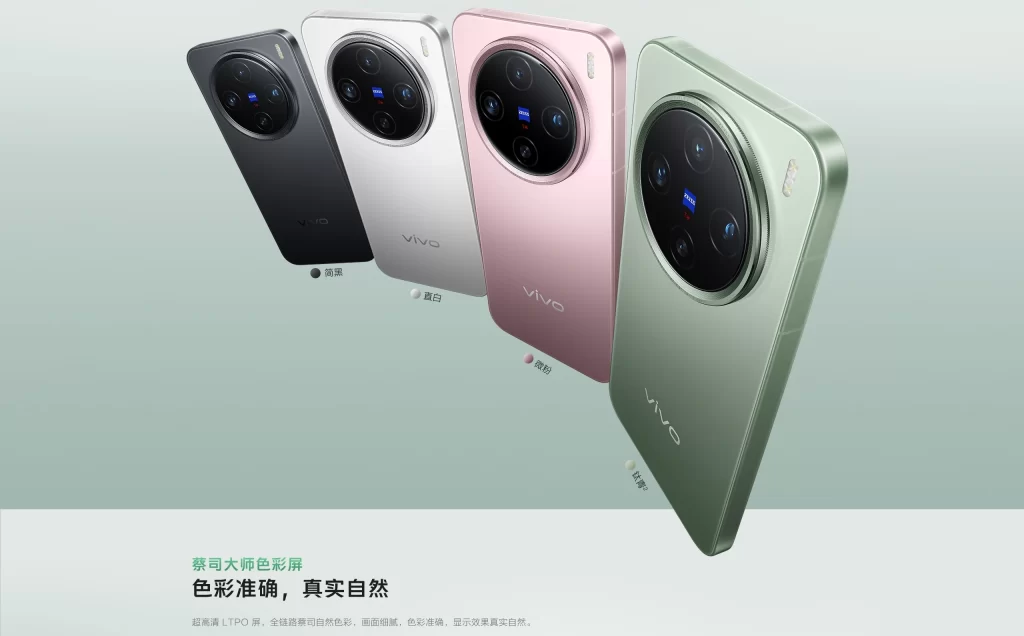
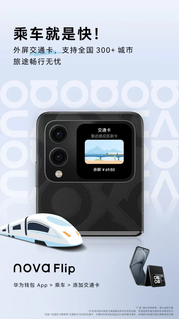
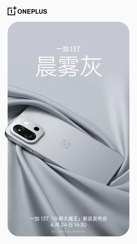
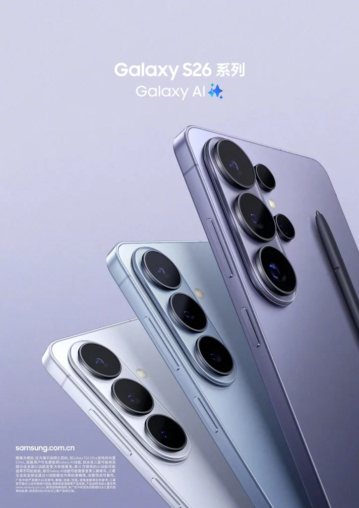
Tactile texture closeups of the OPPO Reno10 Pro+ 5G smartphone are showcased in three distinct colorways: a soft purple, a metallic champagne gold, and a dark gunmetal gray. The devices are arranged in a staggered row against a clean, off-white background with subtle golden textures at the bottom, while prominent Chinese text above the phones announces that the Pro+ version has achieved record-breaking sales for the series.
Visual hierarchy is established through bold sans-serif typography, where the product name sits in black while the ‘Historical New High’ accolade is rendered in large, golden characters framed by laurel wreaths. The photography utilizes soft studio lighting to accentuate the curved edges and premium glass finishes of the handsets. A warm, luxurious palette of gold and cream tones reinforces the high-end positioning of the device.
Marketing professionals utilize such assets to analyze effective strategies for highlighting multiple product variants within a single frame. Design students often examine the balance between technical specifications listed at the bottom and the emotional appeal of the hero imagery. Enthusiasts of mobile technology also reference these materials to track evolving aesthetic trends in smartphone industrial design.